Vladimir Tatlin Palette 2

Palette Analysis
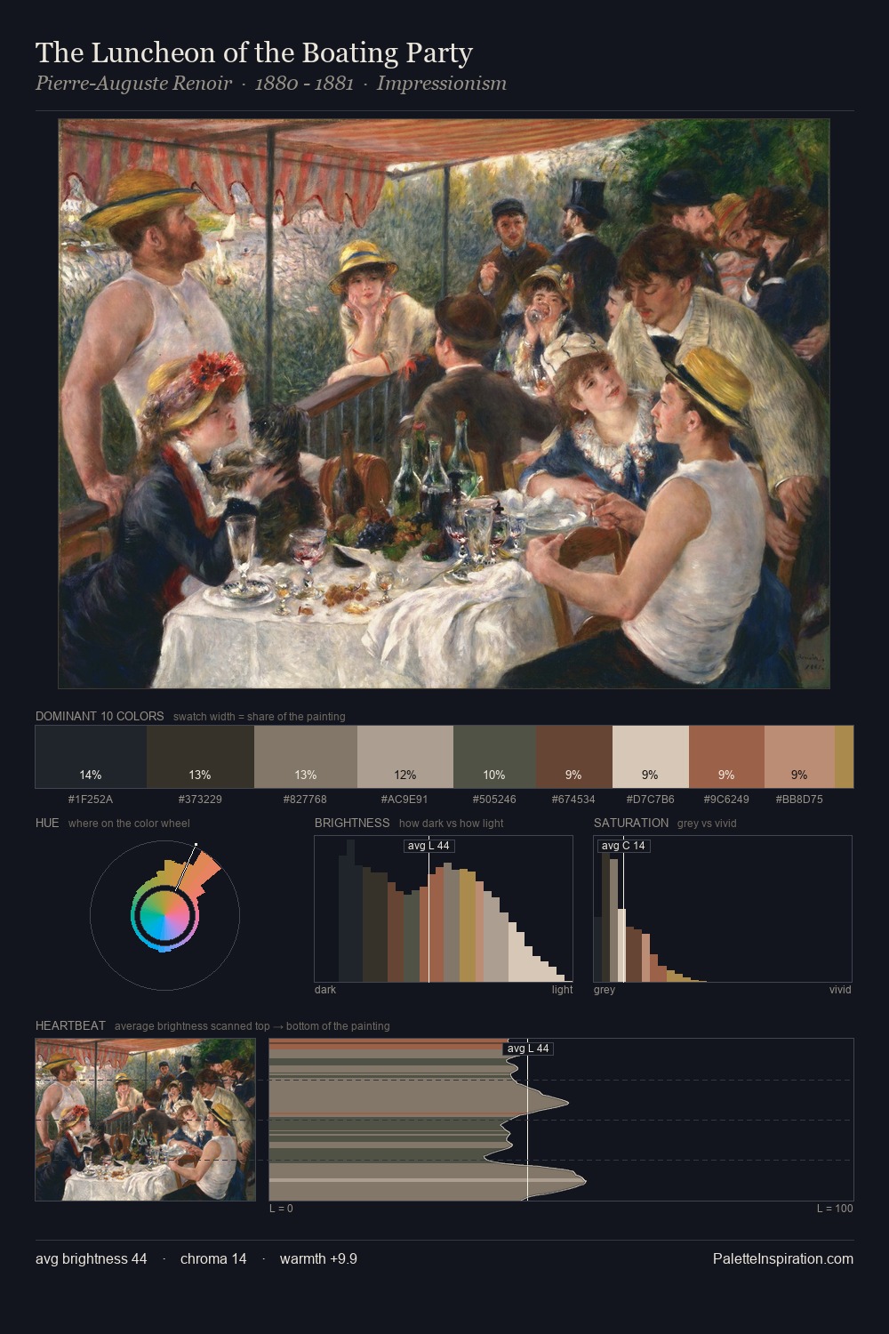
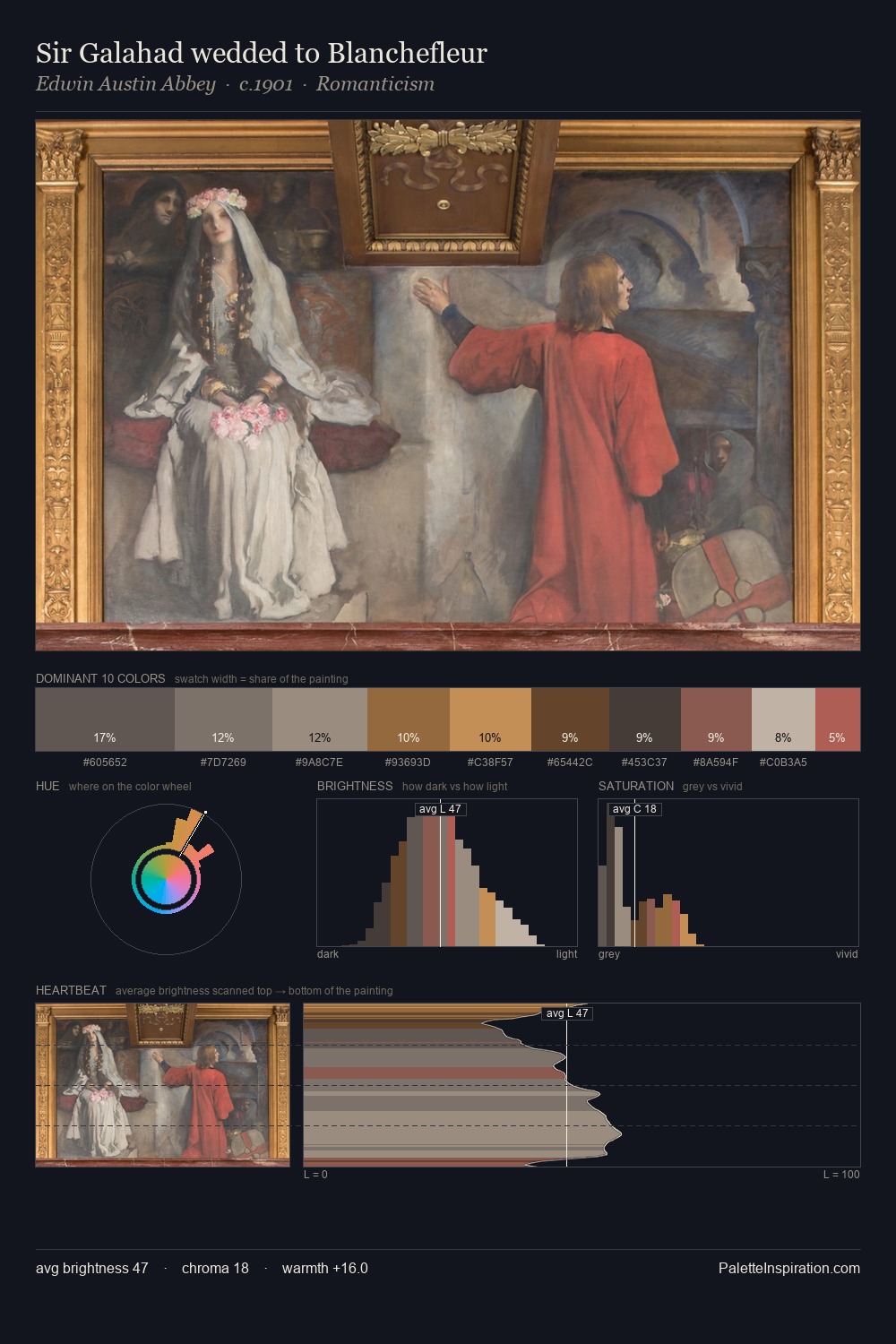
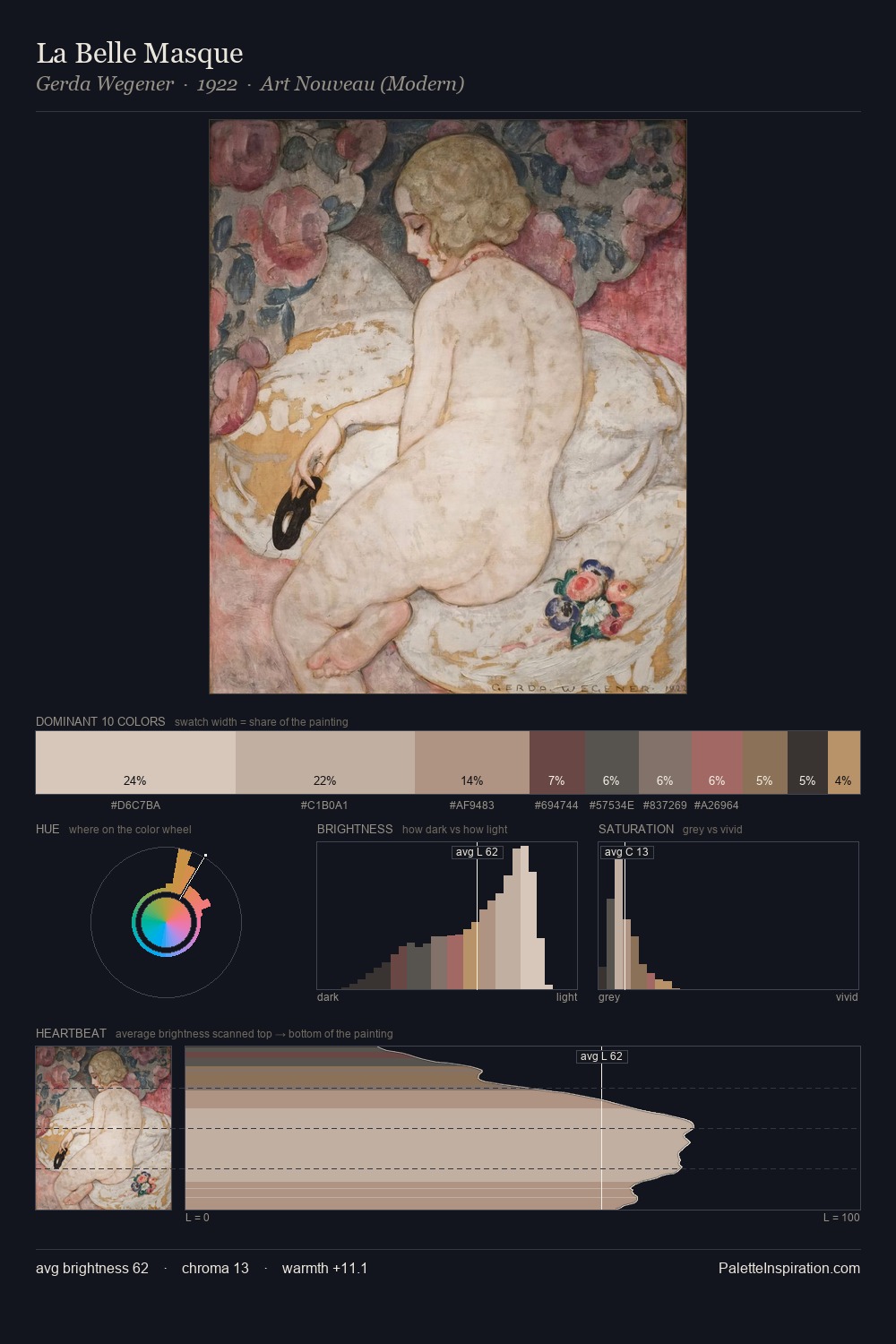
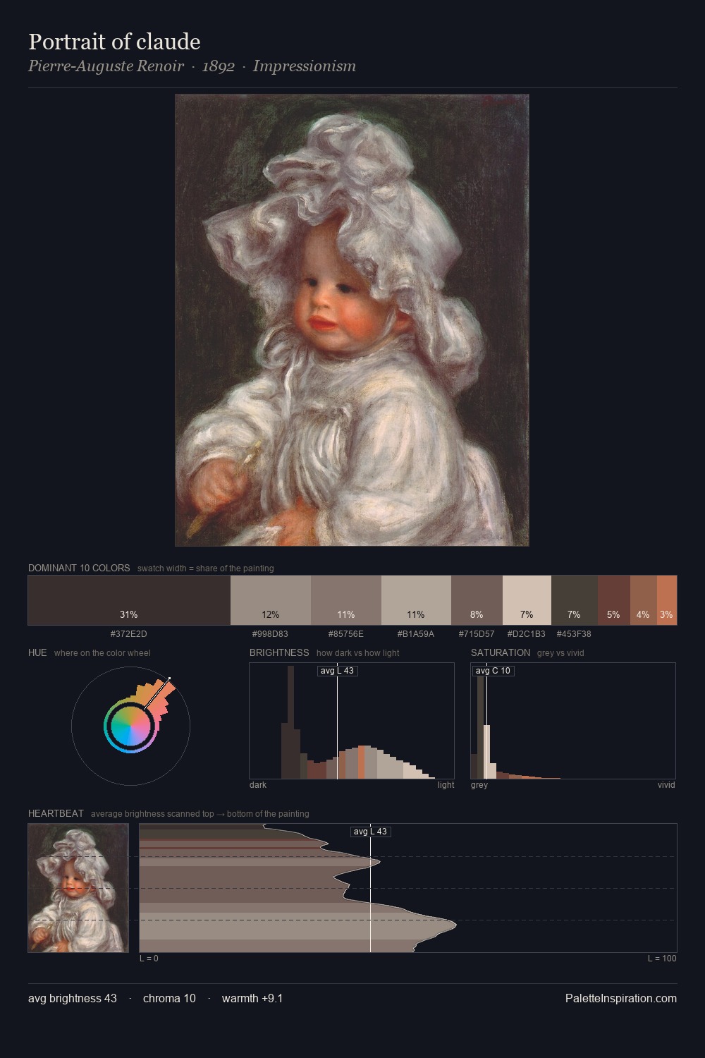
The high-key values of Vladimir Tatlin give it an effulgent, almost bleached quality. A distinctly cool atmosphere runs through this palette: sky, water, and mist given colour form. Saturation is deliberately withheld - the beauty here lies in the near-monochromatic gradations rather than colour difference. 41.6% of the palette belongs to #D5C5AC, a concentration that makes it the unmistakable visual centre. At 2.1%, #6F4741 carries the palette's sharpest chromatic charge: an accent that earns its place precisely because it is withheld. Value range is moderate at 47 units - enough contrast for legibility, not so much as to fragment the tonal unity. The palette has the character of outdoor light: cool, mid-bright, with colour rendered faithfully rather than expressively. Palette 2 sits within the larger chromatic argument that Vladimir Tatlin's complete body of work advances.
Example use cases
- ceramics & pottery
- boutique hospitality
- menswear
- heritage food brands
- craft & artisan brands
I Love This!
Copy, export, or download for your project