Vladimir Tatlin Palette 1

Palette Analysis
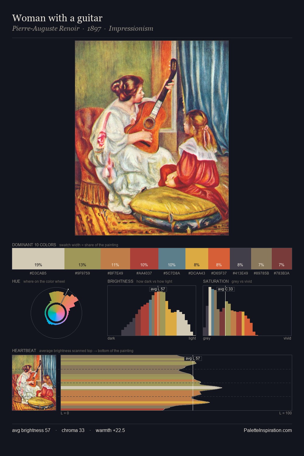
Values in Vladimir Tatlin rest in the mid-range - neither dramatically lit nor steeped in shadow. Vladimir Tatlin tilts toward cool - blues and silver-greys carry the structural weight. Chroma is held at a comfortable level - distinct colours, but no single hue is allowed to overwhelm. The most saturated colour, #DEDCBF, covers 3.4% of the surface: too much to call an accent, too strong to ignore. The full value range is 56 units: broad enough to build convincing three-dimensional form. The mid-to-high key, cool bias, and moderate chroma point to outdoor observation - sky and diffused daylight as the dominant light source. Vladimir Tatlin's palette 1 carries its own internal logic while remaining in conversation with the artist's broader colour intelligence.
Example use cases
- publishing
- corporate identity
- consumer apps
- hospitality
- design agencies
I Love This!
Copy, export, or download for your project