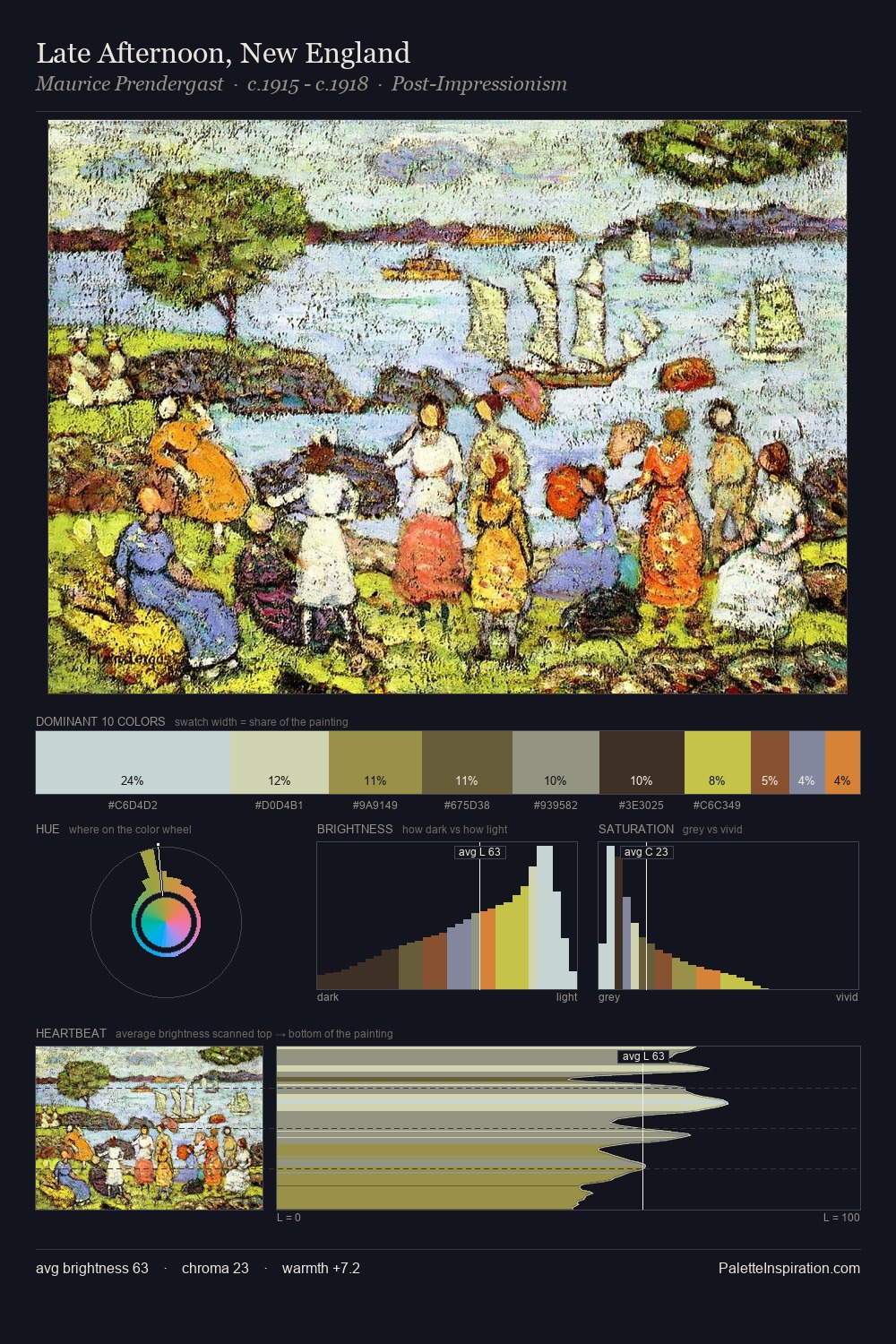
Vladimir Makovsky Palette 1

Palette Analysis
The high-key values of Vladimir Makovsky give it an effulgent, almost bleached quality. Cool hues prevail: blues, greens, and greys anchor the palette's emotional temperature. Chroma hovers near zero; colour declares itself through subtle shifts in hue rather than outright saturation. The dominant colour, #D7DCD9, takes 39.6% of the total area, establishing the overall mood before any other hue is introduced. The highest-chroma note - #818C3C - appears at just 5.6%, deployed as a precision accent against the quieter ground. A value spread of 67 units gives the palette both depth and air - shadows are genuinely dark, lights genuinely light. High luminosity and cool temperature suggest the plein-air condition: unfiltered daylight and open sky. This is palette 1 of Vladimir Makovsky's sequence - a single chapter in a chromatic story told across many works.
Example use cases
- exhibition design
- foundation branding
- estate management
- art education
- museums & galleries
I Love This!
Copy, export, or download for your project