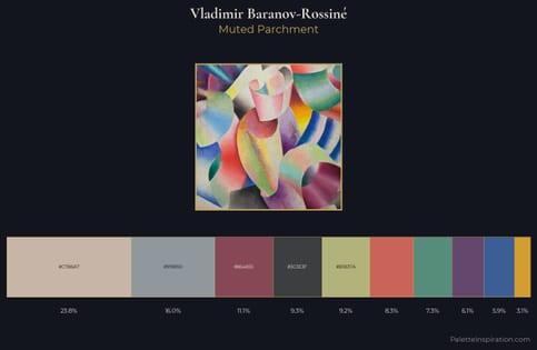
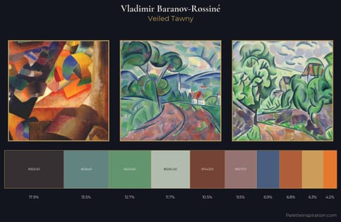
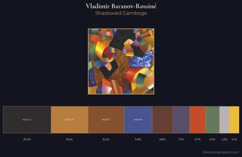
Vladimir Baranov-Rossiné Master Palette
Palette Analysis
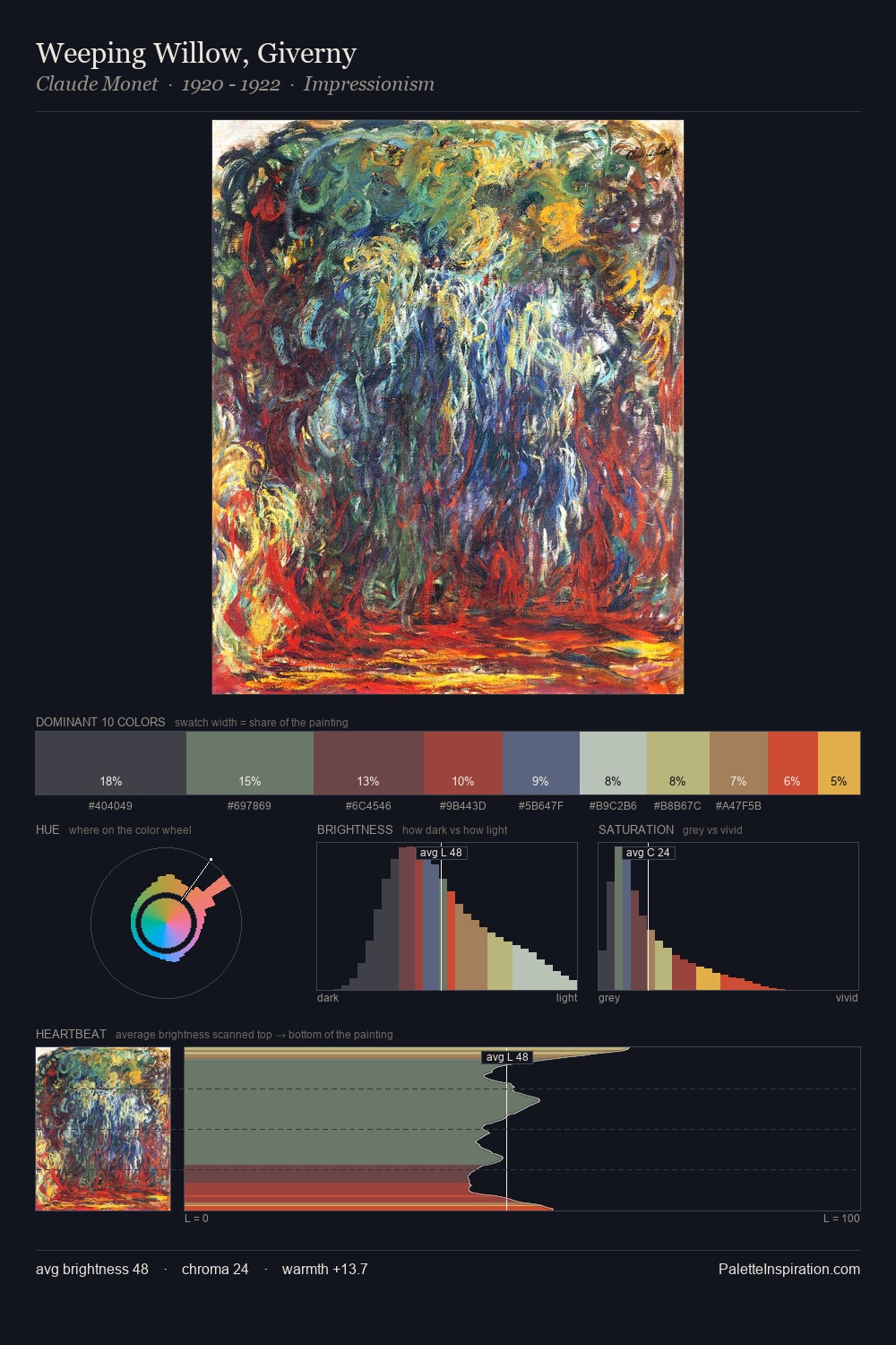
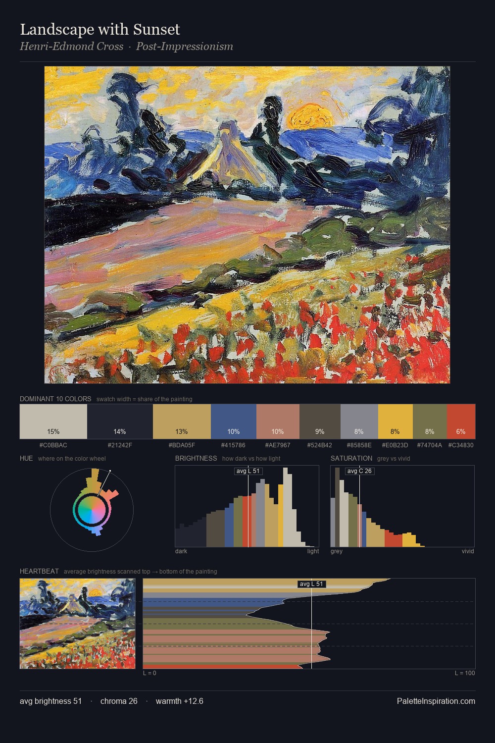
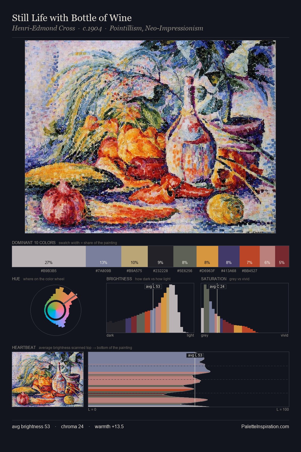
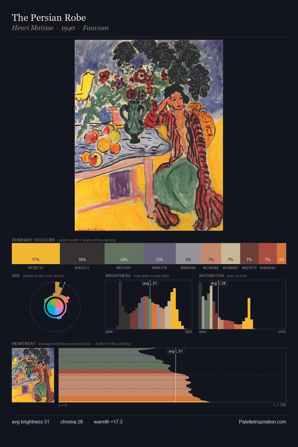
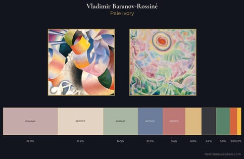
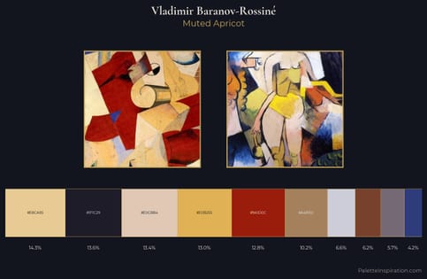
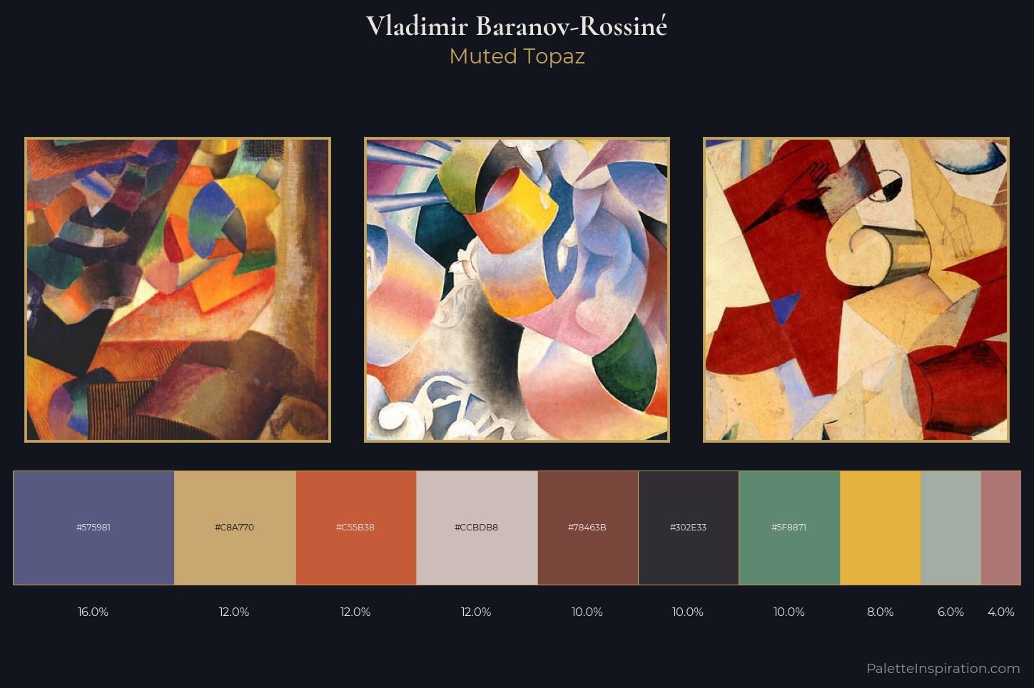
Vladimir Baranov-Rossiné sits in the centre of the value range, lending the palette a sense of even, sustained light. Cool tones set the register here - the blues and greens easily outweigh any warm accents. Chroma is moderate: colours carry enough saturation to be read as colour, but the palette stops well short of garish intensity. The saturated accent, #78463B, registers at 10.0% - sparse enough to feel like a deliberate surprise. At 50 units across the value scale, the palette keeps contrast readable without letting it dominate. The mid-to-high key, cool bias, and moderate chroma point to outdoor observation - sky and diffused daylight as the dominant light source. Vladimir Baranov-Rossiné arrived at this balance through long practice; the palette carries the weight of that experience.
Example use cases
- publishing
- corporate identity
- consumer apps
- hospitality
- design agencies
I Love This!
Copy, export, or download for your project