Vladimir Baranov-Rossiné Palette 2
Palette Analysis
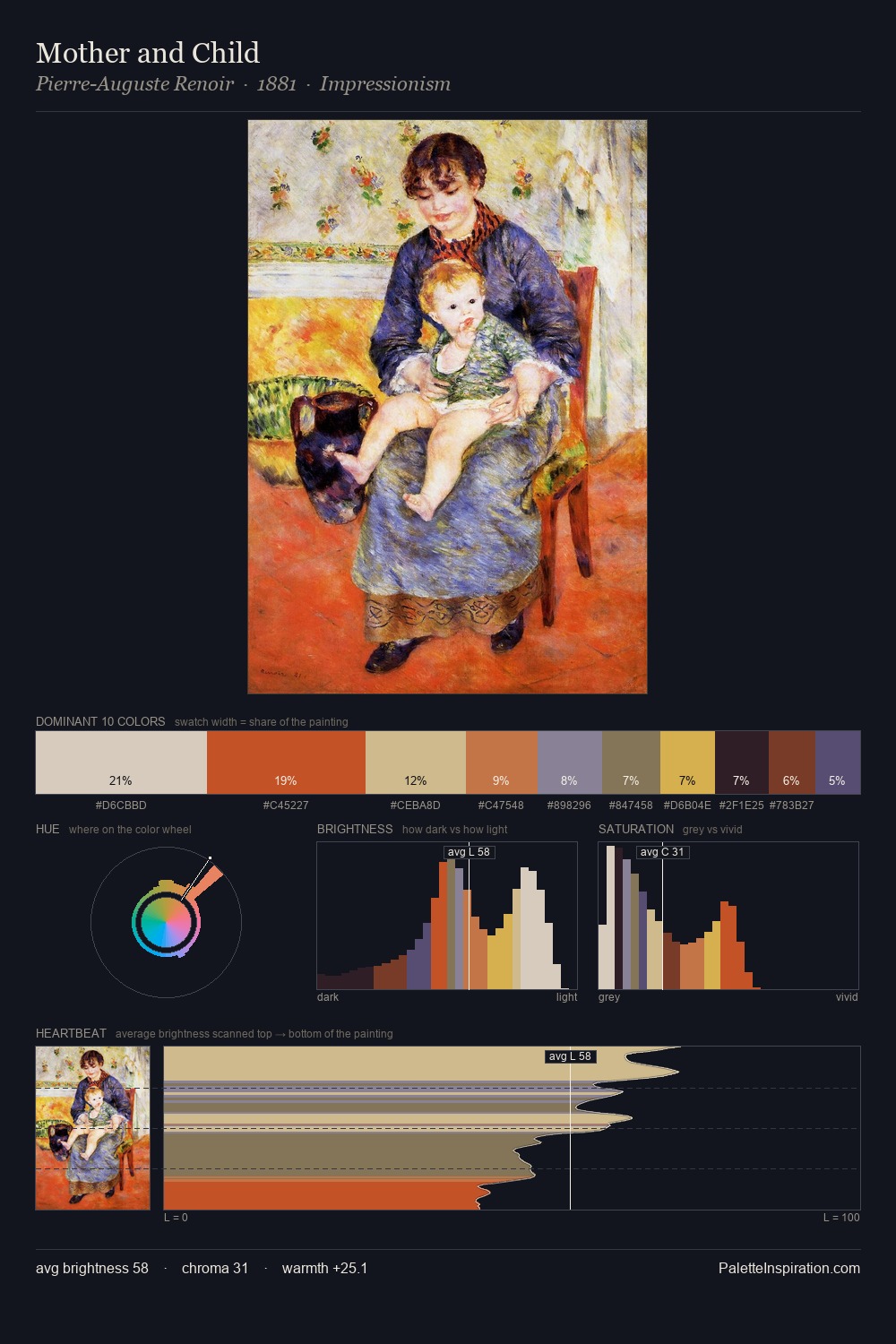
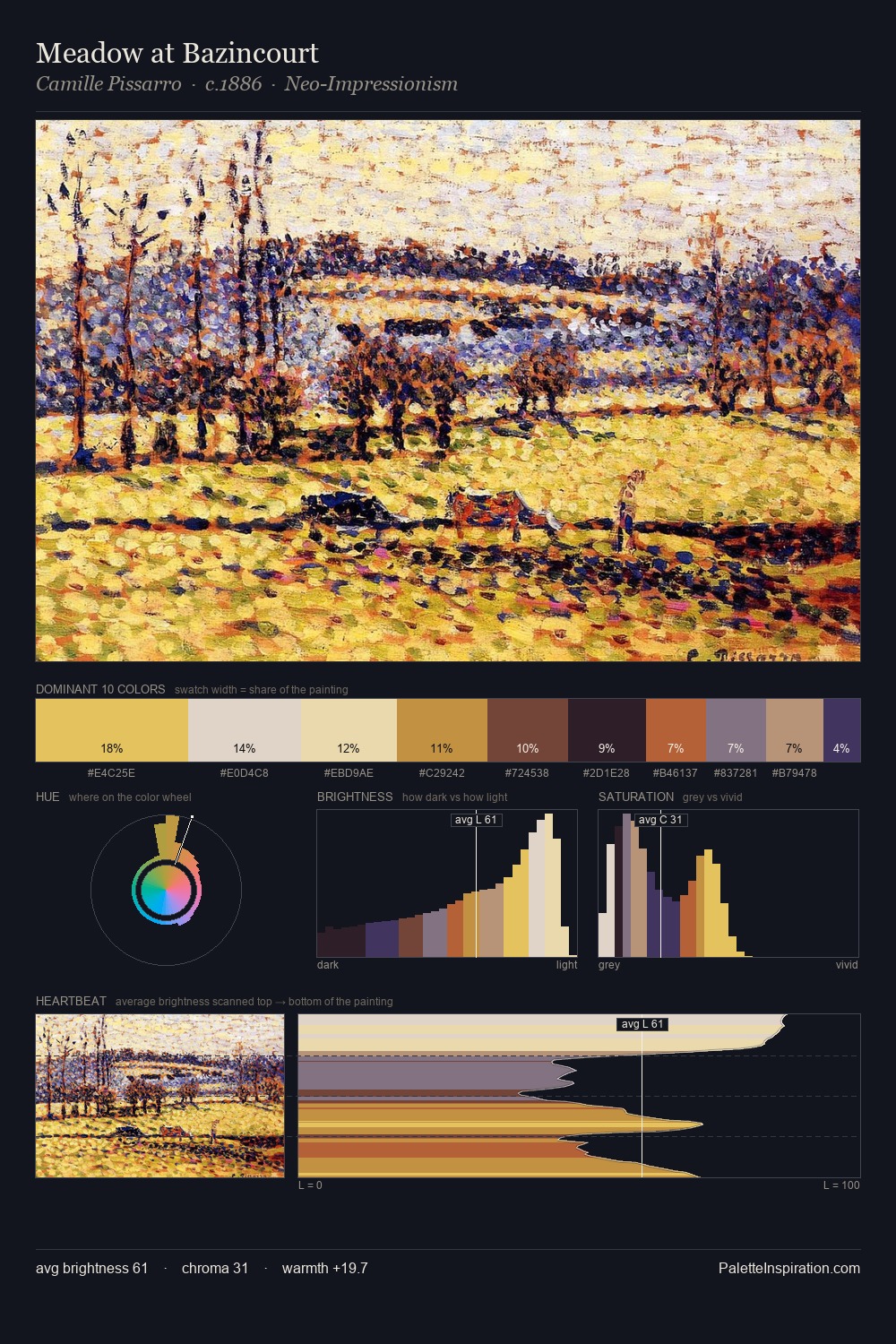
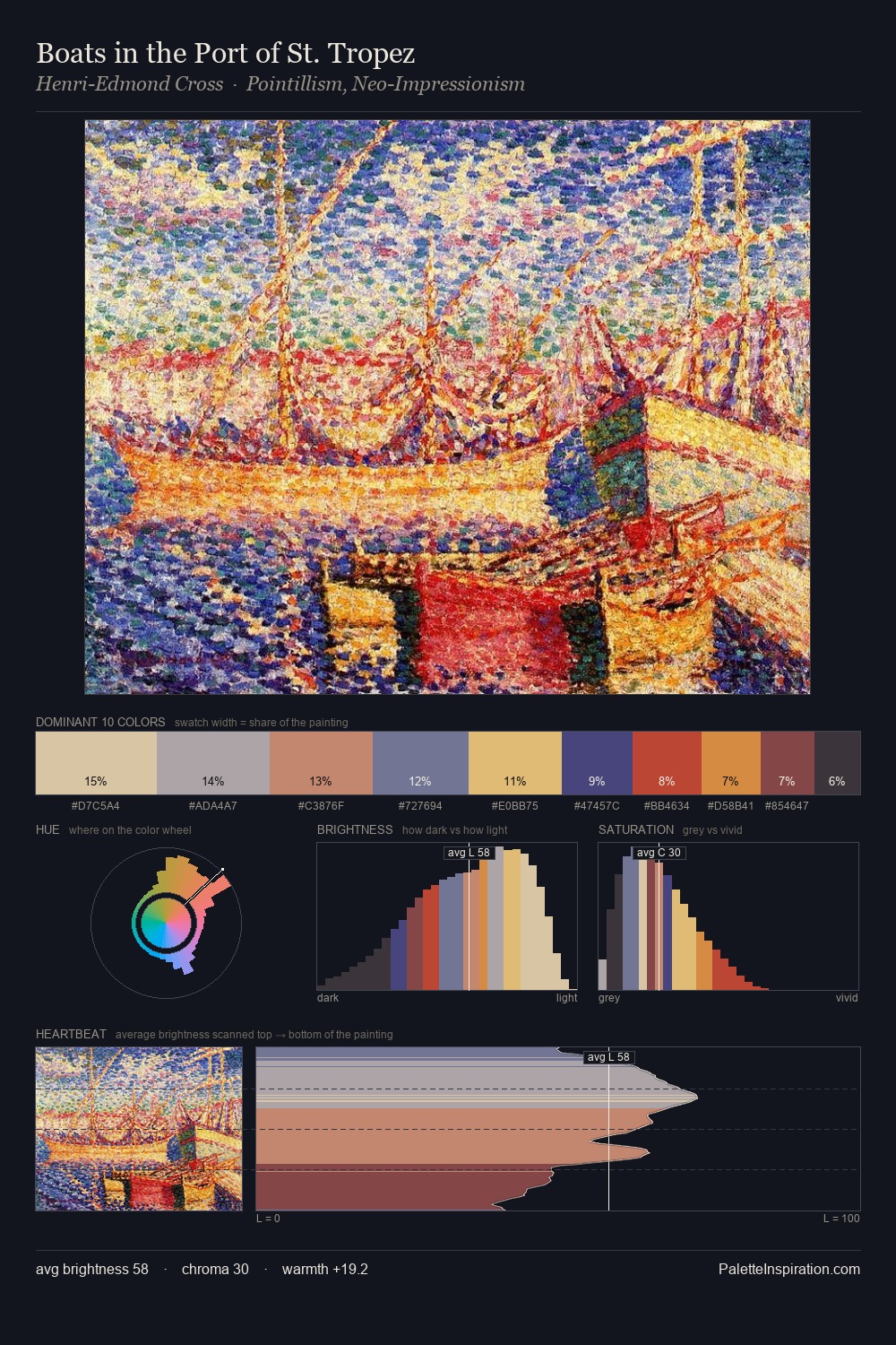
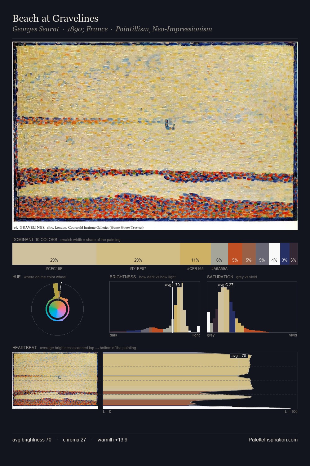
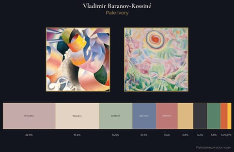
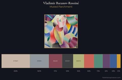
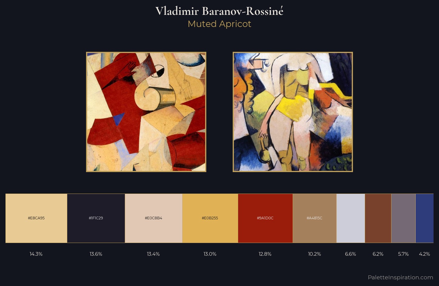
Vladimir Baranov-Rossiné keeps values measured and balanced, a hallmark of tonal restraint. The palette achieves thermal balance - reds and blues, ochres and greens, each holding the other in check. Chroma is held at a comfortable level - distinct colours, but no single hue is allowed to overwhelm. #E0B255 functions as the palette's exclamation mark: highest chroma, lowest percentage (13.0%). At 61 units of value range, the palette has the tonal breadth to sustain complex spatial readings. The palette reads as an Impressionist one - light-biased, chromatically direct, and built on temperature contrast rather than value opposition. In the context of Vladimir Baranov-Rossiné's full range of palettes, group 2 represents one movement in an ongoing chromatic dialogue.
Example use cases
- publishing
- corporate identity
- consumer apps
- hospitality
- design agencies
I Love This!
Copy, export, or download for your project