Vieira Portuense Palette 4

Palette Analysis
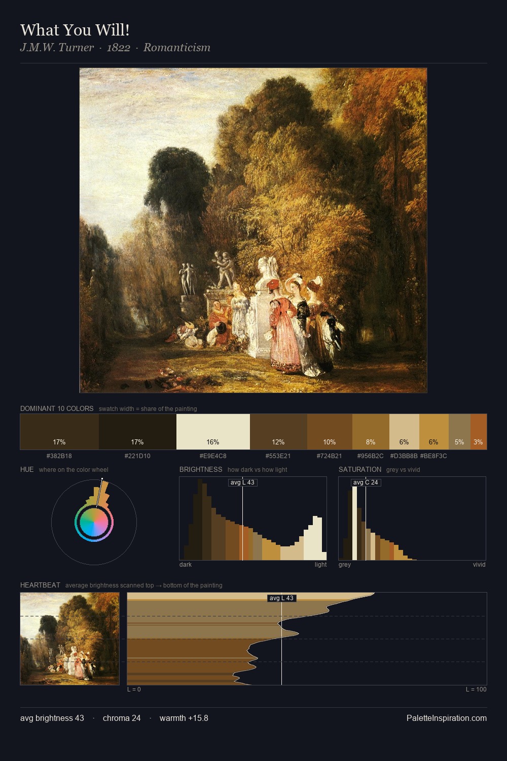
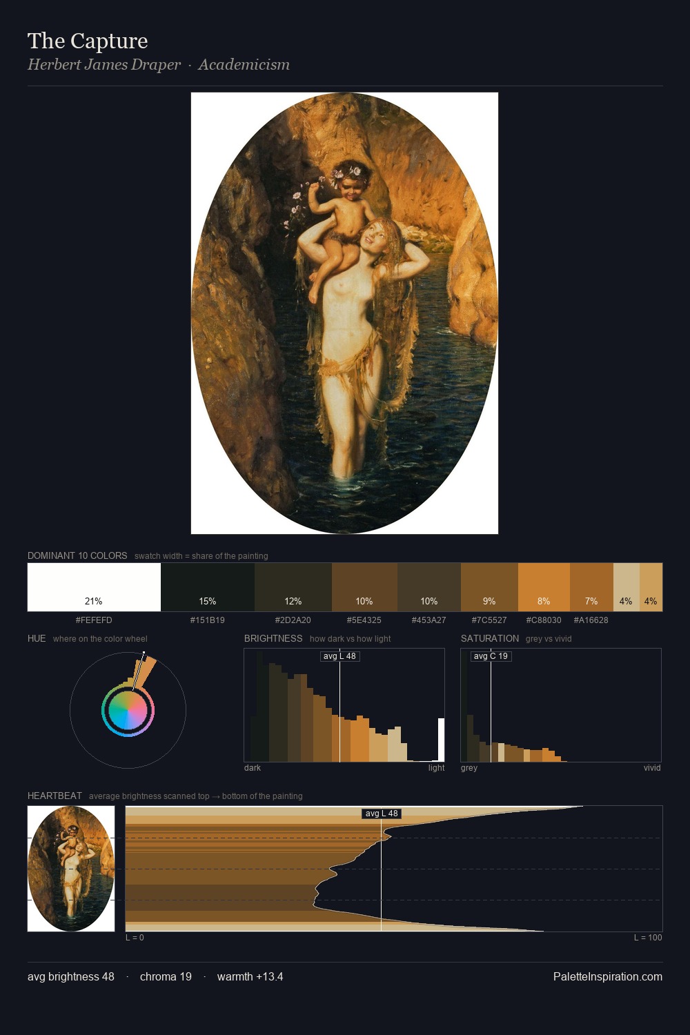
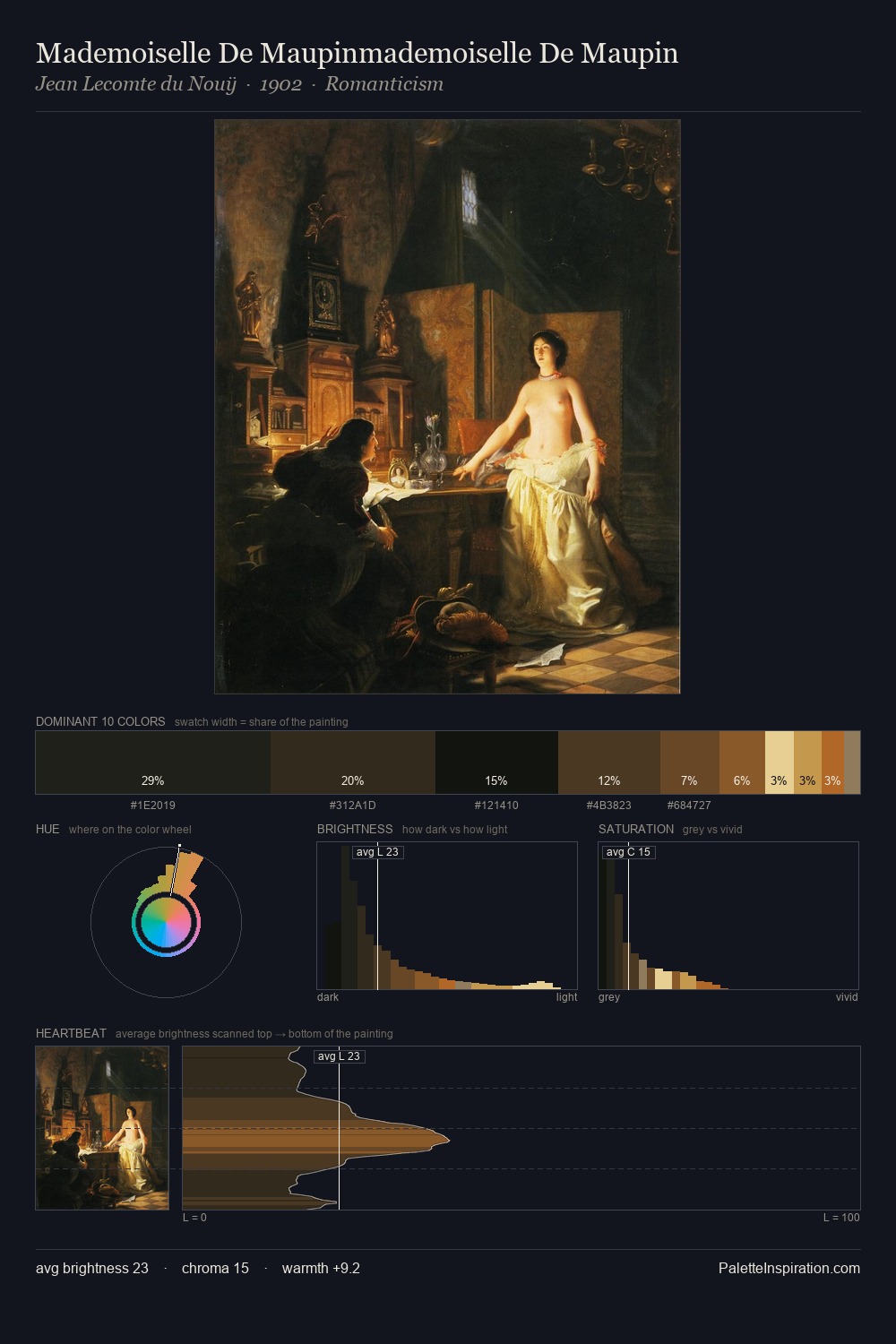
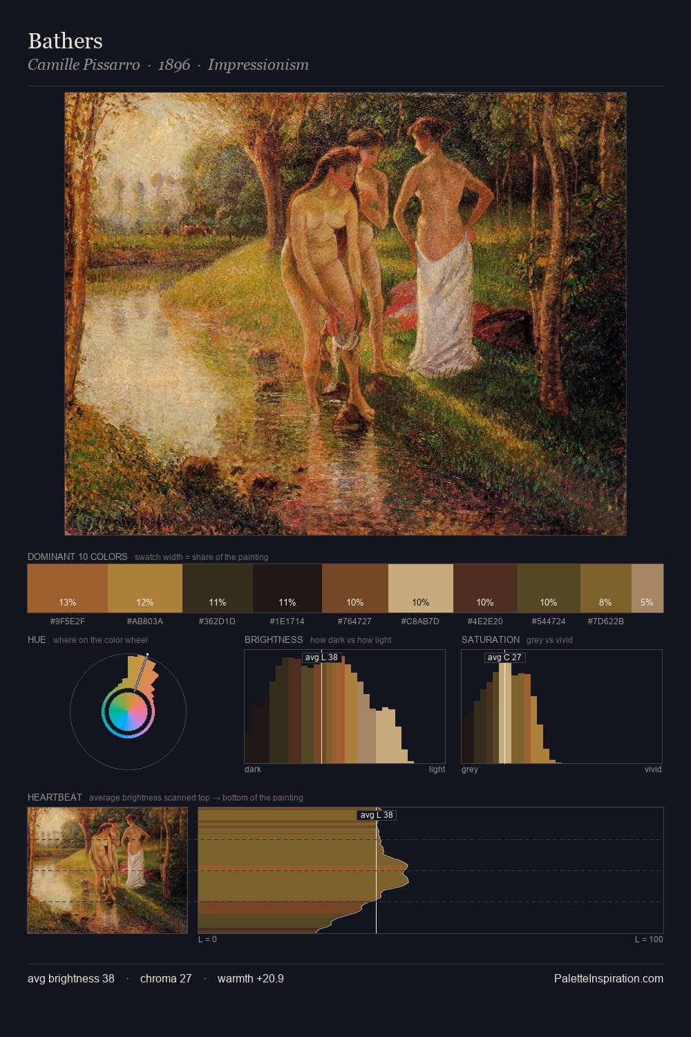
The palette of Vieira Portuense sits in the lower register of the value scale - dense, contained, and weighted. Cool hues prevail: blues, greens, and greys anchor the palette's emotional temperature. All colours lean toward grey, building depth through value rather than colour punch. #171410 claims 25.1% of the surface, functioning as the work's tonal foundation. The most saturated colour, #C09443, is reserved to 3.0% of the surface, where it acts as a focal punctuation. At 59 units of value range, the palette has the tonal breadth to sustain complex spatial readings. This tonal restraint is characteristic of the Vieira Portuense approach: colour serves light, not the reverse. Vieira Portuense's palette 4 carries its own internal logic while remaining in conversation with the artist's broader colour intelligence.
Example use cases
- theater design
- jewelry brands
- tobacco-adjacent retail
- event branding
- film & entertainment
I Love This!
Copy, export, or download for your project