Vieira Portuense Palette 2
Shadowed Sienna
Shadowed Low-key - values weighted toward shadow, the palette of dim interiors and overcast skies.
Sienna Warm red-brown earth - named after the Sienese pigment, a fundamental artist earth color.
Palette Analysis
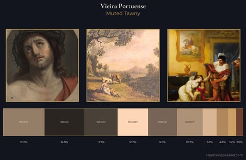
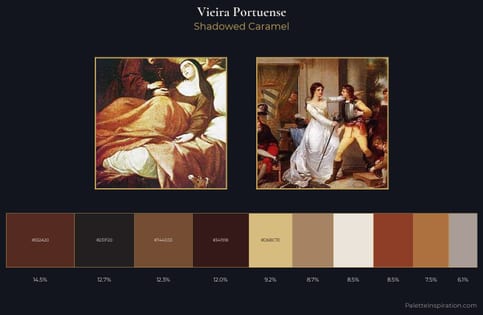
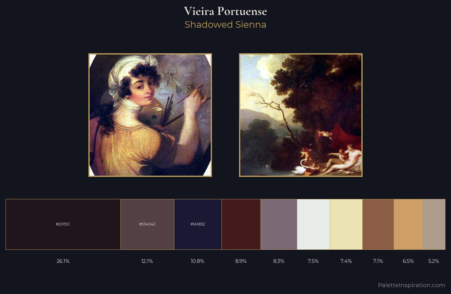
Vieira Portuense keeps values measured and balanced, a hallmark of tonal restraint. The dominant temperature is warm, with earth tones and fire-hues setting the emotional key. Muted throughout, the palette achieves its effects through value and temperature rather than chromatic force. #20151C claims 26.1% of the surface, functioning as the work's tonal foundation. #CD9F66 functions as the palette's exclamation mark: highest chroma, lowest percentage (6.5%). A value spread of 73 units gives the palette both depth and air - shadows are genuinely dark, lights genuinely light. This is palette 2 of Vieira Portuense's sequence - a single chapter in a chromatic story told across many works.
Example use cases
- music labels
- luxury hospitality
- editorial photography
- leather goods
- premium streaming
I Love This!
Use This Palette
Copy, export, or download for your project
Copy, export, or download for your project
Copy:
Download:
Share: