Veduta Master Palette

Palette Analysis
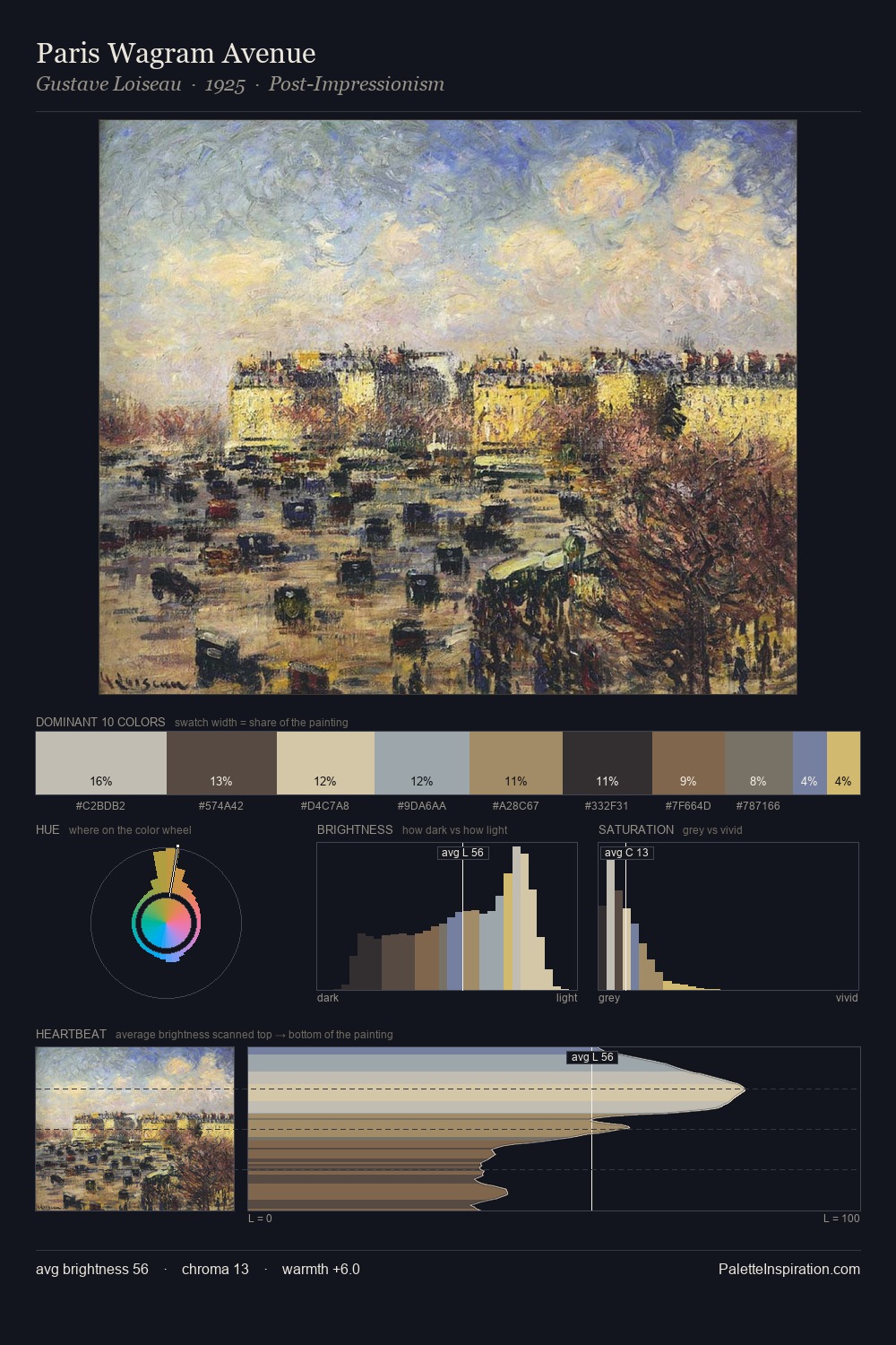
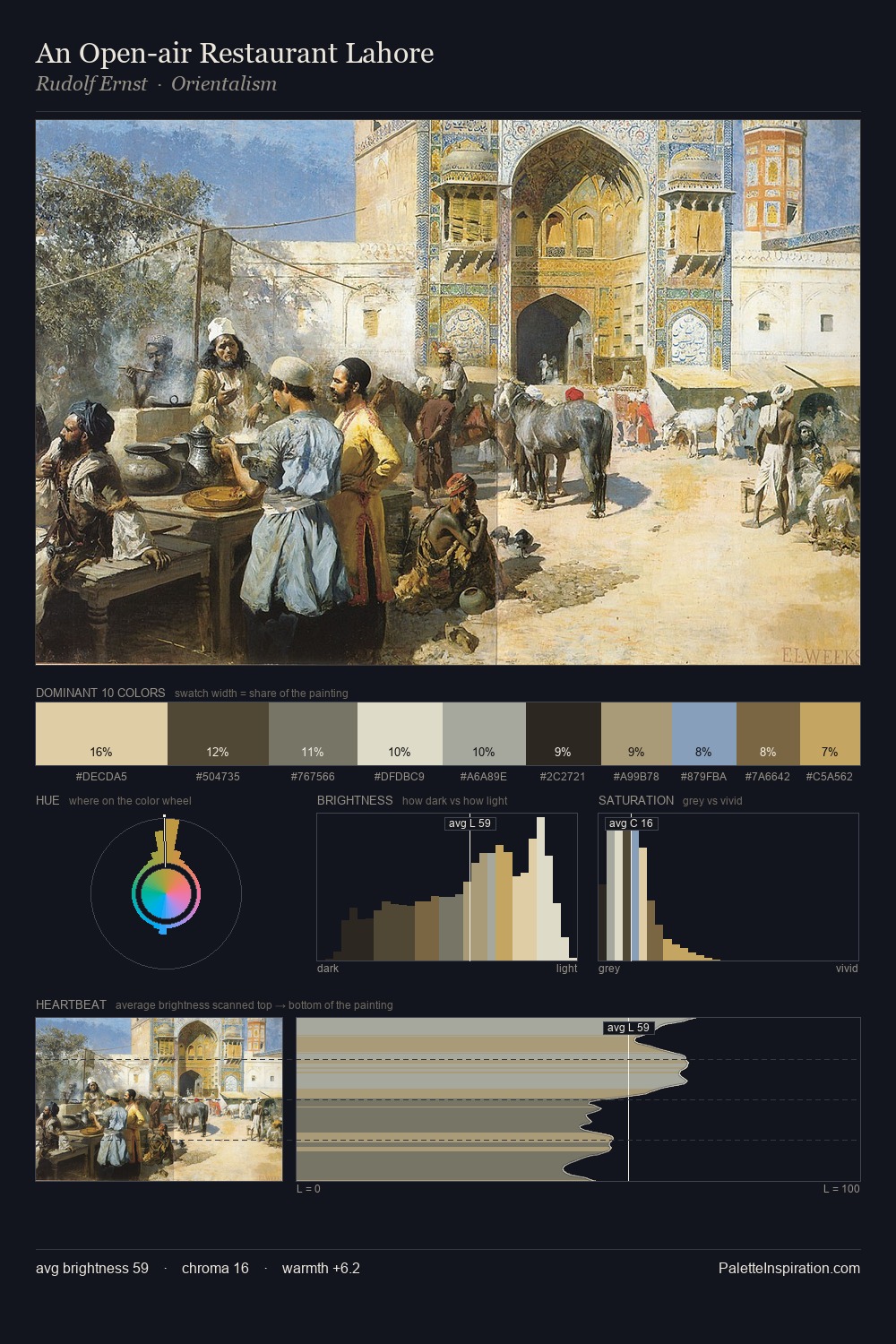
What unites the veduta movement is as much chromatic as stylistic; this palette traces that unspoken agreement. The value structure of veduta is mid-key: quiet, controlled, and cohesive. A distinctly cool atmosphere runs through this palette: sky, water, and mist given colour form. All colours lean toward grey, building depth through value rather than colour punch. The most saturated colour, #BC9E70, is reserved to 7.5% of the surface, where it acts as a focal punctuation. A value spread of 63 units gives the palette both depth and air - shadows are genuinely dark, lights genuinely light. The palette has the character of outdoor light: cool, mid-bright, with colour rendered faithfully rather than expressively. This is the light that veduta painters chose to live inside.
Example use cases
- exhibition design
- foundation branding
- estate management
- art education
- museums & galleries
I Love This!
Copy, export, or download for your project