Vasile Popescu Palette 5
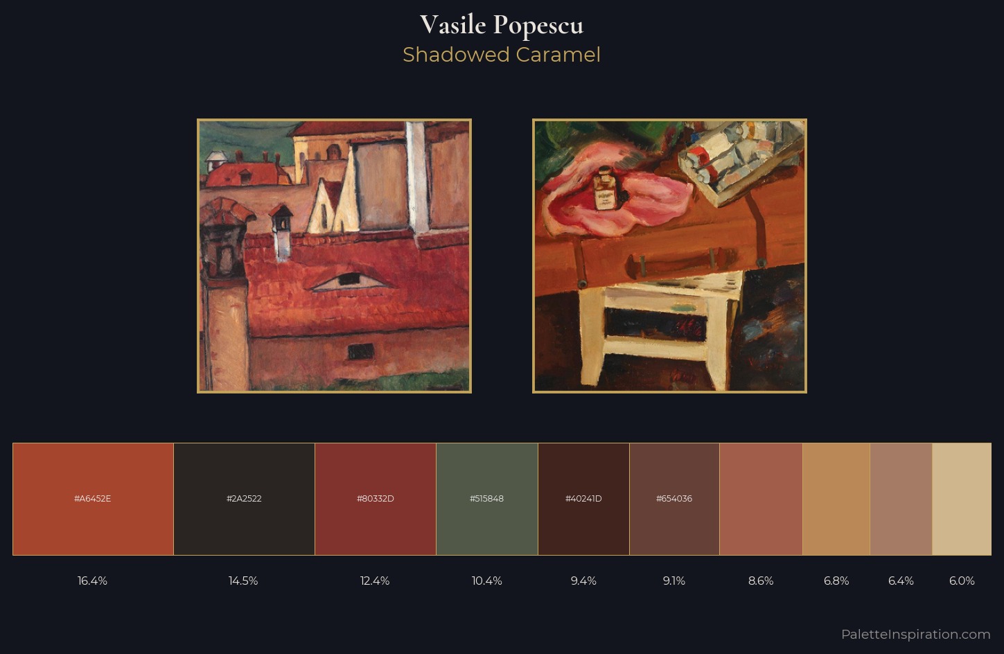
Shadowed Caramel
Shadowed Low-key - values weighted toward shadow, the palette of dim interiors and overcast skies.
Caramel Warm mid-brown - the color of cooked sugar, smooth and amber-toned.
Palette Analysis
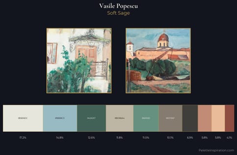
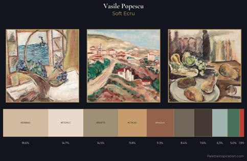
Values in Vasile Popescu rest in the mid-range - neither dramatically lit nor steeped in shadow. Heat pervades this palette; warm chromatic identities outweigh cool ones at almost every weight. Colours are neither washed out nor blazing; they occupy the productive middle ground of the chroma scale. The most saturated colour, #D0B68C, covers 6.0% of the surface: too much to call an accent, too strong to ignore. 52 units of value spread create a palette that is varied but unified - contrast in the service of harmony. Palette 5 sits within the larger chromatic argument that Vasile Popescu's complete body of work advances.
Example use cases
- premium streaming
- cocktail bars
- fashion campaigns
- book covers
- music labels
I Love This!
Use This Palette
Copy, export, or download for your project
Copy, export, or download for your project
Copy:
Download:
Share: