Vasile Popescu Palette 2
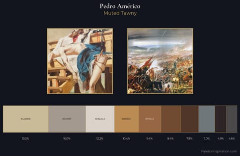
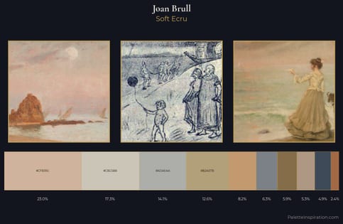
Soft Ecru
Soft Low-contrast, gentle chroma - mid-key values and low saturation, approachable and calm.
Ecru Unbleached linen - warm mid-neutral, slightly grayed, raw and natural.
Palette Analysis
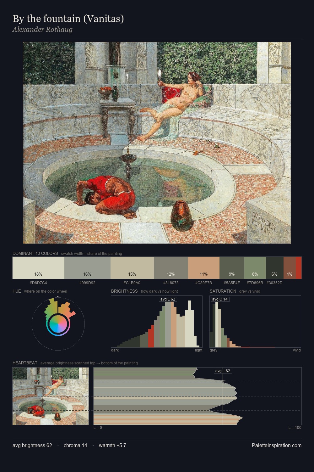
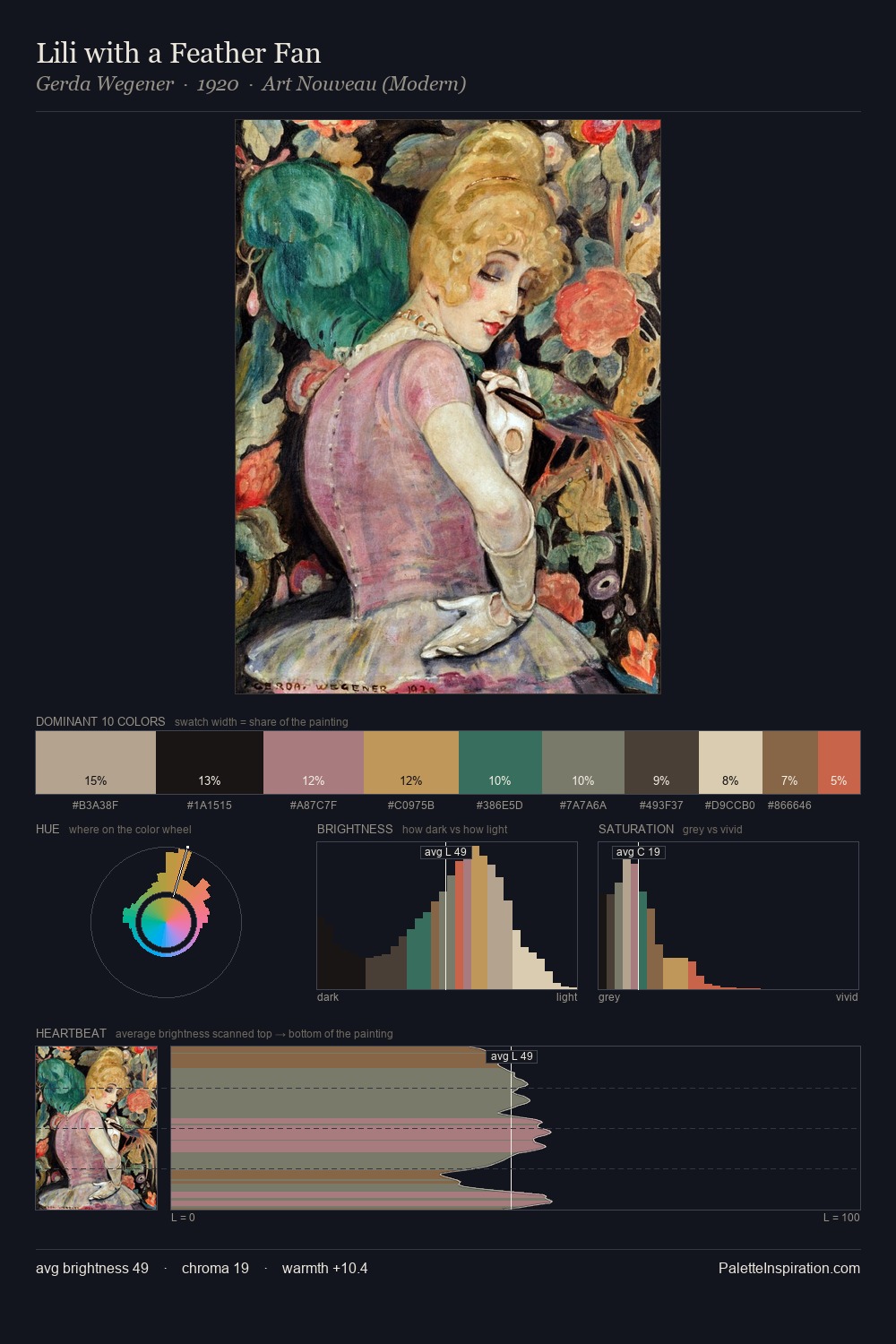
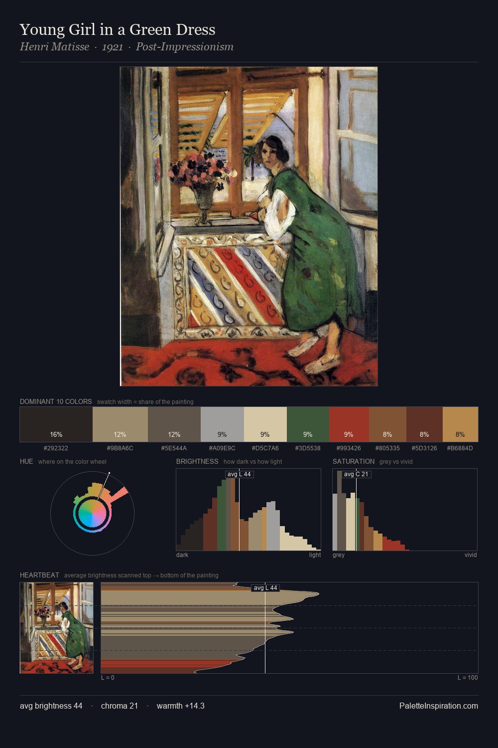
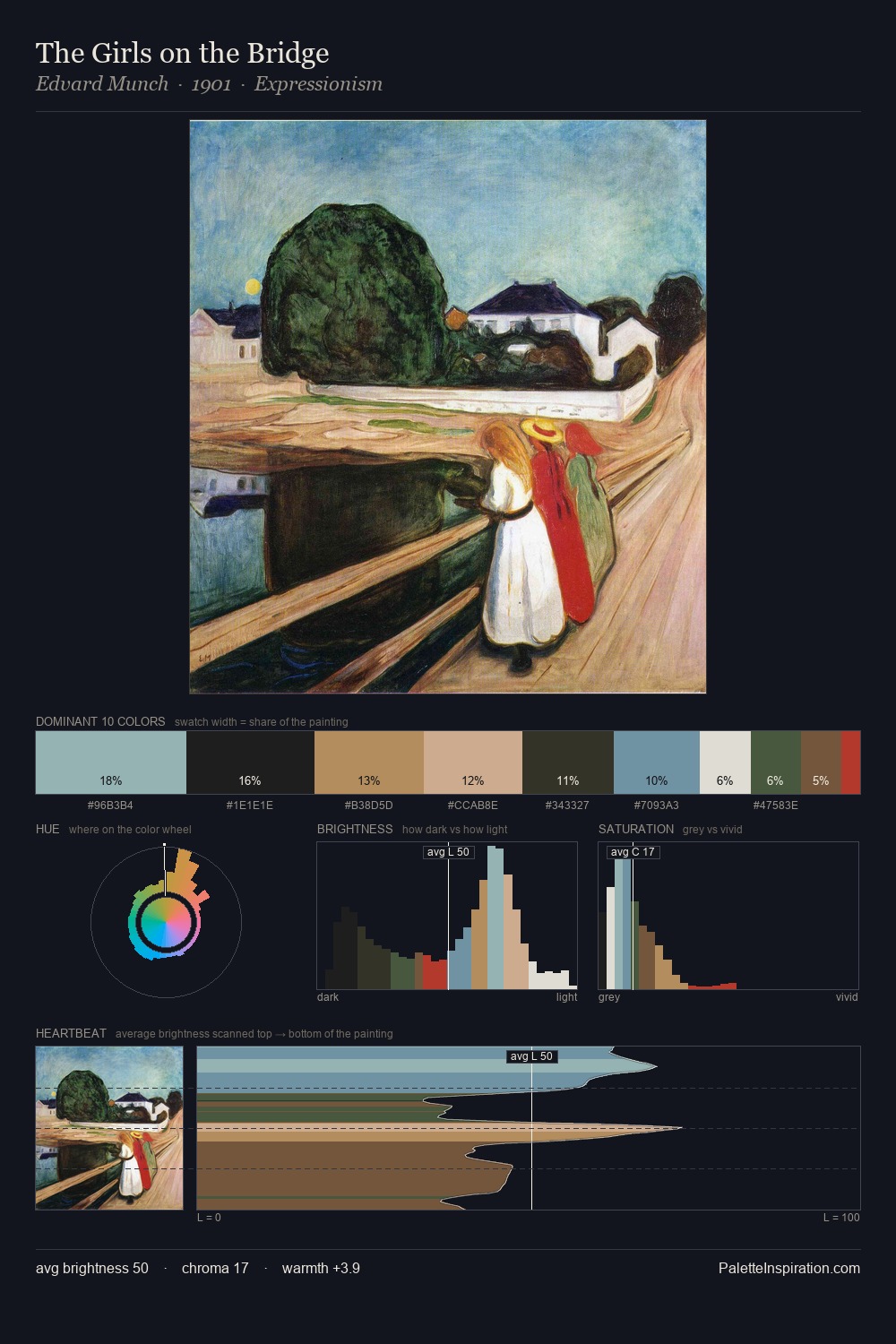
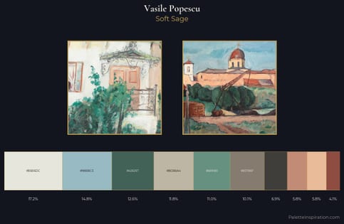
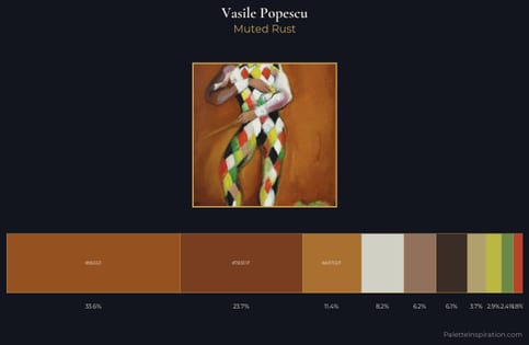
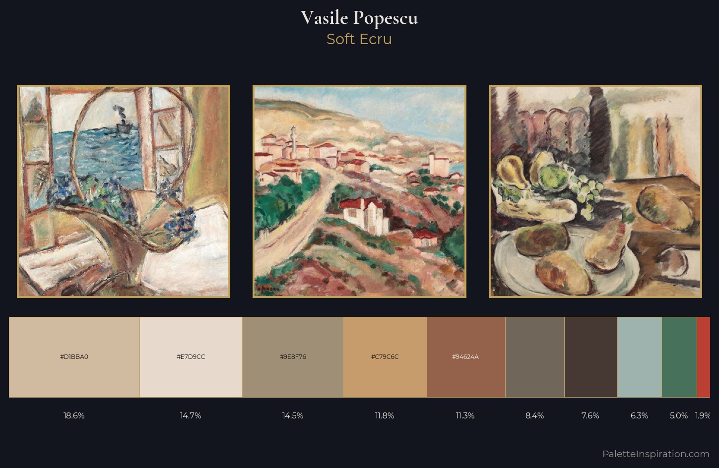
Vasile Popescu is high in key: pale, luminous, and filled with optical air. Vasile Popescu orchestrates warmth above all else - reds, ambers, and siennas take the lead. The absence of saturated colour is itself an expressive choice: this is a palette of restraint and atmosphere. The highest-chroma note - #94624A - appears at just 11.2%, deployed as a precision accent against the quieter ground. The palette spans 54 value units: a measured range that delivers coherence over drama. This is palette 2 of Vasile Popescu's sequence - a single chapter in a chromatic story told across many works.
Example use cases
- craft & artisan brands
- specialty coffee
- home goods
- lifestyle retail
- ceramics & pottery
I Love This!
Use This Palette
Copy, export, or download for your project
Copy, export, or download for your project
Copy:
Download:
Share: