Vanitas Palette 1
Gleaming Champagne
Gleaming Bright and polished - high-key, often warm, suggesting reflective or luminous surfaces.
Champagne Pale gold - the color of sparkling wine, high-key and lightly warm.

Palette Analysis
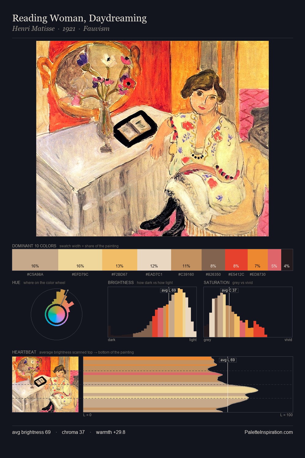
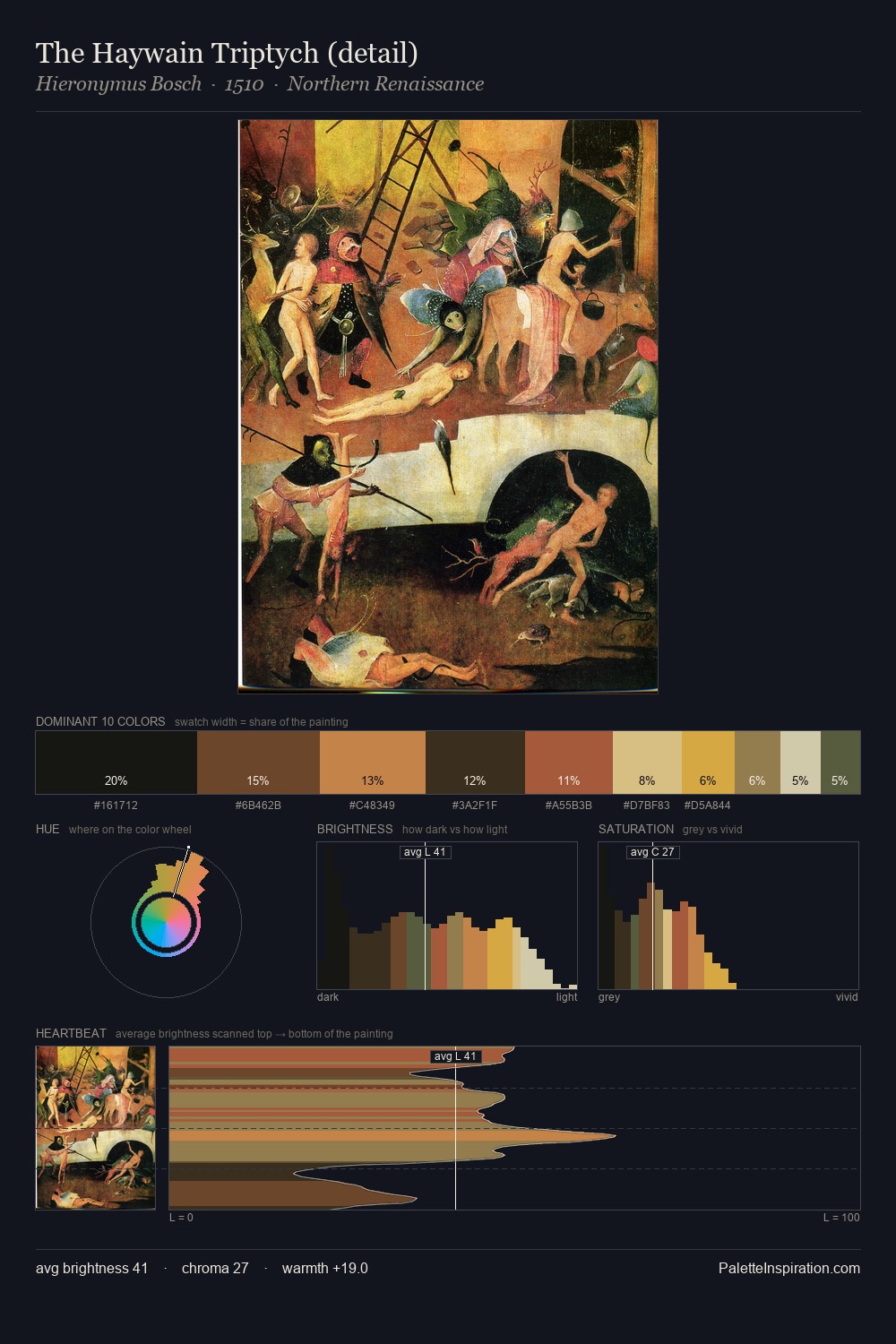
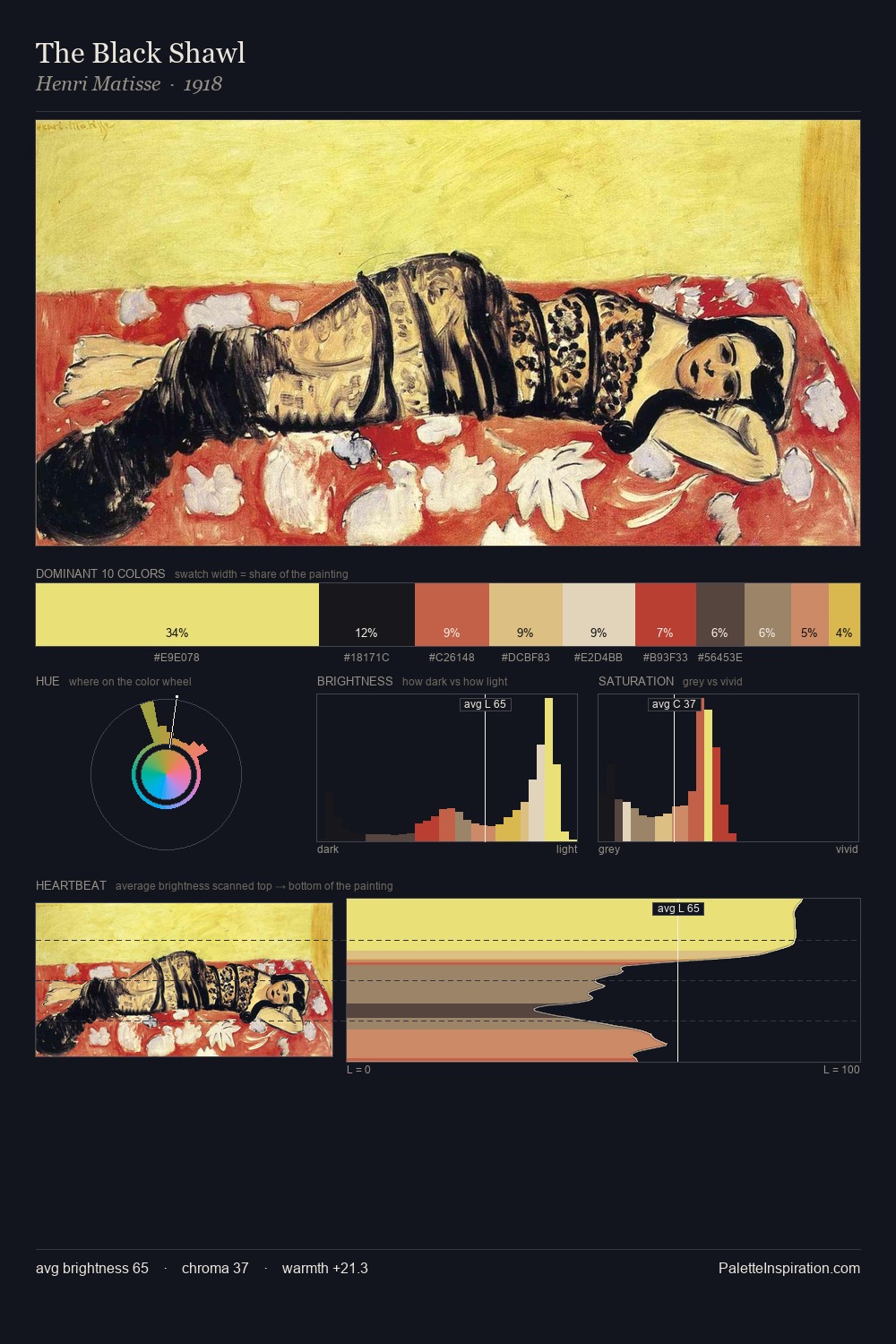
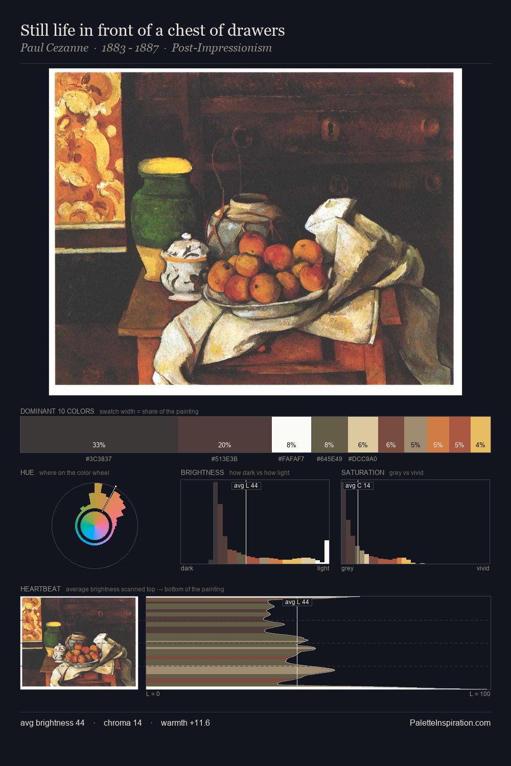
Values in vanitas tilt decisively toward white, giving the palette its luminous character. Built on cool foundations: the palette favours the blue-cyan-green arc. Chroma is held at a comfortable level - distinct colours, but no single hue is allowed to overwhelm. #F0D38F delivers the chromatic peak at only 9.0% - a small shot of colour with outsized visual impact. The value range spans 73 units across the palette, providing the full gamut from deep shadow to near-white and ensuring clear tonal hierarchy. The palette has the character of outdoor light: cool, mid-bright, with colour rendered faithfully rather than expressively.
Example use cases
- publishing
- corporate identity
- consumer apps
- hospitality
- design agencies
I Love This!
Use This Palette
Copy, export, or download for your project
Copy, export, or download for your project
Copy:
Download:
Share: