Vanessa Bell Palette 6

Palette Analysis
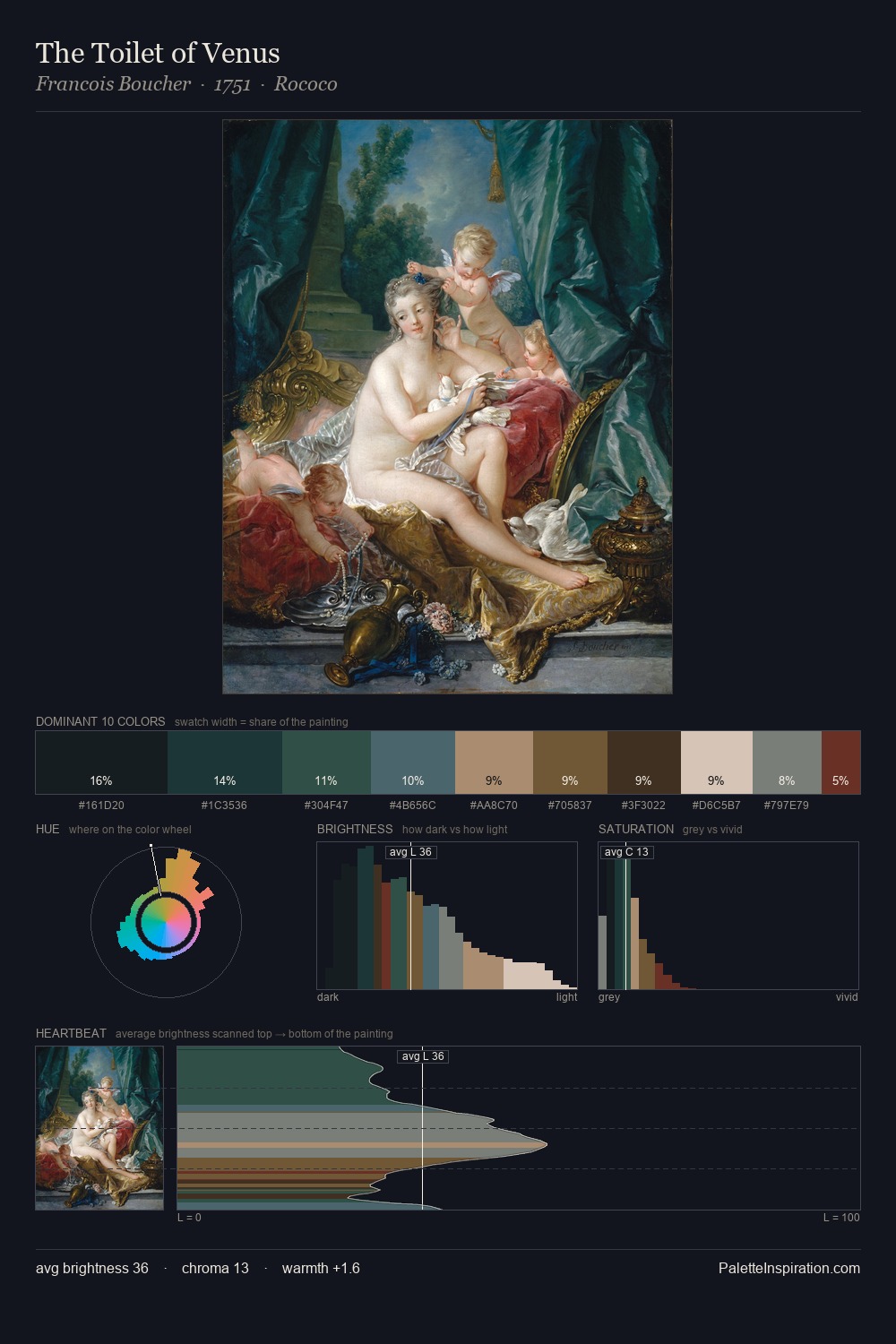
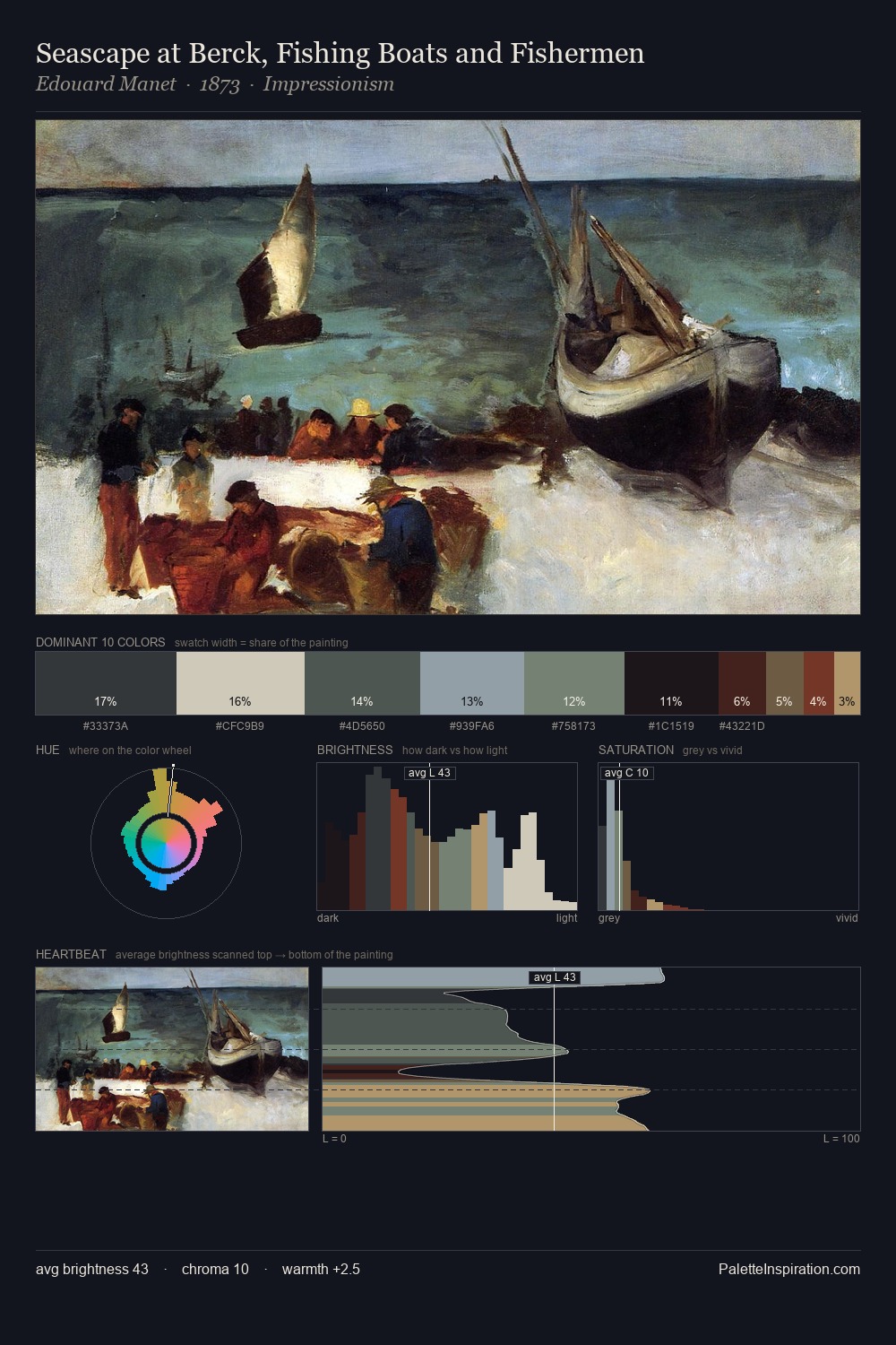
Vanessa Bell distributes its values across the middle register, creating harmony without high contrast. Cool tones set the register here - the blues and greens easily outweigh any warm accents. The absence of saturated colour is itself an expressive choice: this is a palette of restraint and atmosphere. #1E2729 claims 25.0% of the surface, functioning as the work's tonal foundation. Only 10.4% is devoted to #5C4F2E, yet that small allocation delivers the palette's entire chromatic tension. 42 units of value spread create a palette that is varied but unified - contrast in the service of harmony. The mid-to-high key, cool bias, and moderate chroma point to outdoor observation - sky and diffused daylight as the dominant light source. Palette 6 sits within the larger chromatic argument that Vanessa Bell's complete body of work advances.
Example use cases
- theater design
- jewelry brands
- tobacco-adjacent retail
- event branding
- film & entertainment
I Love This!
Copy, export, or download for your project