Edward Hastings Master Palette

Palette Analysis
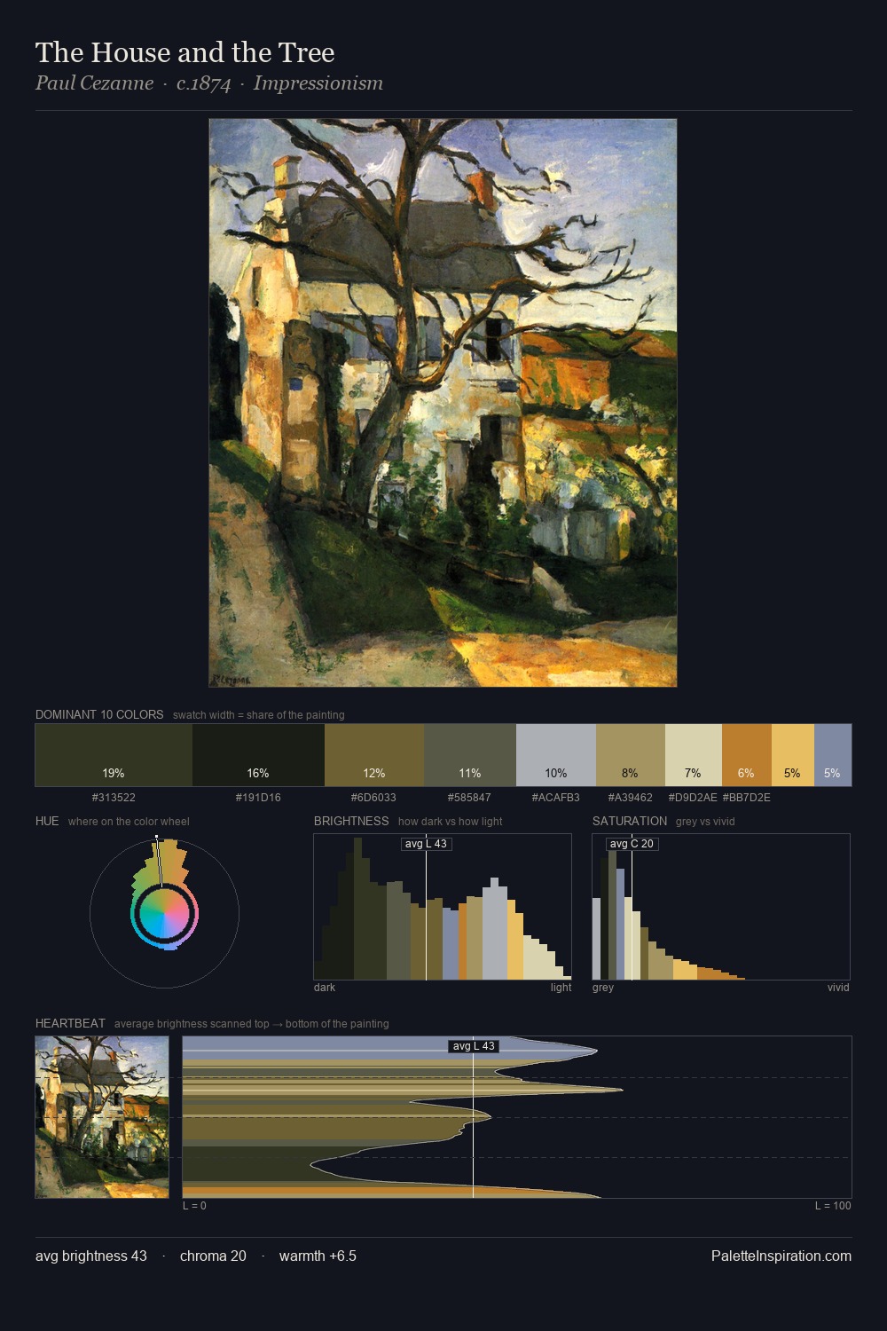
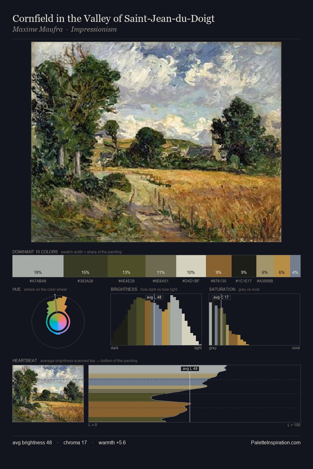
Edward Hastings occupies the comfortable middle of the value scale, avoiding both extremes to hold the eye in a sustained middle grey. Edward Hastings tilts toward cool - blues and silver-greys carry the structural weight. Saturation is deliberately withheld - the beauty here lies in the near-monochromatic gradations rather than colour difference. Only 11.5% is devoted to #372F20, yet that small allocation delivers the palette's entire chromatic tension. From deepest dark to palest light, the palette traverses 59 units of the value scale - a span that creates natural depth. The palette has the character of outdoor light: cool, mid-bright, with colour rendered faithfully rather than expressively. This is the light Edward Hastings preferred, made measurable.
Example use cases
- theater design
- jewelry brands
- tobacco-adjacent retail
- event branding
- film & entertainment
I Love This!
Copy, export, or download for your project