Vanessa Bell Palette 1
Soft Calico
Soft Low-contrast, gentle chroma - mid-key values and low saturation, approachable and calm.
Calico Warm speckled neutral - the color of unbleached cotton, mottled and soft.

Palette Analysis
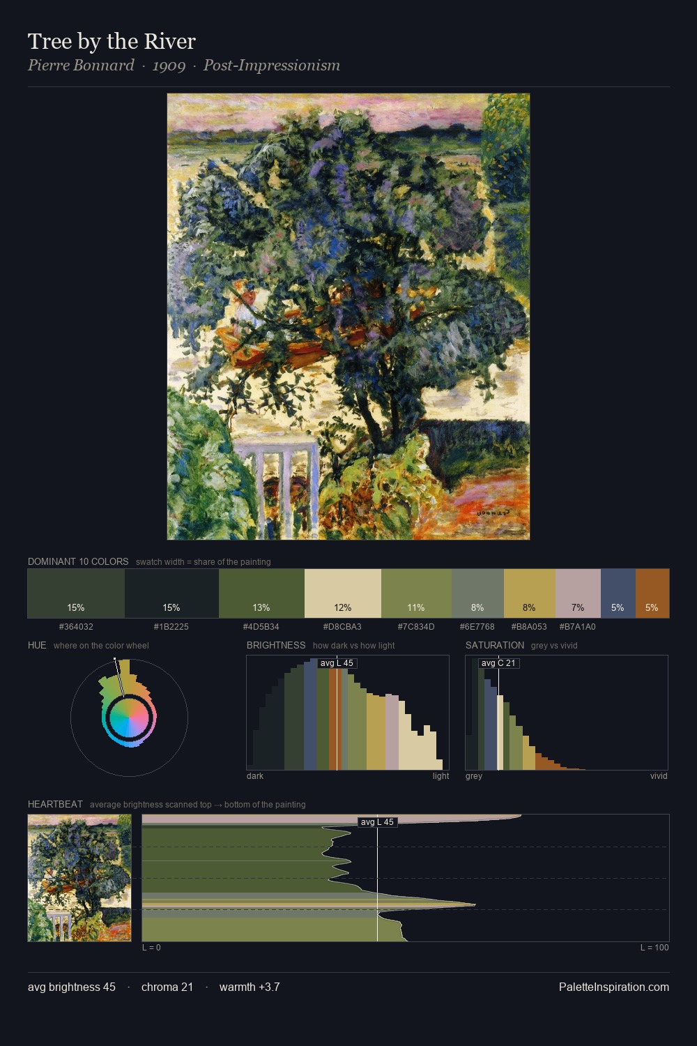
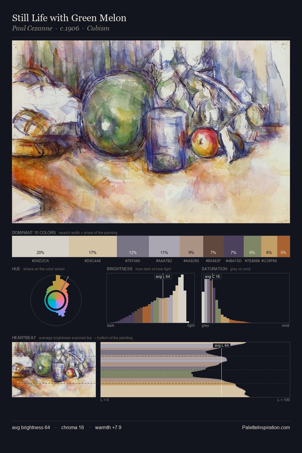
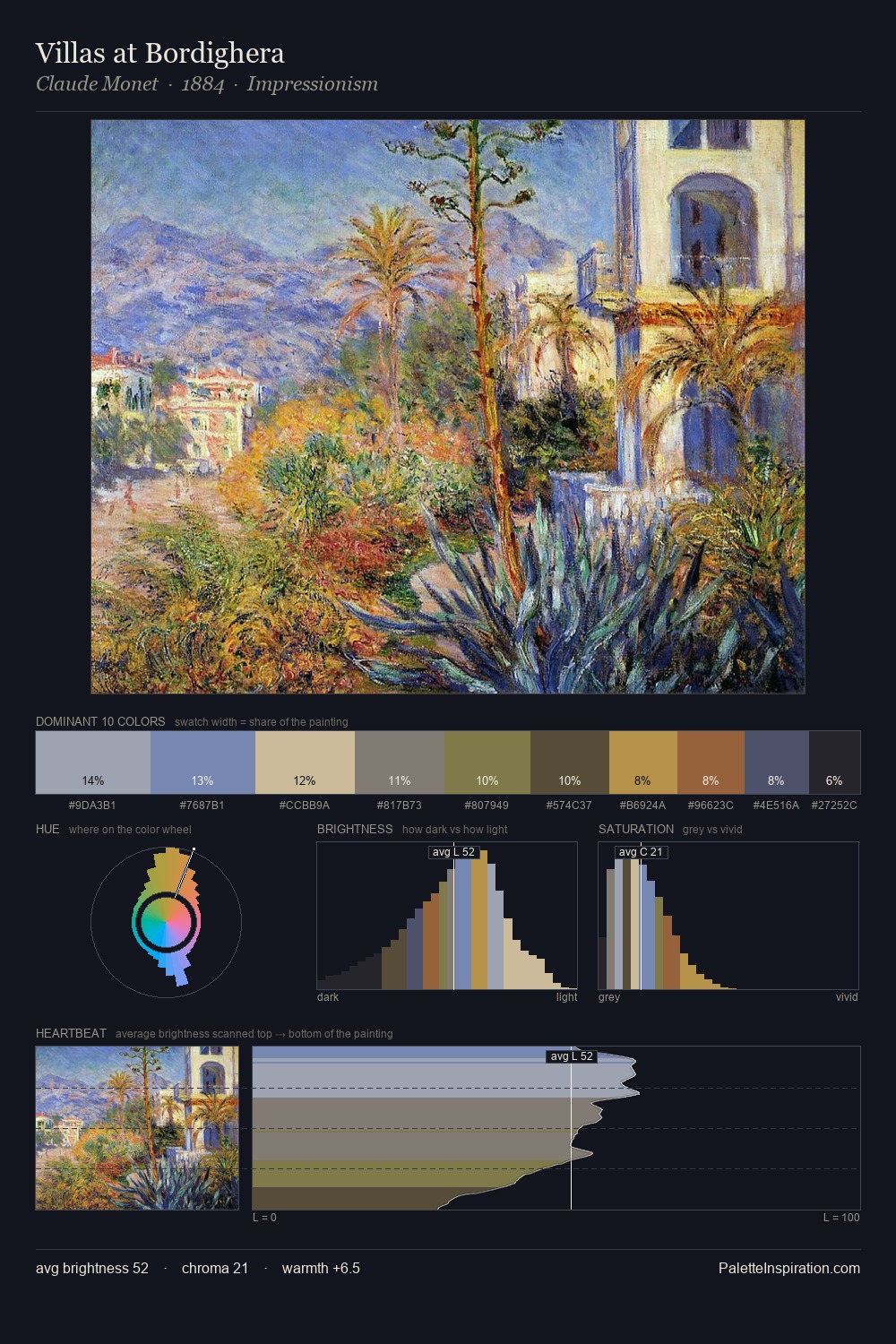
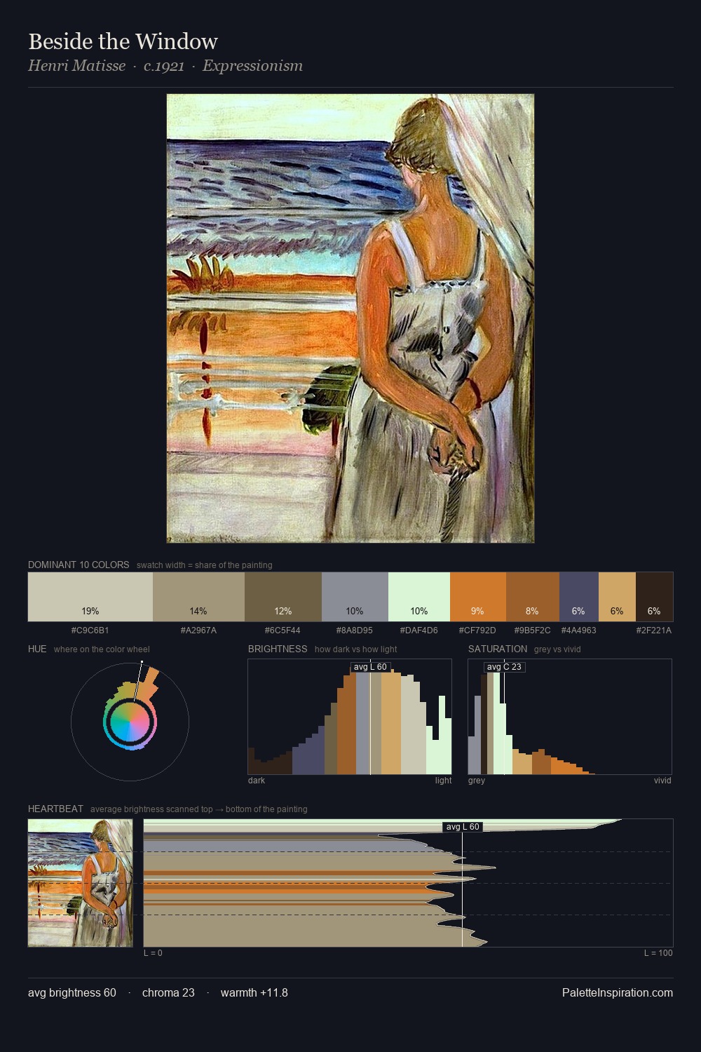
The high-key values of Vanessa Bell give it an effulgent, almost bleached quality. Vanessa Bell tilts toward cool - blues and silver-greys carry the structural weight. A restrained, mid-chroma palette: every hue is present and legible, but nothing shouts. #B69E8B delivers the chromatic peak at only 6.9% - a small shot of colour with outsized visual impact. At 46 units across the value scale, the palette keeps contrast readable without letting it dominate. High luminosity and cool temperature suggest the plein-air condition: unfiltered daylight and open sky. Palette 1 sits within the larger chromatic argument that Vanessa Bell's complete body of work advances.
Example use cases
- ceramics & pottery
- boutique hospitality
- menswear
- heritage food brands
- craft & artisan brands
I Love This!
Use This Palette
Copy, export, or download for your project
Copy, export, or download for your project
Copy:
Download:
Share: