Utagawa Kunisada II Master Palette

Palette Analysis
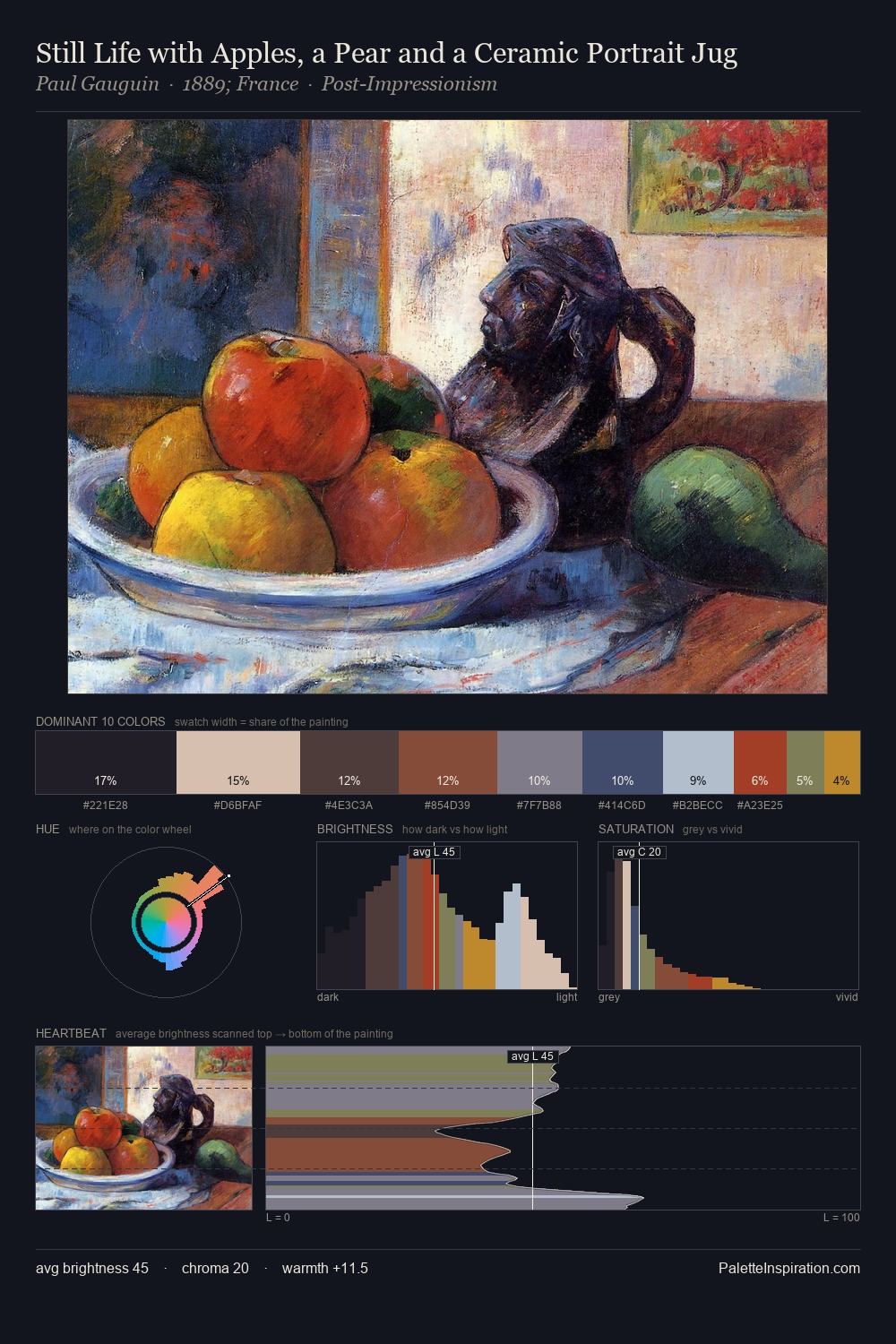
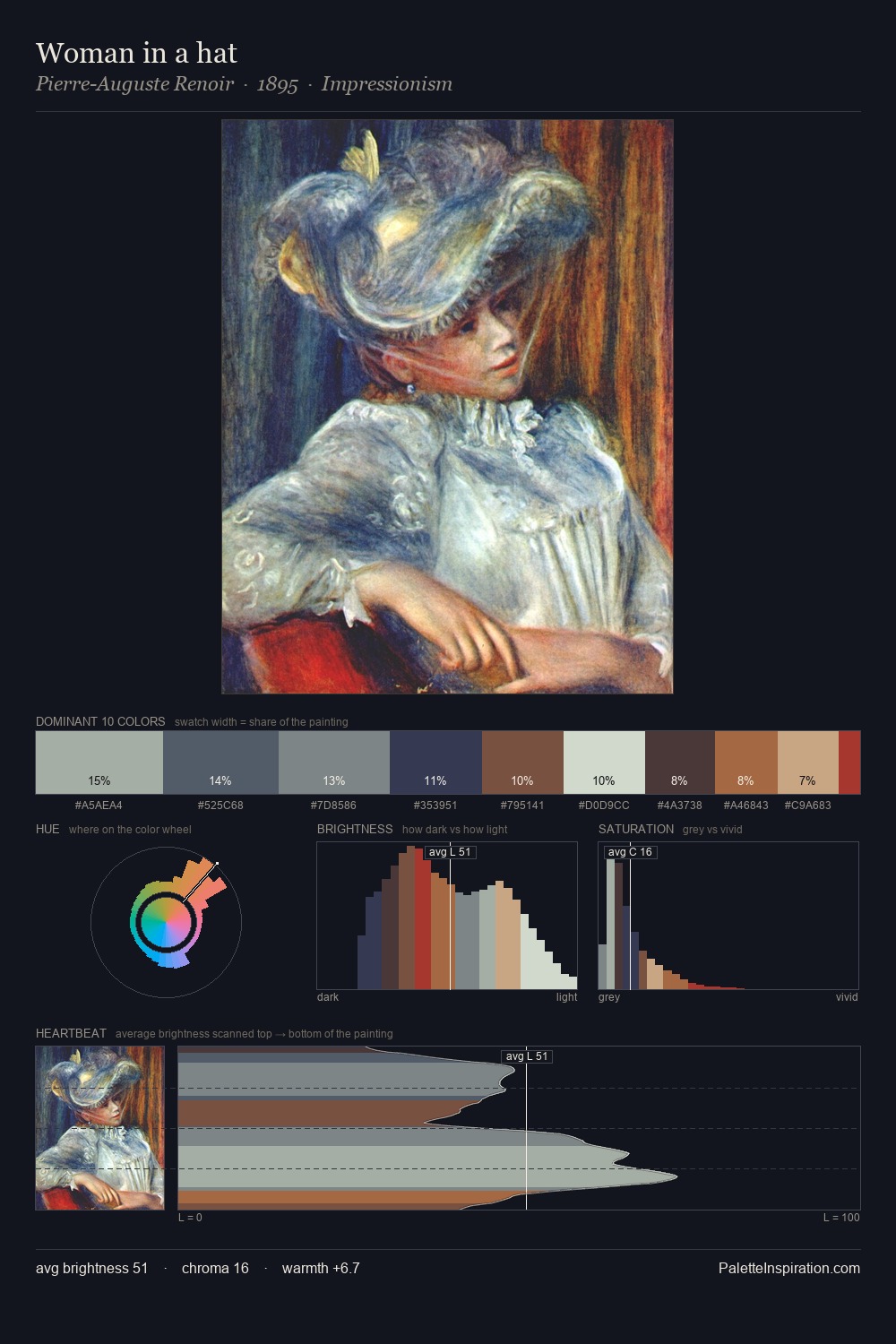
The value structure of Utagawa Kunisada II is mid-key: quiet, controlled, and cohesive. Cool hues prevail: blues, greens, and greys anchor the palette's emotional temperature. Saturation is deliberately withheld - the beauty here lies in the near-monochromatic gradations rather than colour difference. The highest-chroma note - #1B2B54 - appears at just 2.0%, deployed as a precision accent against the quieter ground. From deepest dark to palest light, the palette traverses 57 units of the value scale - a span that creates natural depth. The palette has the character of outdoor light: cool, mid-bright, with colour rendered faithfully rather than expressively. The palette is a signature: Utagawa Kunisada II's particular sense of value, warmth, and colour weight made legible.
Example use cases
- exhibition design
- foundation branding
- estate management
- art education
- museums & galleries
I Love This!
Copy, export, or download for your project