Utagawa Kunisada II Palette 5

Palette Analysis
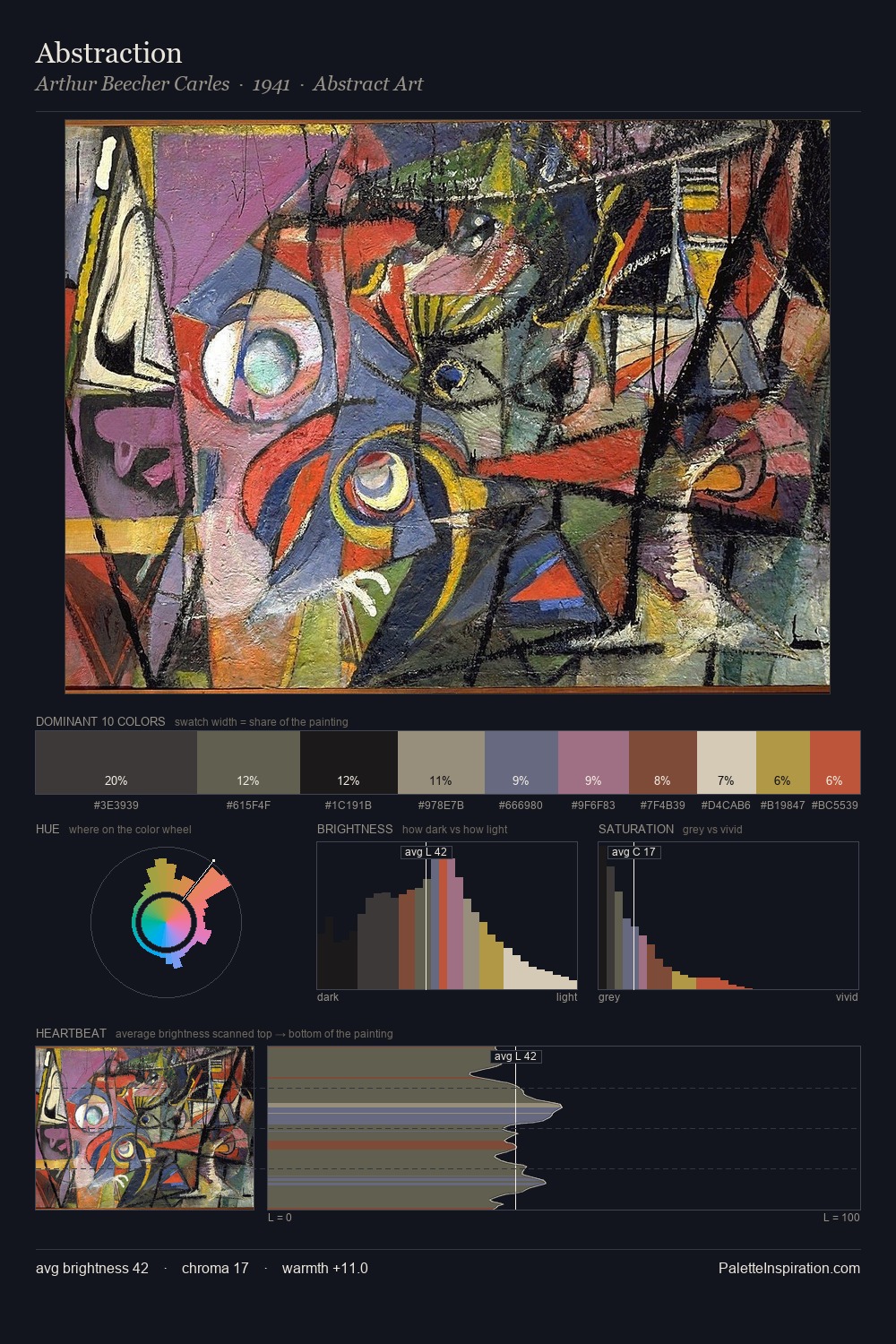
Mid-key values give Utagawa Kunisada II its characteristic quietness - nothing blazes, nothing disappears. Utagawa Kunisada II tilts toward cool - blues and silver-greys carry the structural weight. Muted throughout, the palette achieves its effects through value and temperature rather than chromatic force. #CBBFAB claims 49.6% of the surface, functioning as the work's tonal foundation. The saturated accent, #965B4A, registers at 2.1% - sparse enough to feel like a deliberate surprise. 57 units of value range underpin the palette's structural clarity: the eye always knows where light falls. The palette has the character of outdoor light: cool, mid-bright, with colour rendered faithfully rather than expressively. Utagawa Kunisada II's palette 5 carries its own internal logic while remaining in conversation with the artist's broader colour intelligence.
Example use cases
- exhibition design
- foundation branding
- estate management
- art education
- museums & galleries
I Love This!
Copy, export, or download for your project