Utagawa Kunisada II Palette 3

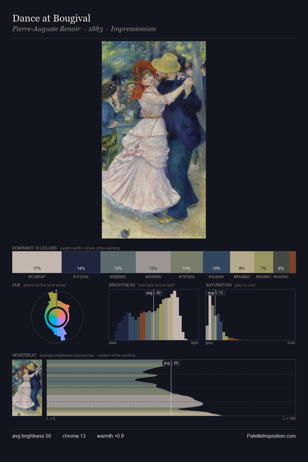
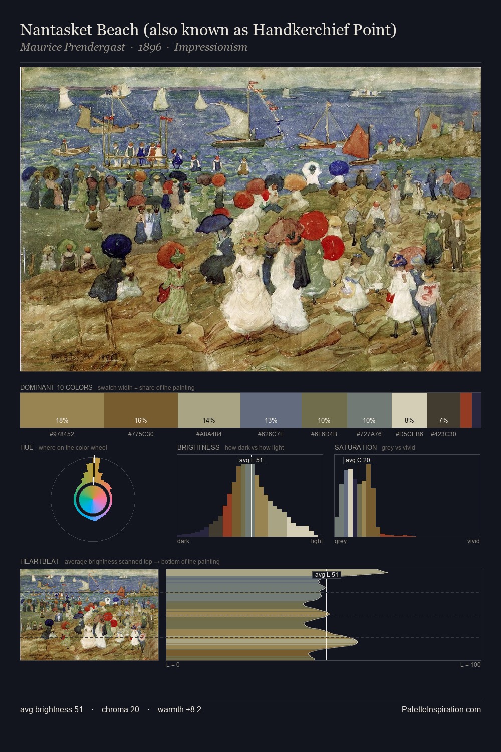
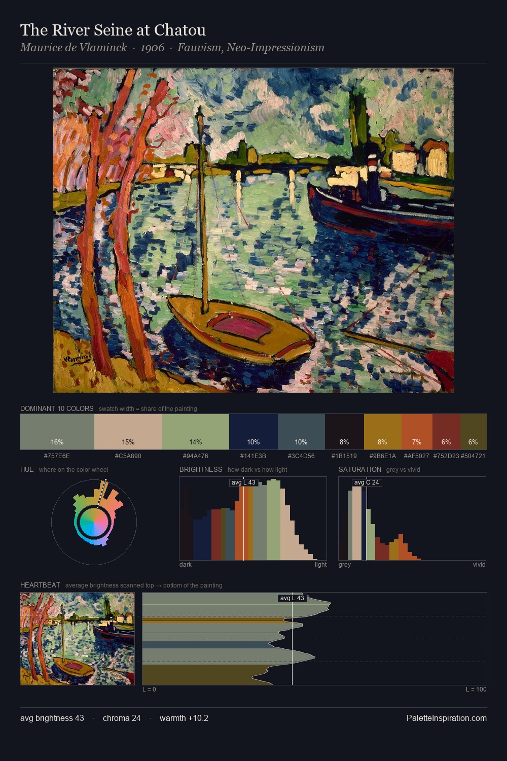
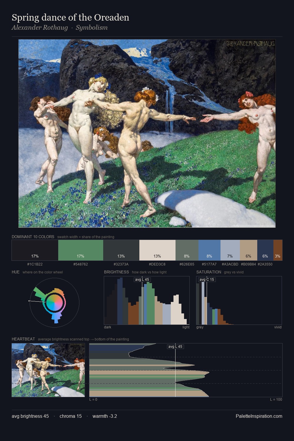
Palette Analysis
The high-key values of Utagawa Kunisada II give it an effulgent, almost bleached quality. Cool tones set the register here - the blues and greens easily outweigh any warm accents. Chroma hovers near zero; colour declares itself through subtle shifts in hue rather than outright saturation. Utagawa Kunisada II gives 37.9% of the composition to a single #D8D4C0 - a decisive chromatic anchor. The most saturated colour, #7B221E, is reserved to 1.5% of the surface, where it acts as a focal punctuation. At 62 units of value range, the palette has the tonal breadth to sustain complex spatial readings. The mid-to-high key, cool bias, and moderate chroma point to outdoor observation - sky and diffused daylight as the dominant light source. In the context of Utagawa Kunisada II's full range of palettes, group 3 represents one movement in an ongoing chromatic dialogue.
Example use cases
- archival print
- university identity
- rare books
- cultural institutions
- nonprofit identity
I Love This!
Copy, export, or download for your project