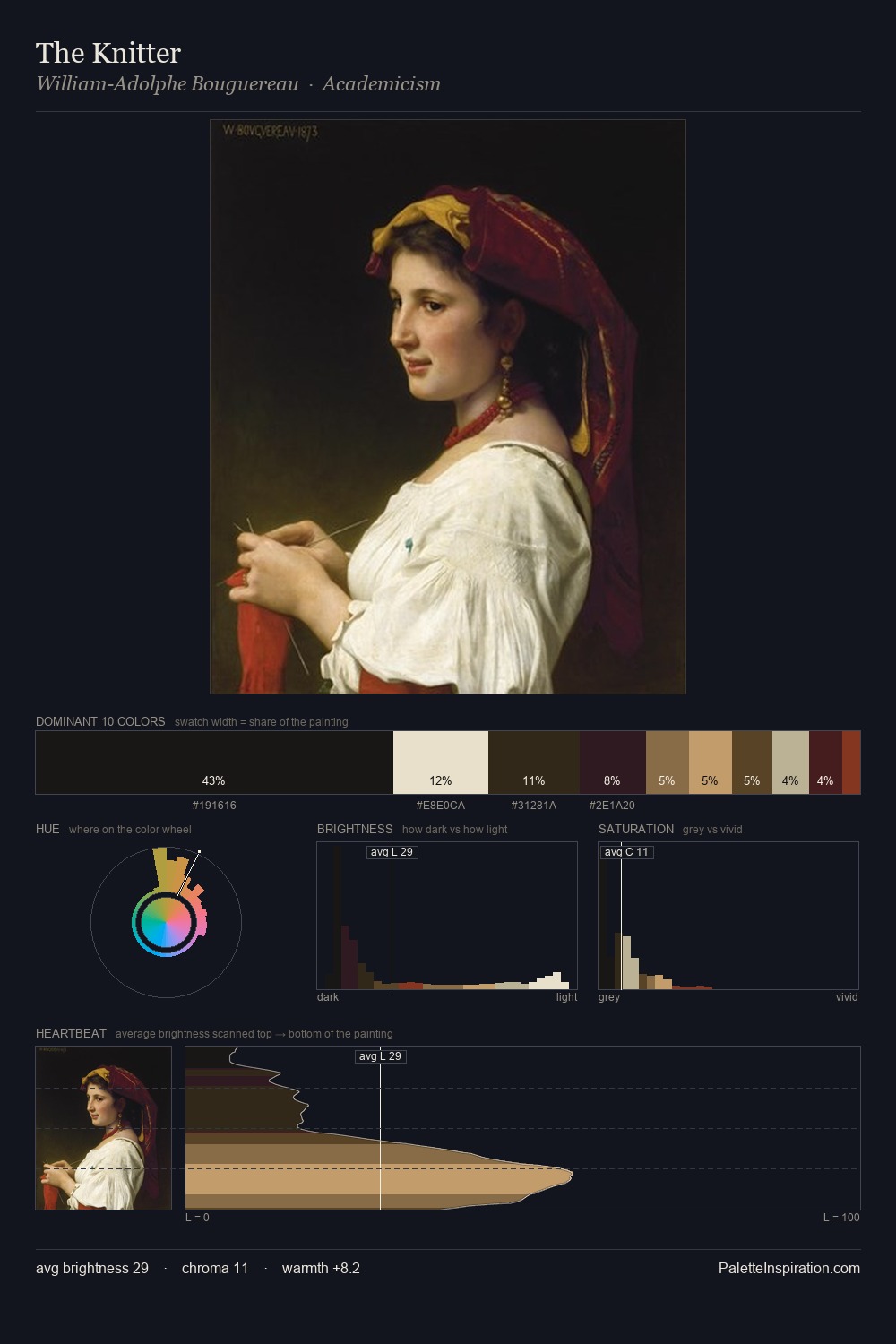
Toby Edward Rosenthal Palette 3

Palette Analysis
The palette of Toby Edward Rosenthal sits in the lower register of the value scale - dense, contained, and weighted. Warm and cool are kept in productive tension, creating the kind of chromatic harmony that sustains the eye. All colours lean toward grey, building depth through value rather than colour punch. #CBAD7A delivers the chromatic peak at only 6.2% - a small shot of colour with outsized visual impact. At 83 units of value range, the palette has the tonal breadth to sustain complex spatial readings. This tonal restraint is characteristic of the Toby Edward Rosenthal approach: colour serves light, not the reverse. Palette 3 sits within the larger chromatic argument that Toby Edward Rosenthal's complete body of work advances.
Example use cases
- premium streaming
- cocktail bars
- fashion campaigns
- book covers
- music labels
I Love This!
Copy, export, or download for your project
Related Palettes

Artemisia Gentileschi Palette 8
Nocturnal Bister

Frederic Soulacroix Palette 5
Nocturnal Bister

Friedrich von Amerling Palette 7
Nocturnal Bister

William-Adolphe Bouguereau Palette 16
Nocturnal Bister

Toby Edward Rosenthal Palette 1
Penumbral Parchment

Toby Edward Rosenthal Palette 2
Penumbral Bister