Thomas Pollock Anshutz Palette 3

Palette Analysis
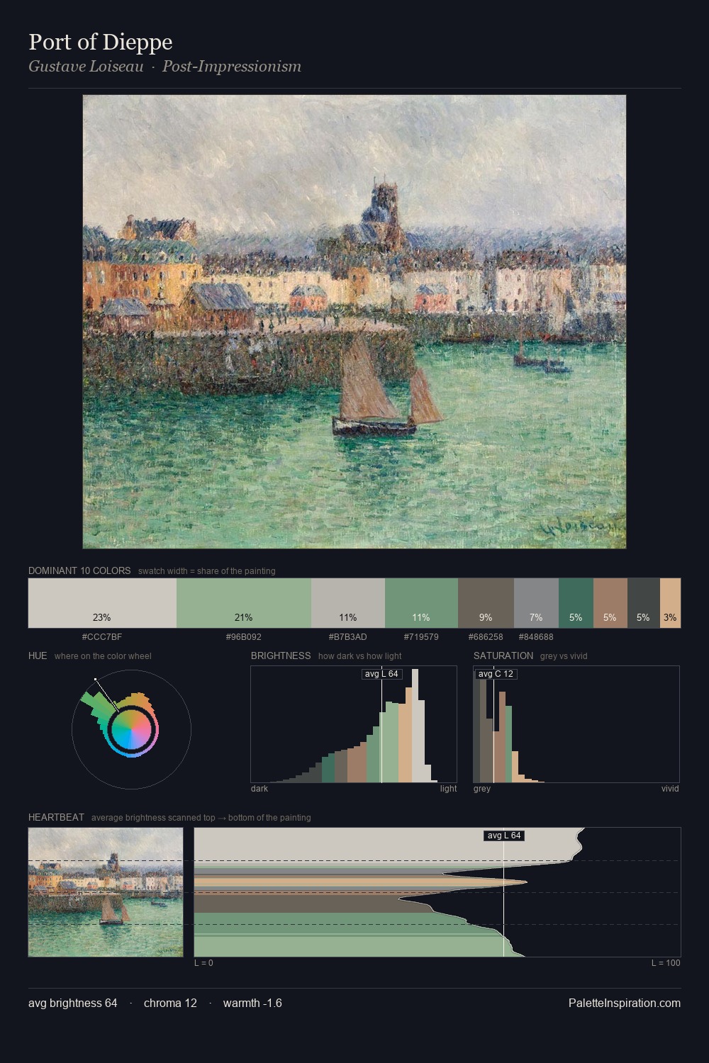
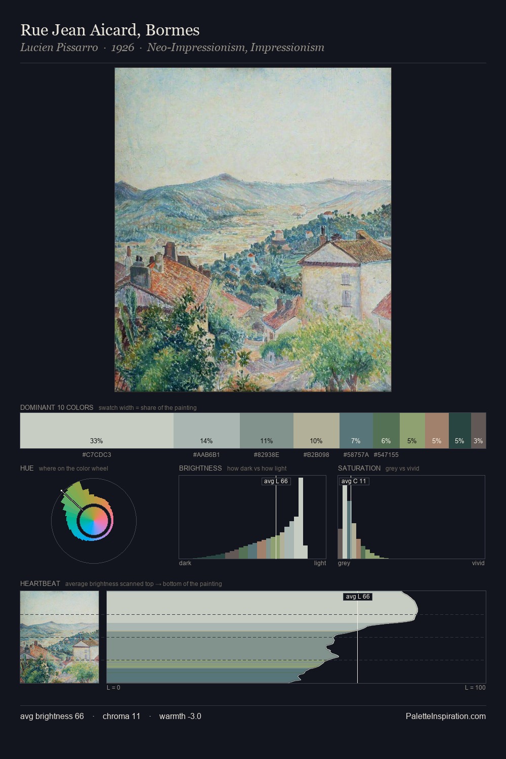
Thomas Pollock Anshutz is high in key: pale, luminous, and filled with optical air. Cool tones set the register here - the blues and greens easily outweigh any warm accents. The absence of saturated colour is itself an expressive choice: this is a palette of restraint and atmosphere. The dominant colour, #D3D5C6, takes 43.2% of the total area, establishing the overall mood before any other hue is introduced. #7E915C delivers the chromatic peak at only 2.5% - a small shot of colour with outsized visual impact. Value range is moderate at 38 units - enough contrast for legibility, not so much as to fragment the tonal unity. High luminosity and cool temperature suggest the plein-air condition: unfiltered daylight and open sky. Thomas Pollock Anshutz's palette 3 carries its own internal logic while remaining in conversation with the artist's broader colour intelligence.
Example use cases
- florist branding
- event design
- real estate
- jewelry retail
- hospitality branding
I Love This!
Copy, export, or download for your project