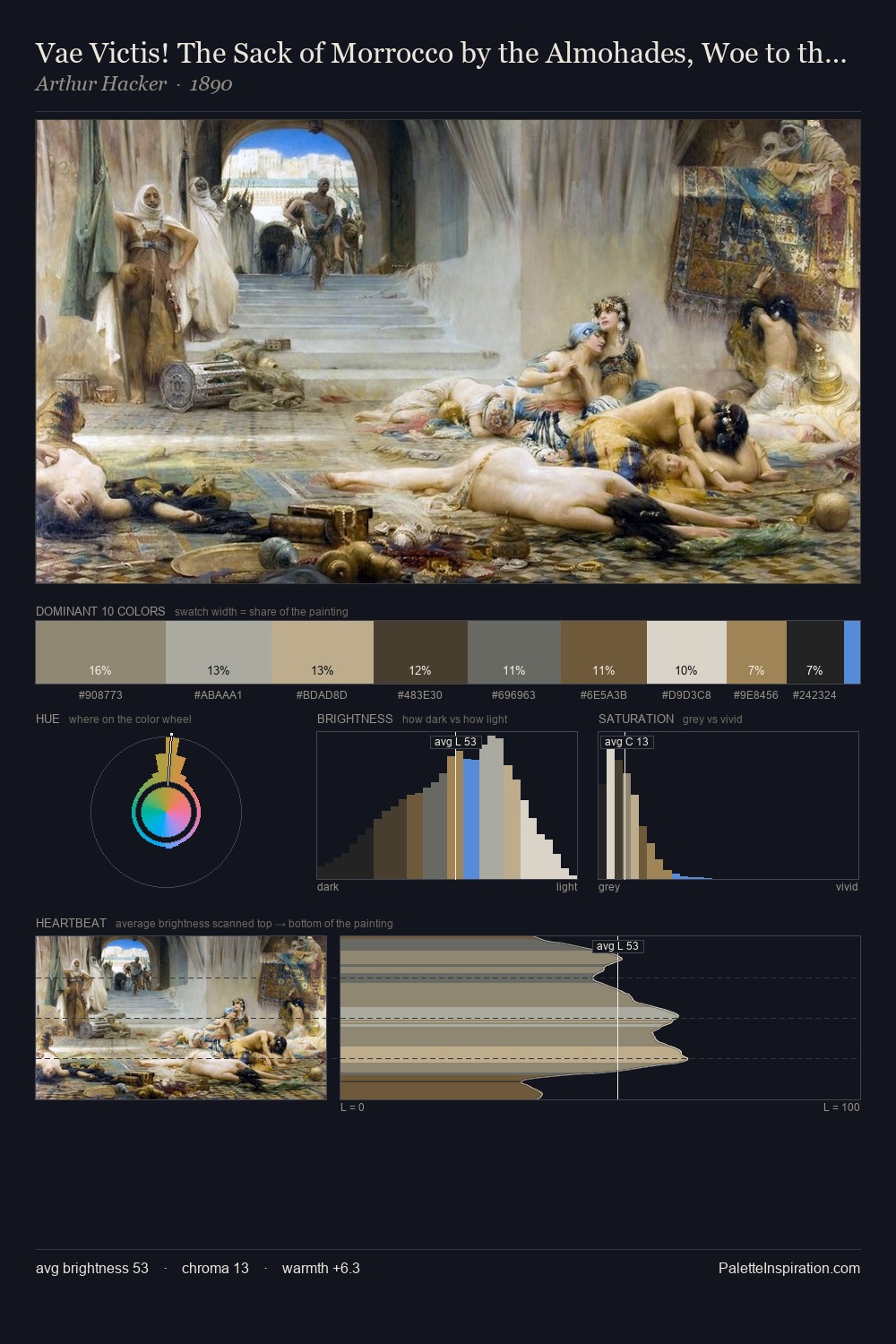
Thomas Moran Palette 9

Palette Analysis
Values in Thomas Moran rest in the mid-range - neither dramatically lit nor steeped in shadow. Thomas Moran tilts toward cool - blues and silver-greys carry the structural weight. Muted throughout, the palette achieves its effects through value and temperature rather than chromatic force. The highest-chroma note - #564D2E - appears at just 10.3%, deployed as a precision accent against the quieter ground. From deepest dark to palest light, the palette traverses 67 units of the value scale - a span that creates natural depth. The mid-to-high key, cool bias, and moderate chroma point to outdoor observation - sky and diffused daylight as the dominant light source. Thomas Moran's palette 9 carries its own internal logic while remaining in conversation with the artist's broader colour intelligence.
Example use cases
- archival print
- university identity
- rare books
- cultural institutions
- nonprofit identity
I Love This!
Copy, export, or download for your project