Thomas Girtin Palette 3

Palette Analysis
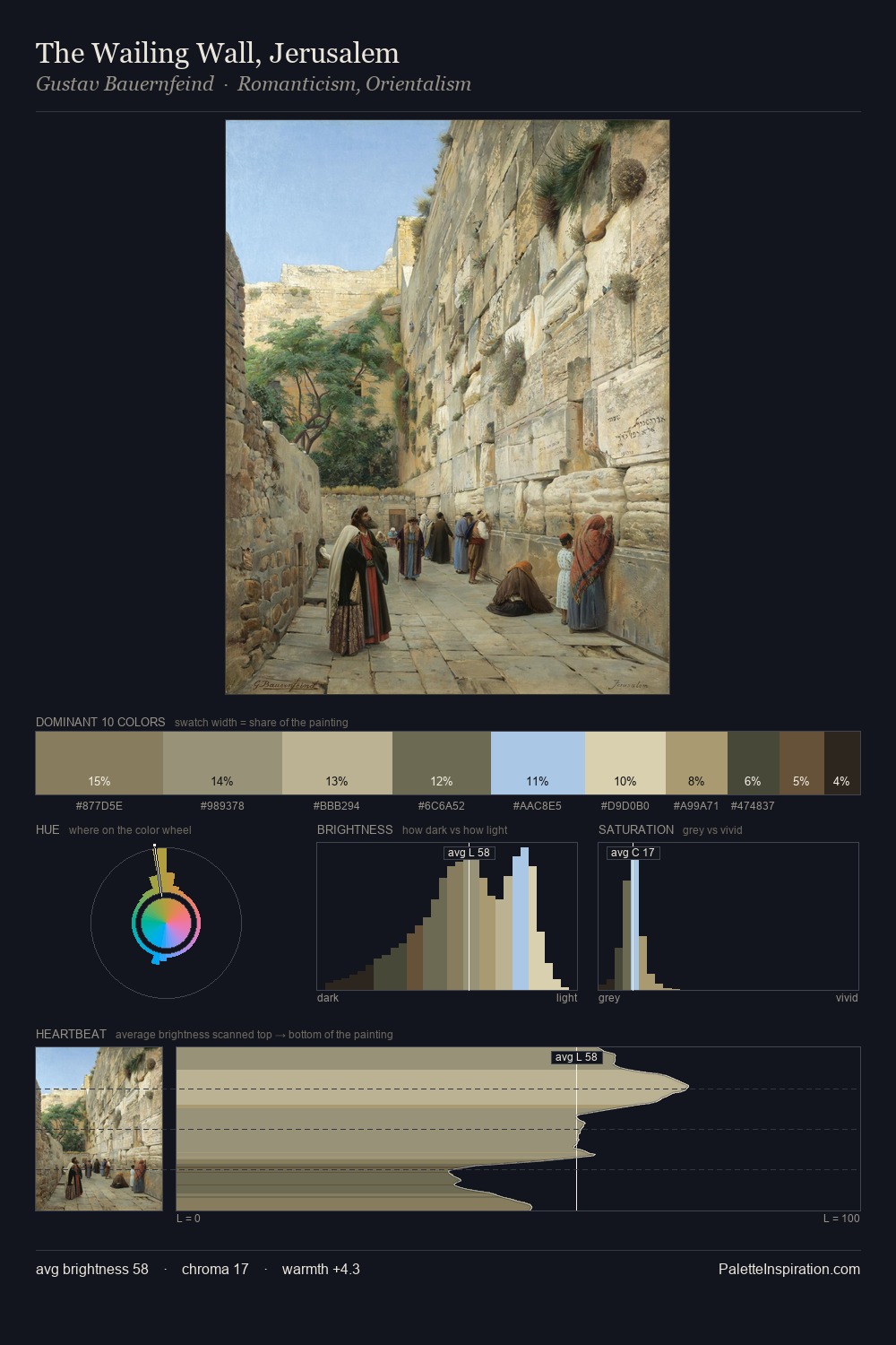
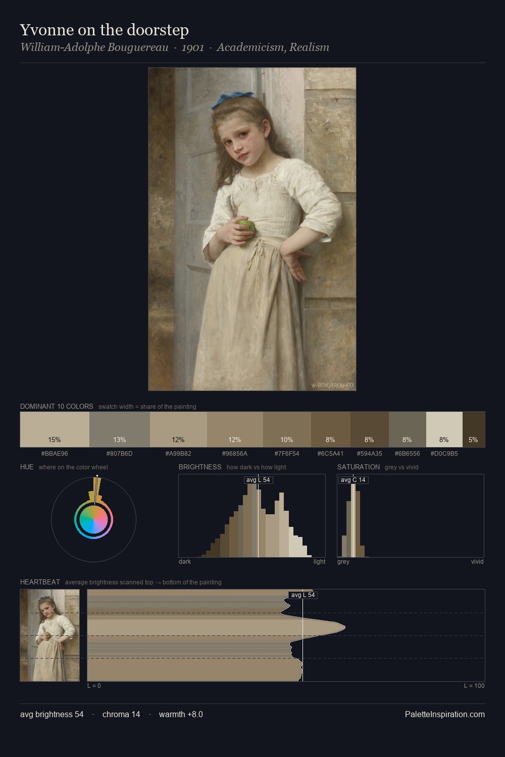
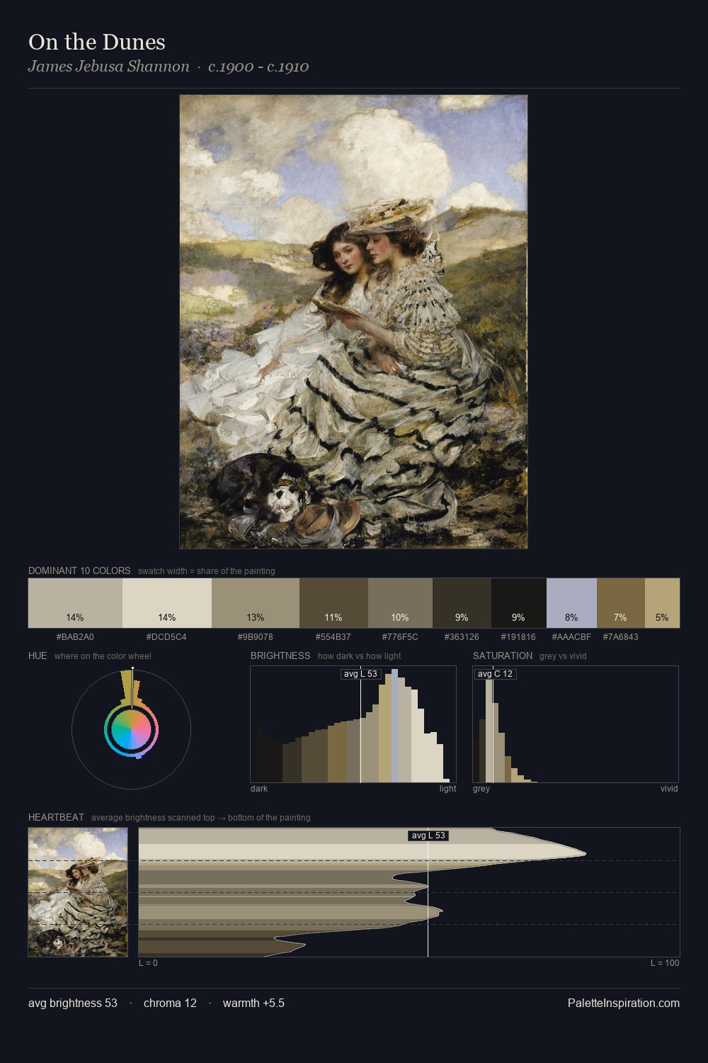
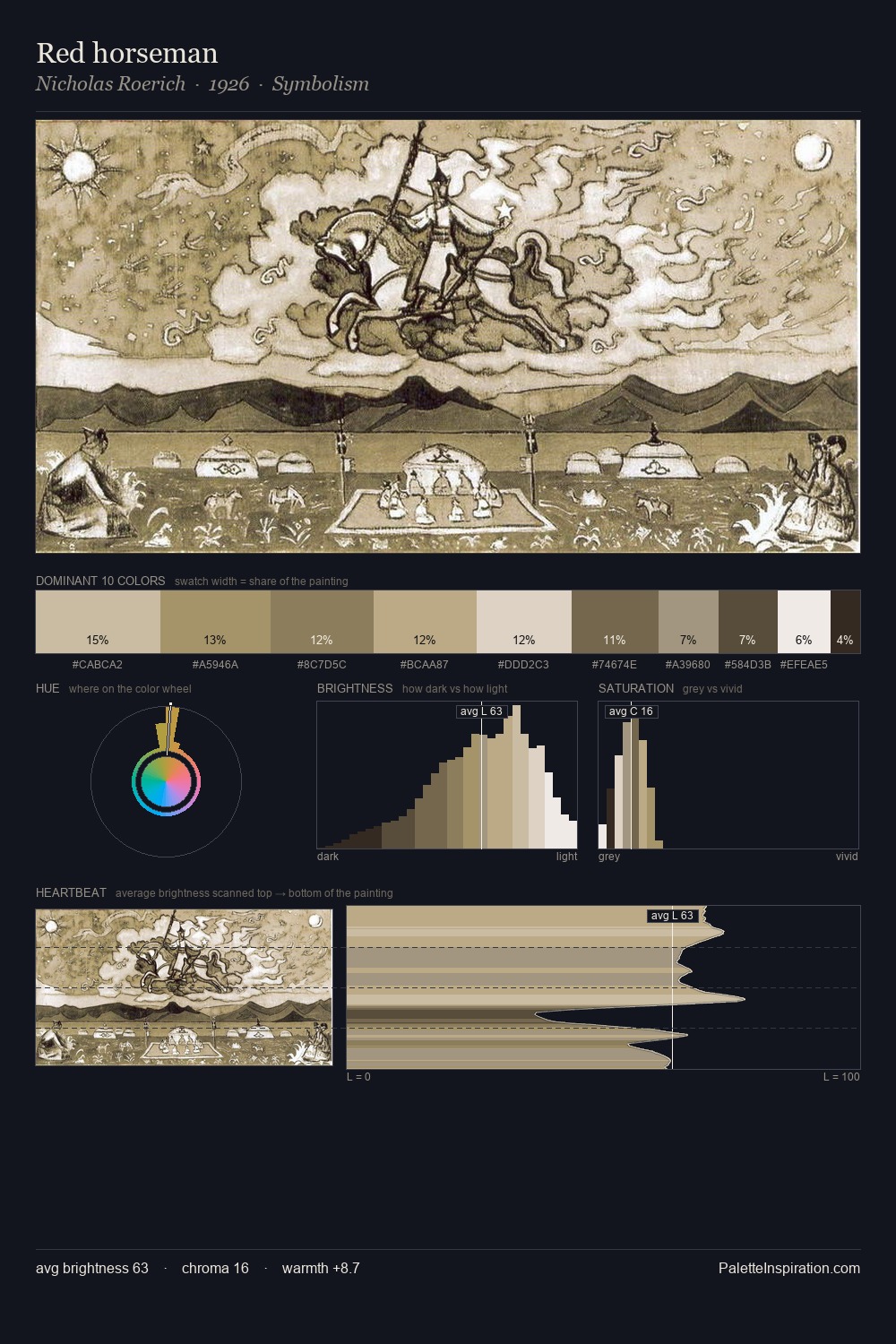
Values in Thomas Girtin rest in the mid-range - neither dramatically lit nor steeped in shadow. Temperature is cool-dominant, with blue and green families claiming the largest areas. Muted throughout, the palette achieves its effects through value and temperature rather than chromatic force. The saturated accent, #867051, registers at 10.2% - sparse enough to feel like a deliberate surprise. 54 units of value spread create a palette that is varied but unified - contrast in the service of harmony. The mid-to-high key, cool bias, and moderate chroma point to outdoor observation - sky and diffused daylight as the dominant light source. Thomas Girtin's palette 3 carries its own internal logic while remaining in conversation with the artist's broader colour intelligence.
Example use cases
- food packaging
- leather accessories
- travel & outdoor
- natural cosmetics
- interior design
I Love This!
Copy, export, or download for your project