Louis-Nicolas van Blarenberghe Palette 2

Palette Analysis
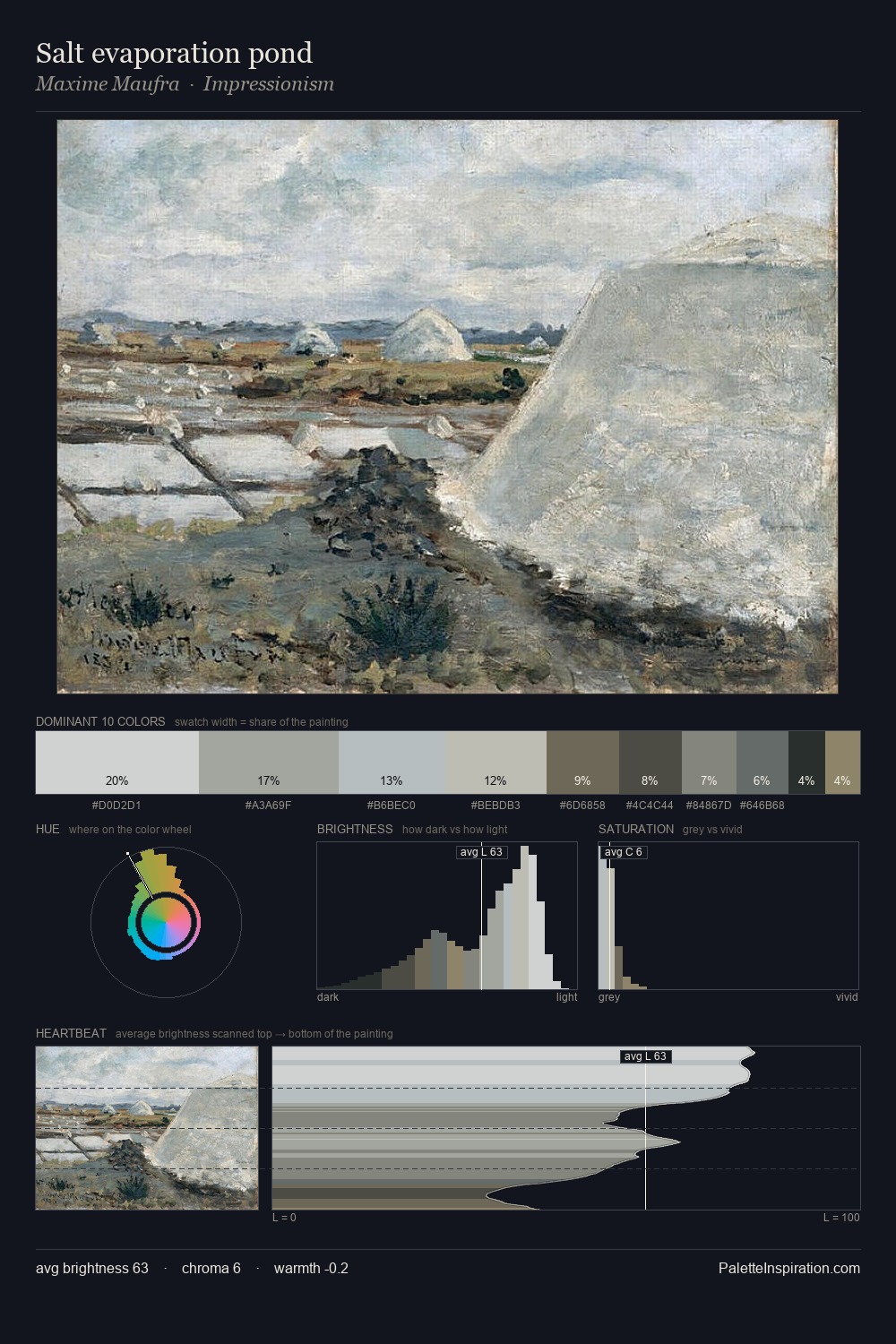
Values in Louis-Nicolas van Blarenberghe tilt decisively toward white, giving the palette its luminous character. A distinctly cool atmosphere runs through this palette: sky, water, and mist given colour form. Saturation is deliberately withheld - the beauty here lies in the near-monochromatic gradations rather than colour difference. The highest-chroma note - #A28B70 - appears at just 3.3%, deployed as a precision accent against the quieter ground. Value range is moderate at 36 units - enough contrast for legibility, not so much as to fragment the tonal unity. High luminosity and cool temperature suggest the plein-air condition: unfiltered daylight and open sky. Louis-Nicolas van Blarenberghe's palette 2 carries its own internal logic while remaining in conversation with the artist's broader colour intelligence.
Example use cases
- exhibition design
- foundation branding
- estate management
- art education
- museums & galleries
I Love This!
Copy, export, or download for your project