Louis-Nicolas van Blarenberghe Palette 1

Palette Analysis
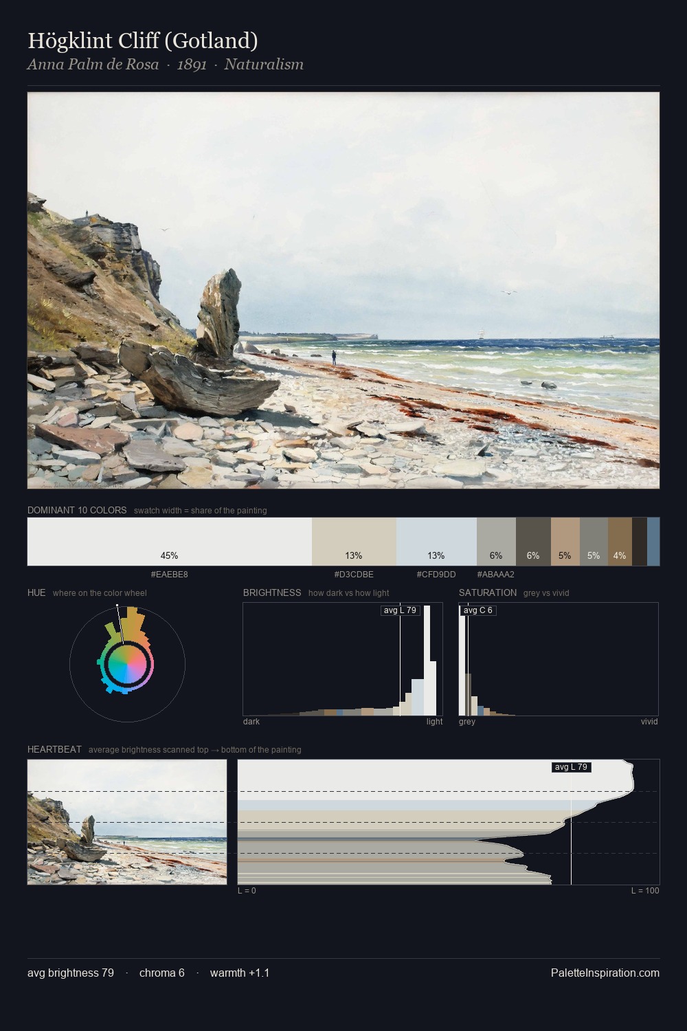
Louis-Nicolas van Blarenberghe works in the upper reaches of the value scale, creating an atmosphere of brightness and expansiveness. Cool hues prevail: blues, greens, and greys anchor the palette's emotional temperature. Chroma hovers near zero; colour declares itself through subtle shifts in hue rather than outright saturation. A single dominant - #D9E6EE at 25.7% - sets the character of the whole composition. #9B7862 functions as the palette's exclamation mark: highest chroma, lowest percentage (6.9%). Value range is moderate at 47 units - enough contrast for legibility, not so much as to fragment the tonal unity. The mid-to-high key, cool bias, and moderate chroma point to outdoor observation - sky and diffused daylight as the dominant light source. Louis-Nicolas van Blarenberghe's palette 1 carries its own internal logic while remaining in conversation with the artist's broader colour intelligence.
Example use cases
- publishing
- corporate identity
- consumer apps
- hospitality
- design agencies
I Love This!
Copy, export, or download for your project