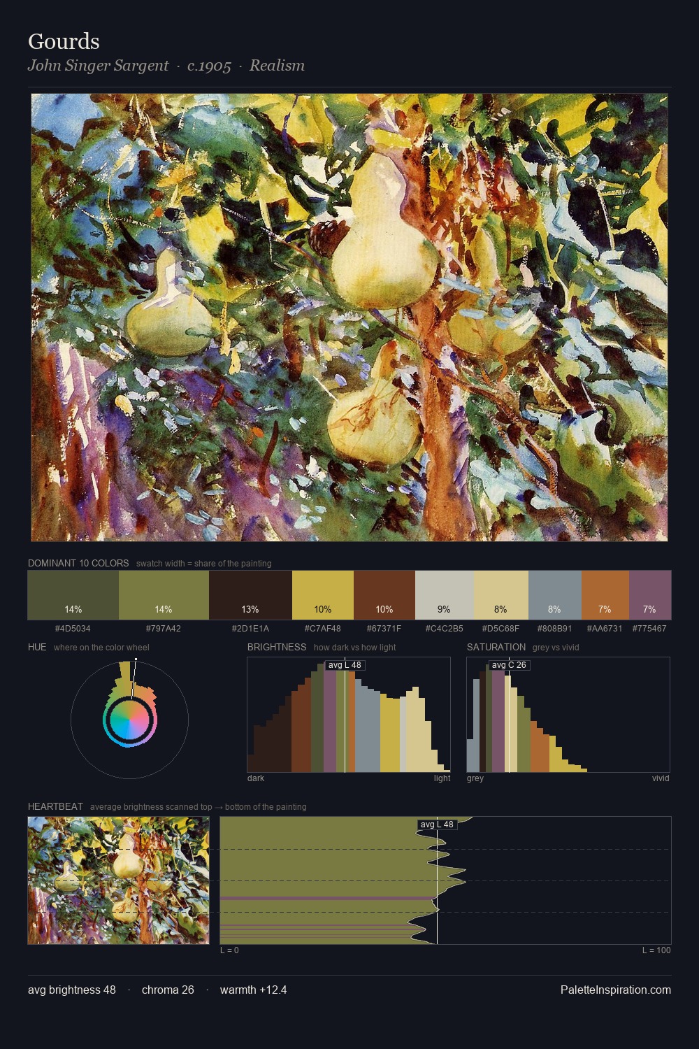
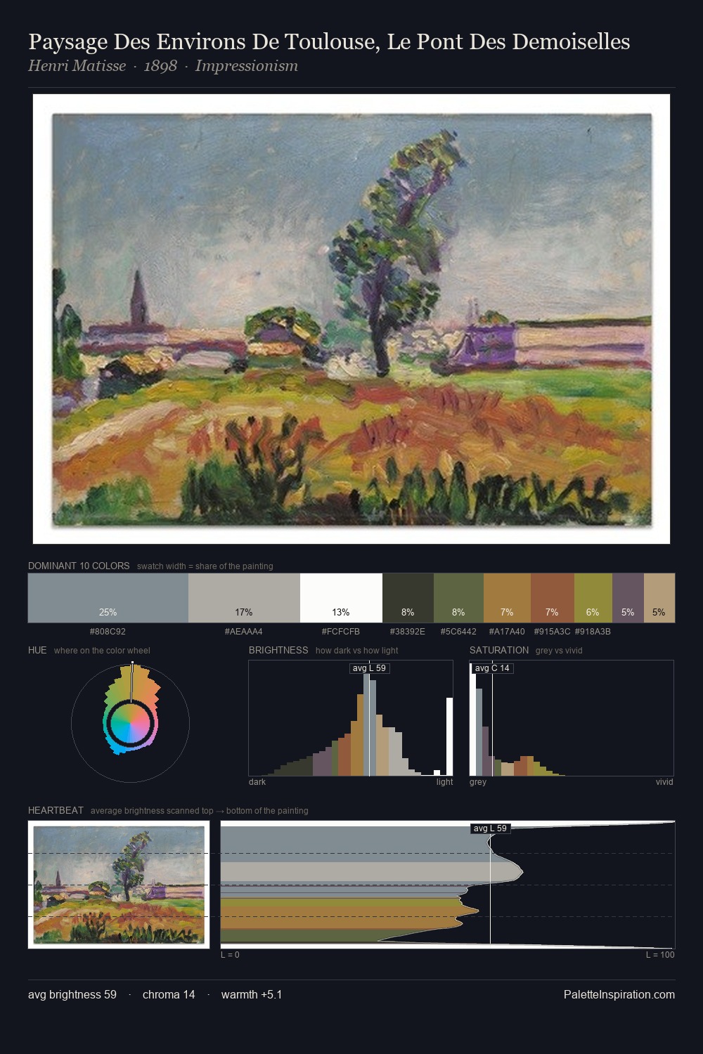
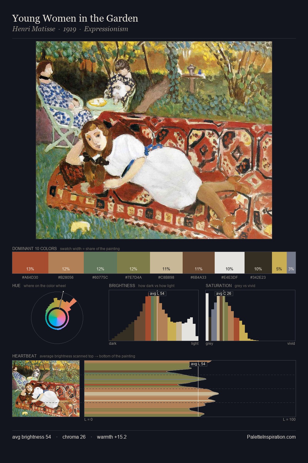
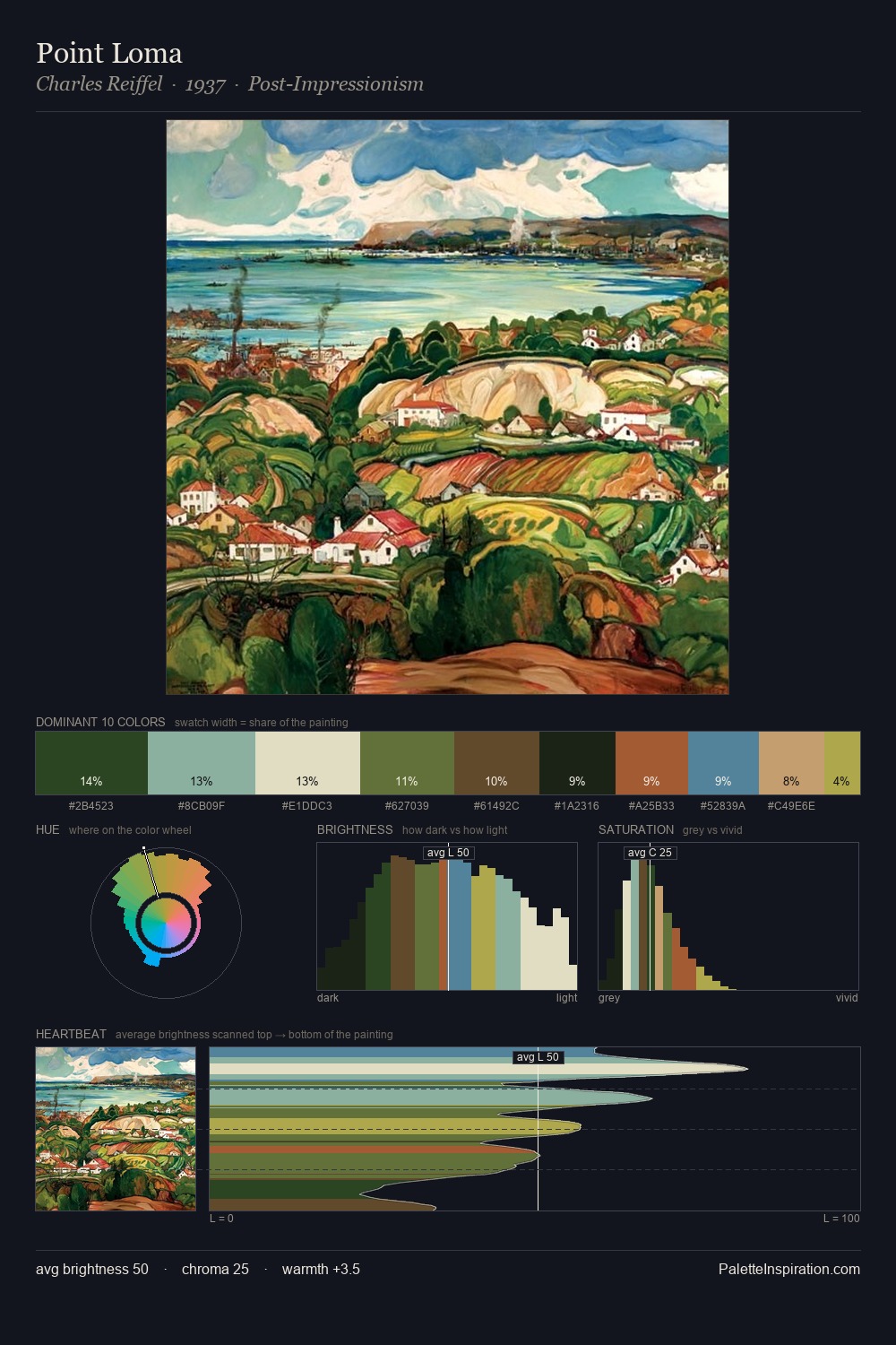
Theodor Kleehaas Master Palette
Veiled Tawny
Veiled Partially obscured light - mid-dark with a hazy, scrim-filtered quality.
Tawny Warm orange-brown - a traditional term for the color of tanned leather or lion fur.

Palette Analysis
Mid-key values give Theodor Kleehaas its characteristic quietness - nothing blazes, nothing disappears. The palette achieves thermal balance - reds and blues, ochres and greens, each holding the other in check. Saturation is deliberately withheld - the beauty here lies in the near-monochromatic gradations rather than colour difference. Only 4.0% is devoted to #A4AA3D, yet that small allocation delivers the palette's entire chromatic tension. 70 units of value range underpin the palette's structural clarity: the eye always knows where light falls. Taken together, these qualities constitute Theodor Kleehaas's chromatic voice - distinctive enough to be read across an entire body of work.
Example use cases
- ceramics & pottery
- boutique hospitality
- menswear
- heritage food brands
- craft & artisan brands
I Love This!
Use This Palette
Copy, export, or download for your project
Copy, export, or download for your project
Copy:
Download:
Share: