Theodor Kleehaas Palette 2

Palette Analysis
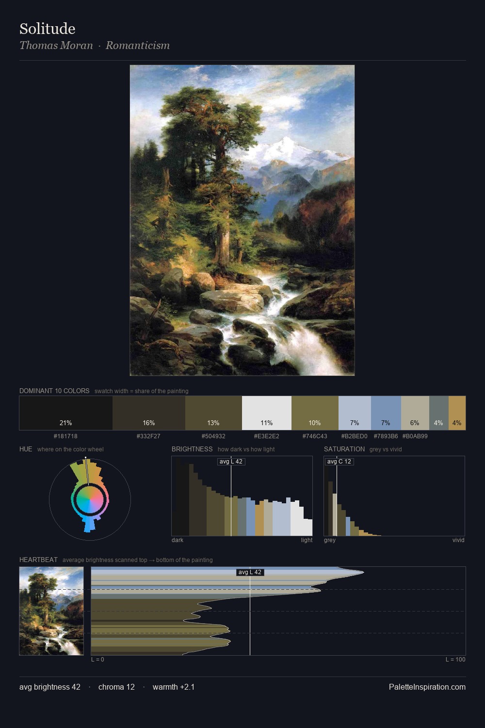
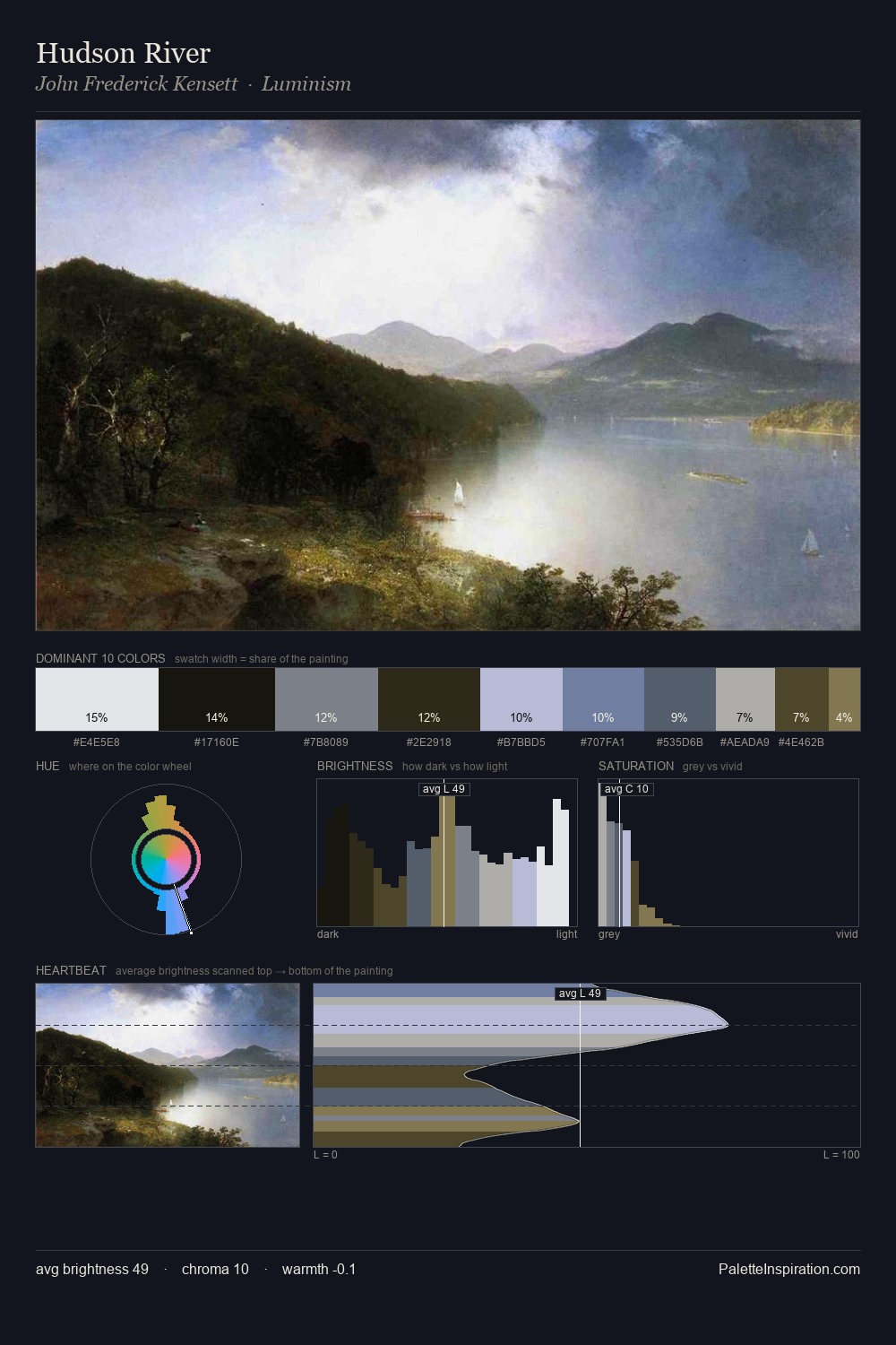
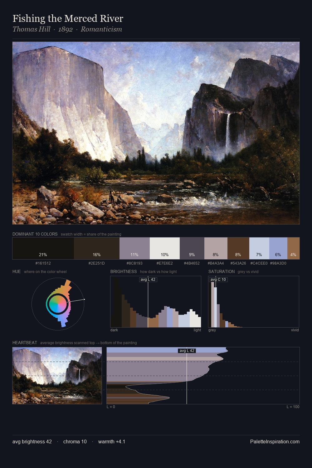
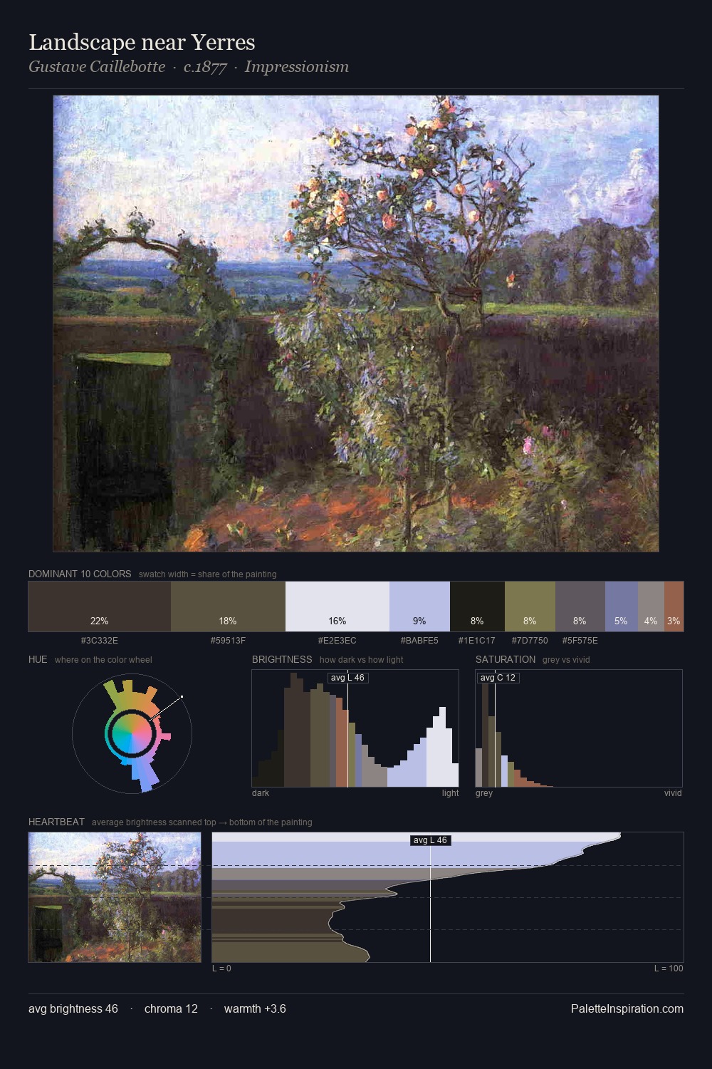
Theodor Kleehaas sits in the centre of the value range, lending the palette a sense of even, sustained light. Cool hues prevail: blues, greens, and greys anchor the palette's emotional temperature. Saturation is deliberately withheld - the beauty here lies in the near-monochromatic gradations rather than colour difference. The highest-chroma note - #847650 - appears at just 6.4%, deployed as a precision accent against the quieter ground. At 76 units of value range, the palette has the tonal breadth to sustain complex spatial readings. High luminosity and cool temperature suggest the plein-air condition: unfiltered daylight and open sky. This is palette 2 of Theodor Kleehaas's sequence - a single chapter in a chromatic story told across many works.
Example use cases
- exhibition design
- foundation branding
- estate management
- art education
- museums & galleries
I Love This!
Copy, export, or download for your project