Symbolism Palette 5
Soft Apricot
Soft Low-contrast, gentle chroma - mid-key values and low saturation, approachable and calm.
Apricot Soft warm orange - peach-adjacent, the color of ripe stone fruit.

Palette Analysis
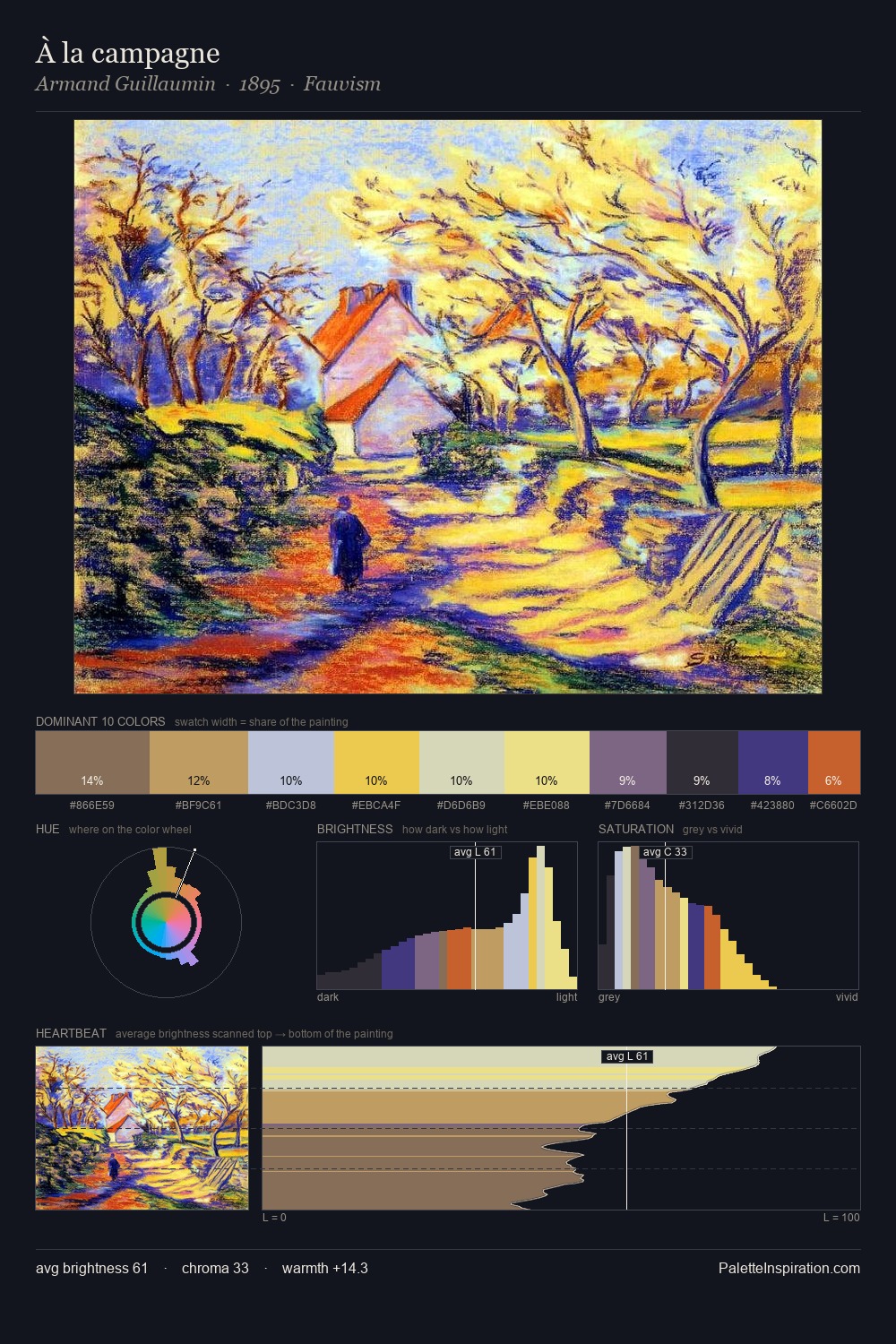
Symbolism occupies the comfortable middle of the value scale, avoiding both extremes to hold the eye in a sustained middle grey. Warm and cool are kept in productive tension, creating the kind of chromatic harmony that sustains the eye. Saturation is measured and controlled, giving the palette presence without visual aggression. #F0D07D delivers the chromatic peak at only 4.7% - a small shot of colour with outsized visual impact. 65 units of value range underpin the palette's structural clarity: the eye always knows where light falls. The palette reads as an Impressionist one - light-biased, chromatically direct, and built on temperature contrast rather than value opposition.
Example use cases
- publishing
- corporate identity
- consumer apps
- hospitality
- design agencies
I Love This!
Use This Palette
Copy, export, or download for your project
Copy, export, or download for your project
Copy:
Download:
Share: