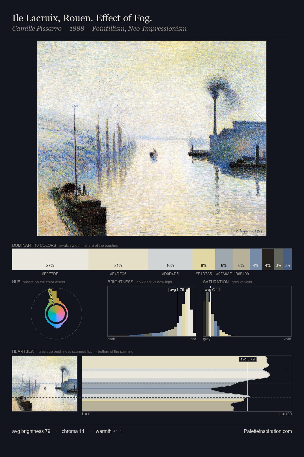
Symbolism Palette 3
Silvery Whisper
Silvery Cool metallic sheen - mid-to-high key, desaturated, with a gray-blue cast.
Whisper Barely-there pale neutral - so light it barely registers, the quietest color.

Palette Analysis
Values in Symbolism tilt decisively toward white, giving the palette its luminous character. Cool tones set the register here - the blues and greens easily outweigh any warm accents. Saturation is deliberately withheld - the beauty here lies in the near-monochromatic gradations rather than colour difference. The saturated accent, #515F97, registers at 3.5% - sparse enough to feel like a deliberate surprise. At 40 units across the value scale, the palette keeps contrast readable without letting it dominate. The palette has the character of outdoor light: cool, mid-bright, with colour rendered faithfully rather than expressively.
Example use cases
- publishing
- product photography
- design studios
- luxury retail
- museum collateral
I Love This!
Use This Palette
Copy, export, or download for your project
Copy, export, or download for your project
Copy:
Download:
Share: