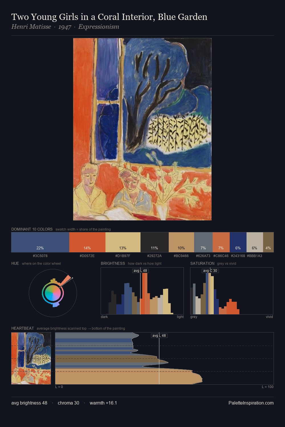
Suprematism Palette 9
Muted Vermillion
Muted Deliberately desaturated - chroma pulled toward gray, the restraint of tonal painting.
Vermillion Brilliant red-orange - the classic mercury sulfide pigment, vivid and warm.

Palette Analysis
Suprematism distributes its values across the middle register, creating harmony without high contrast. Temperature reads distinctly warm: the reds and earth tones carry the compositional weight. Mid-range chroma keeps the palette grounded - colourful but not strident. The chromatic peak belongs to #B46B4B, and at 10.3% it dominates, not decorates. The value range spans 57 units across the palette, providing the full gamut from deep shadow to near-white and ensuring clear tonal hierarchy.
Example use cases
- publishing
- corporate identity
- consumer apps
- hospitality
- design agencies
I Love This!
Use This Palette
Copy, export, or download for your project
Copy, export, or download for your project
Copy:
Download:
Share: