Suprematism Palette 7
Muted Parchment
Muted Deliberately desaturated - chroma pulled toward gray, the restraint of tonal painting.
Parchment Aged warm neutral - the color of old manuscript parchment, tan and slightly yellowed.

Palette Analysis
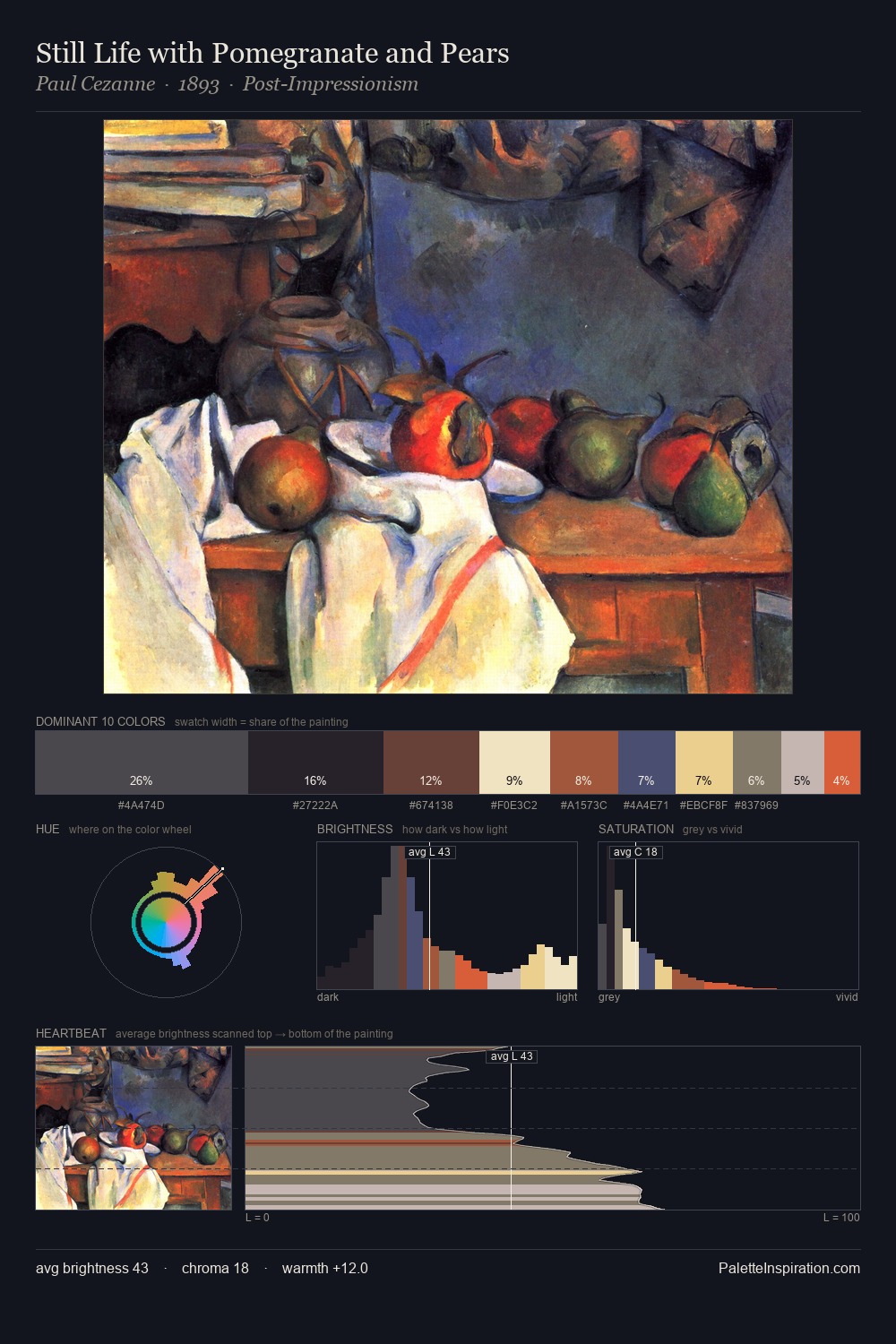
Suprematism sits in the centre of the value range, lending the palette a sense of even, sustained light. Warm hues command this palette; it favours the reds, oranges, and yellows of firelight and earth. Muted throughout, the palette achieves its effects through value and temperature rather than chromatic force. The highest-chroma note - #CDA363 - appears at just 3.4%, deployed as a precision accent against the quieter ground. 63 units of value range underpin the palette's structural clarity: the eye always knows where light falls.
Example use cases
- exhibition design
- foundation branding
- estate management
- art education
- museums & galleries
I Love This!
Use This Palette
Copy, export, or download for your project
Copy, export, or download for your project
Copy:
Download:
Share: