Stanisław Wyspiański Palette 7
Palette Analysis
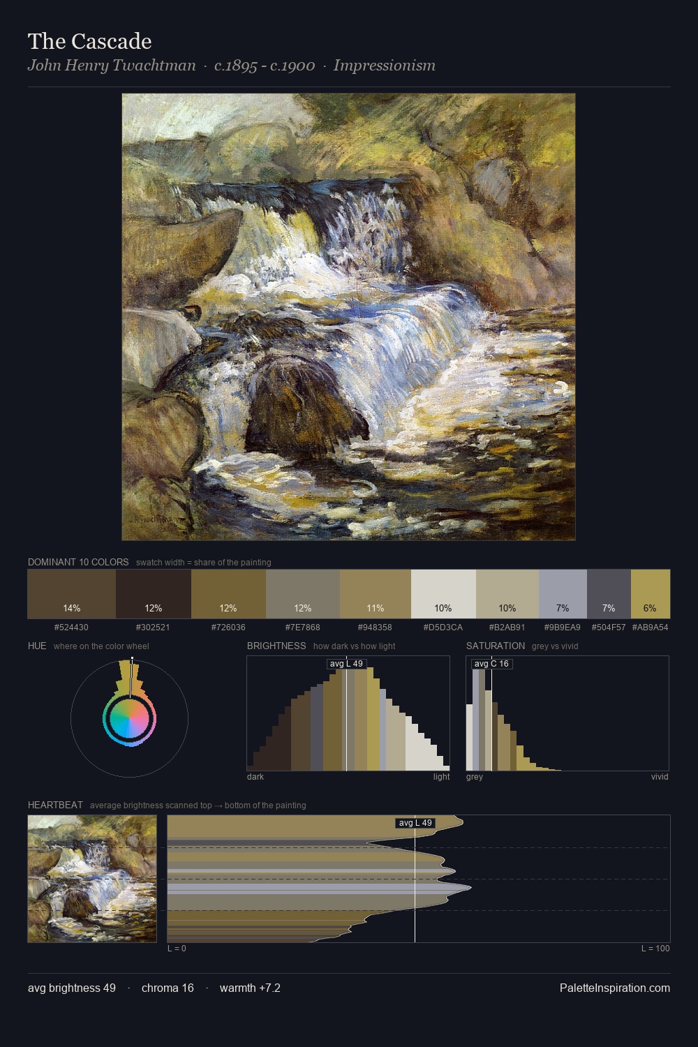
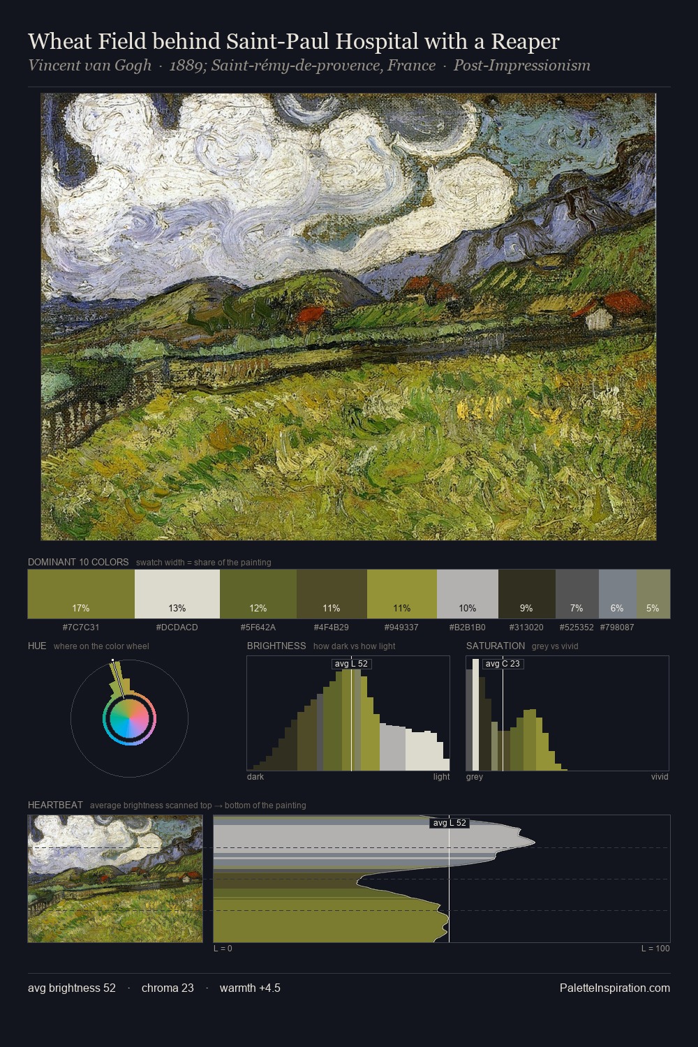
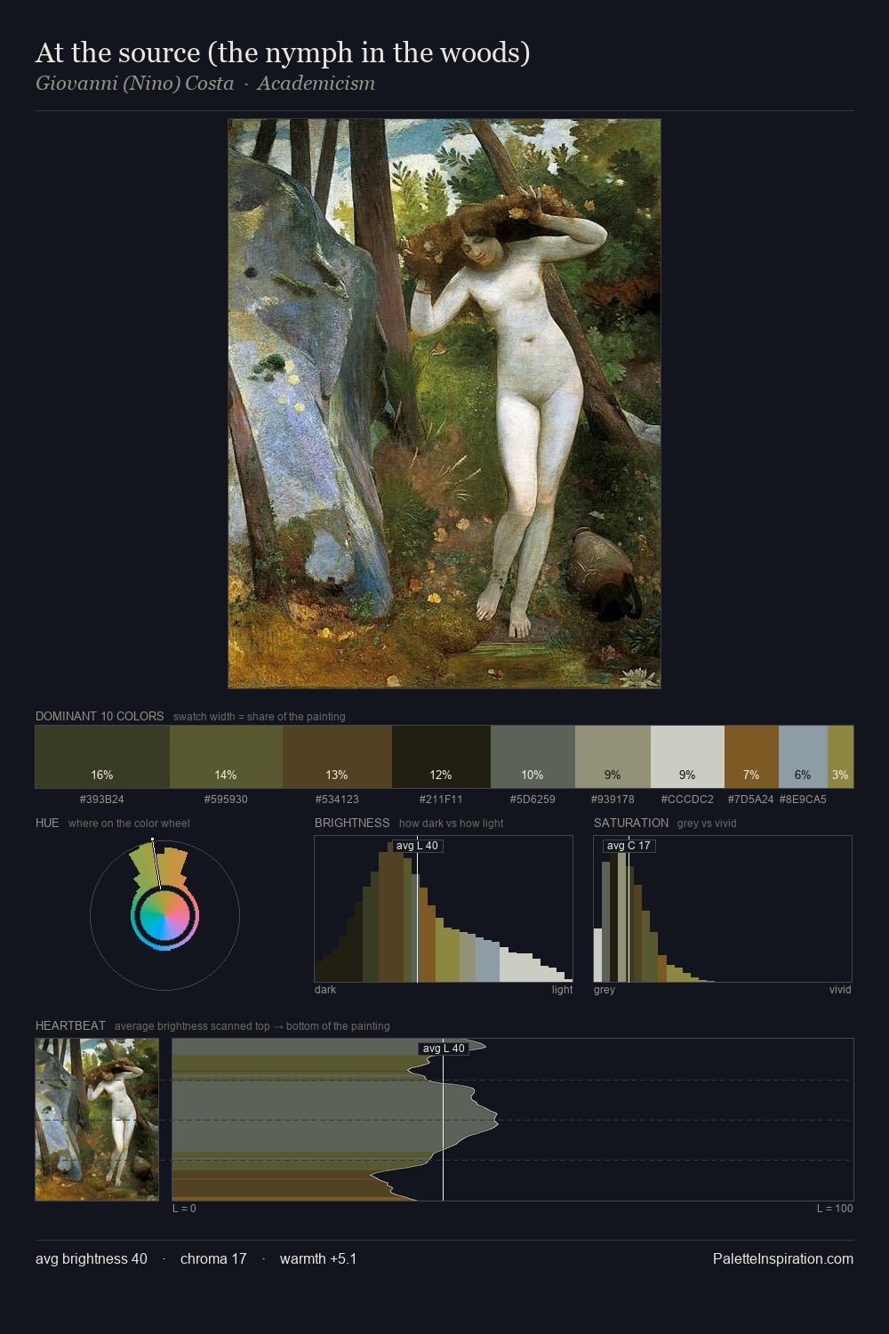
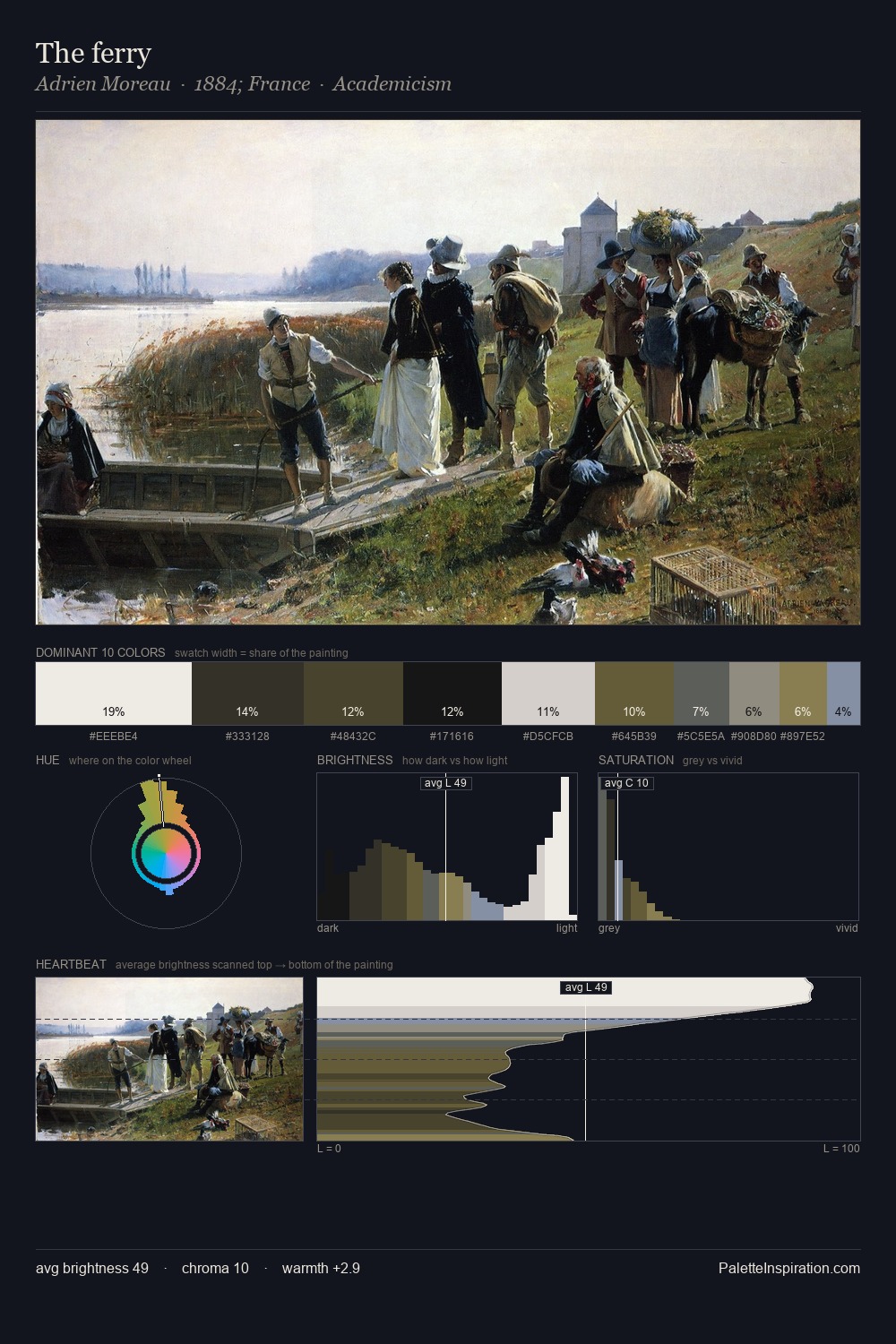
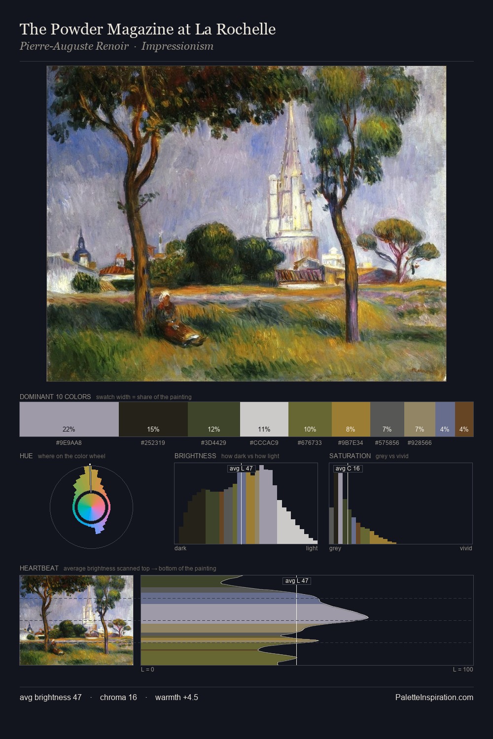
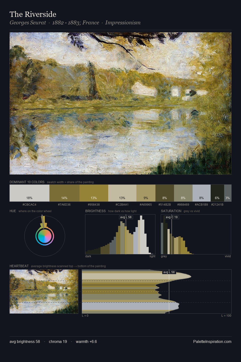
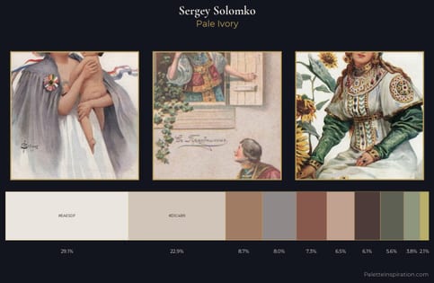
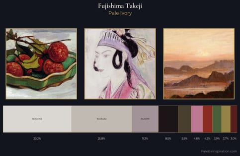
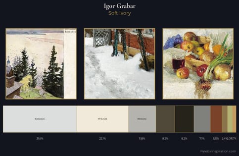
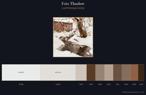
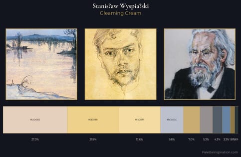
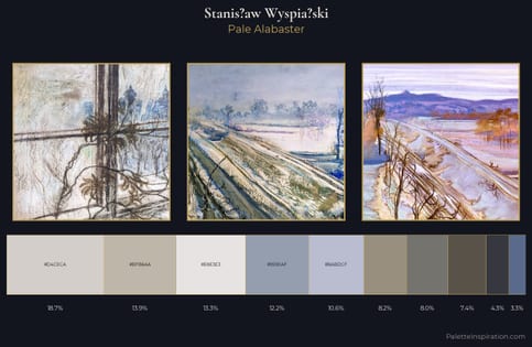
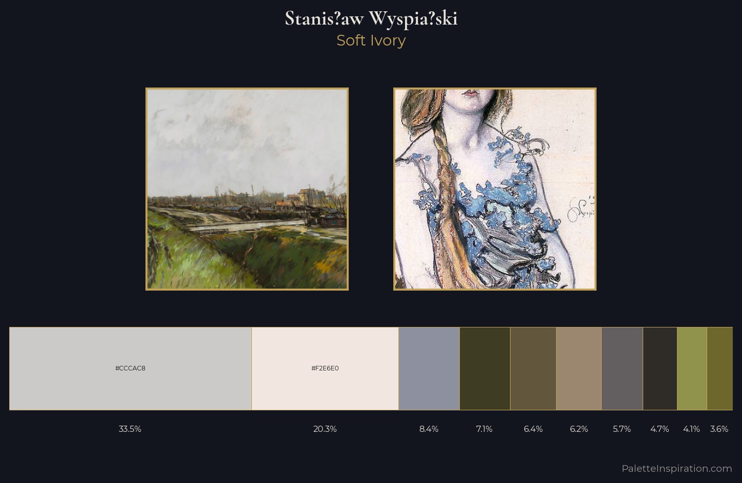
Stanis?aw Wyspia?ski is strongly light-biased - shadow is suggested rather than declared. Yellow, ochre, sienna: warm hues that Stanis?aw Wyspia?ski deploys as the palette's primary energy. All colours lean toward grey, building depth through value rather than colour punch. 33.5% of the palette belongs to #CCCAC8, a concentration that makes it the unmistakable visual centre. The saturated accent, #3E3D24, registers at 7.0% - sparse enough to feel like a deliberate surprise. The value range spans 64 units across the palette, providing the full gamut from deep shadow to near-white and ensuring clear tonal hierarchy. Stanis?aw Wyspia?ski's palette 7 carries its own internal logic while remaining in conversation with the artist's broader colour intelligence.
Example use cases
- florist branding
- event design
- real estate
- jewelry retail
- hospitality branding
I Love This!
Copy, export, or download for your project