Stanisław Wyspiański Palette 2
Pale Alabaster
Pale High-key and low-chroma - delicate, bleached, washed with light.
Alabaster Warm off-white - creamy stone white, luminous and slightly translucent.
Palette Analysis
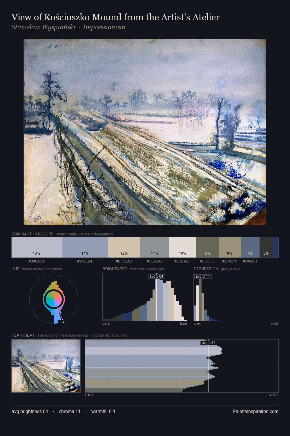
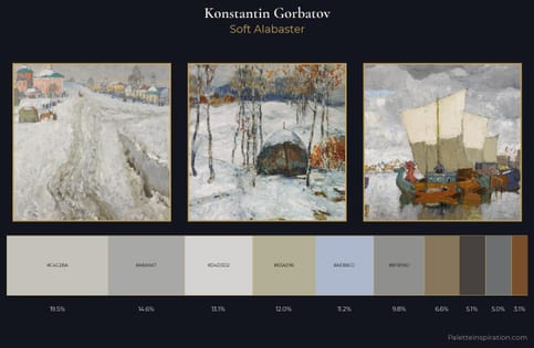
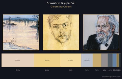
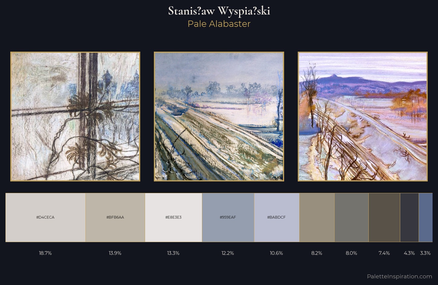
Light floods Stanis?aw Wyspia?ski; the palette keeps values pale and airy across its range. Cool hues prevail: blues, greens, and greys anchor the palette's emotional temperature. Muted throughout, the palette achieves its effects through value and temperature rather than chromatic force. The saturated accent, #596A8D, registers at 3.3% - sparse enough to feel like a deliberate surprise. The full value range is 58 units: broad enough to build convincing three-dimensional form. The palette has the character of outdoor light: cool, mid-bright, with colour rendered faithfully rather than expressively. Stanis?aw Wyspia?ski's palette 2 carries its own internal logic while remaining in conversation with the artist's broader colour intelligence.
Example use cases
- florist branding
- event design
- real estate
- jewelry retail
- hospitality branding
I Love This!
Use This Palette
Copy, export, or download for your project
Copy, export, or download for your project
Copy:
Download:
Share: