Self-portrait Palette 23
Somber Ash
Somber Subdued and serious - low-key, low-chroma, emotionally weighted toward gravity.
Ash Mid cool-gray - the neutral residue of fire, between white and charcoal.

Palette Analysis
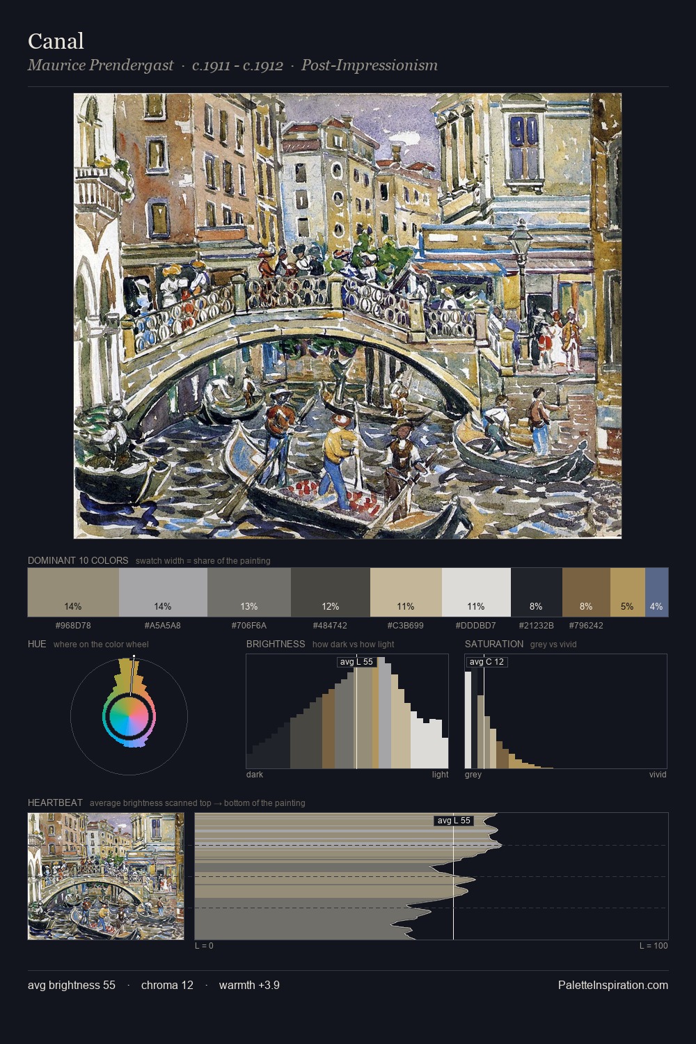
self-portrait distributes its values across the middle register, creating harmony without high contrast. Cool tones set the register here - the blues and greens easily outweigh any warm accents. All colours lean toward grey, building depth through value rather than colour punch. The saturated accent, #C09D62, registers at 1.6% - sparse enough to feel like a deliberate surprise. At 65 units of value range, the palette has the tonal breadth to sustain complex spatial readings. High luminosity and cool temperature suggest the plein-air condition: unfiltered daylight and open sky.
Example use cases
- publishing
- corporate identity
- consumer apps
- hospitality
- design agencies
I Love This!
Use This Palette
Copy, export, or download for your project
Copy, export, or download for your project
Copy:
Download:
Share: