Self-portrait Palette 21
Muted Vermillion
Muted Deliberately desaturated - chroma pulled toward gray, the restraint of tonal painting.
Vermillion Brilliant red-orange - the classic mercury sulfide pigment, vivid and warm.

Palette Analysis
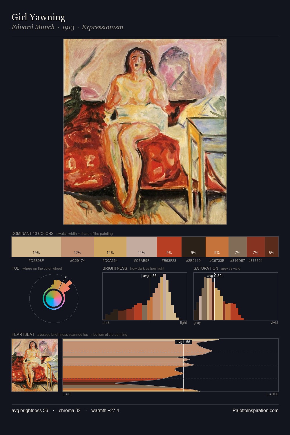
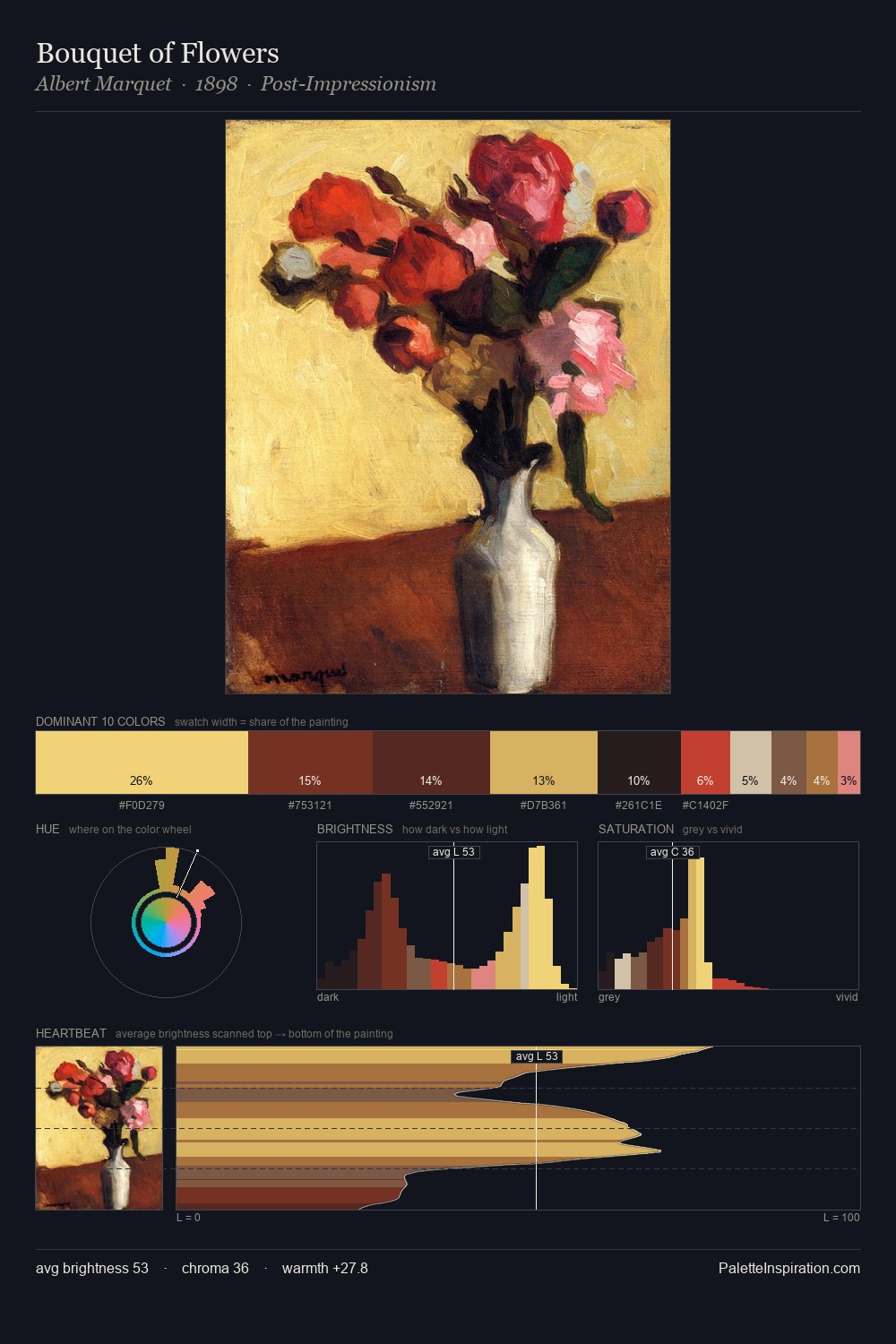
Mid-key values give self-portrait its characteristic quietness - nothing blazes, nothing disappears. Heat pervades this palette; warm chromatic identities outweigh cool ones at almost every weight. Chroma is held at a comfortable level - distinct colours, but no single hue is allowed to overwhelm. The dominant colour, #D3844C, takes 31.5% of the total area, establishing the overall mood before any other hue is introduced. The highest-chroma note - #E9B069 - appears at just 7.2%, deployed as a precision accent against the quieter ground. At 60 units of value range, the palette has the tonal breadth to sustain complex spatial readings.
Example use cases
- publishing
- corporate identity
- consumer apps
- hospitality
- design agencies
I Love This!
Use This Palette
Copy, export, or download for your project
Copy, export, or download for your project
Copy:
Download:
Share: