Sanyu Palette 1
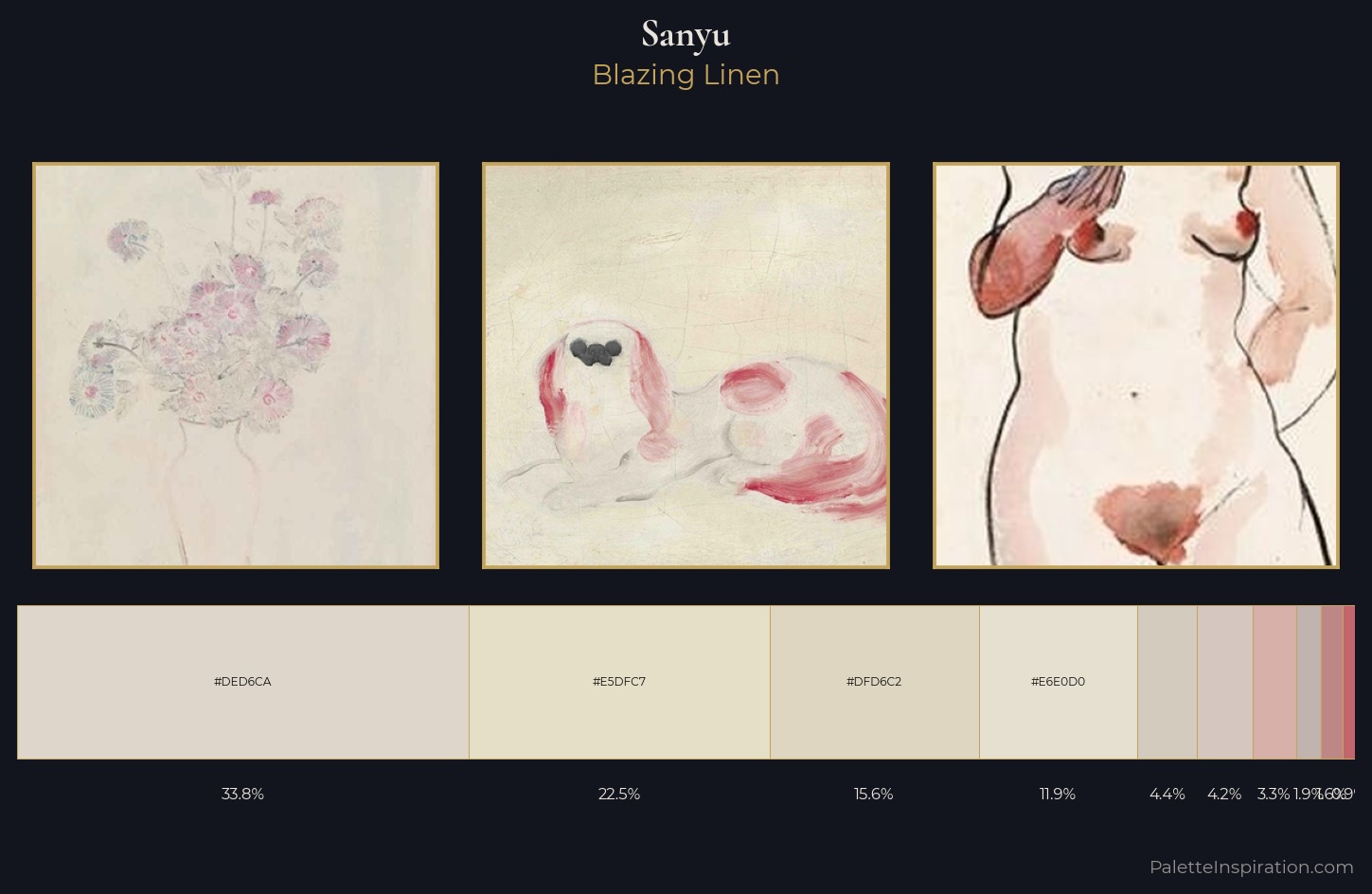
Palette Analysis
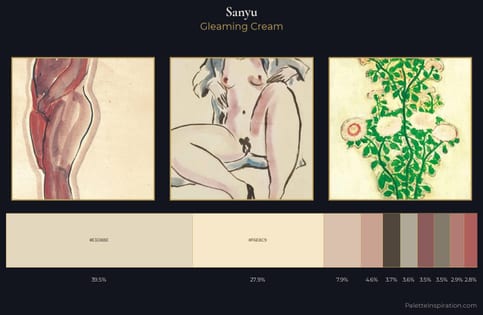
The high-key values of Sanyu give it an effulgent, almost bleached quality. Blues and teal-greys govern the palette, lending it an aquatic or atmospheric quality. Chroma is kept low across all colours, producing the soft, enveloping quality that characterises tonal painting. The dominant colour, #DED6CA, takes 33.8% of the total area, establishing the overall mood before any other hue is introduced. Only 0.9% is devoted to #C3656D, yet that small allocation delivers the palette's entire chromatic tension. The value range of 29 units sits in the comfortable middle: enough depth, enough light, neither extreme. The mid-to-high key, cool bias, and moderate chroma point to outdoor observation - sky and diffused daylight as the dominant light source. Palette 1 sits within the larger chromatic argument that Sanyu's complete body of work advances.
Example use cases
- ceramics & pottery
- boutique hospitality
- menswear
- heritage food brands
- craft & artisan brands
I Love This!
Copy, export, or download for your project