Karl Nordström Palette 1
Luminous Linen
Luminous Self-illuminated feeling - high-key values with an inner glow quality.
Linen Warm light neutral - the color of natural linen, slightly warm beige.
Palette Analysis
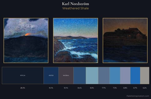
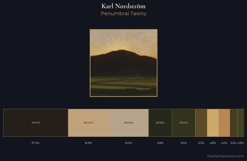
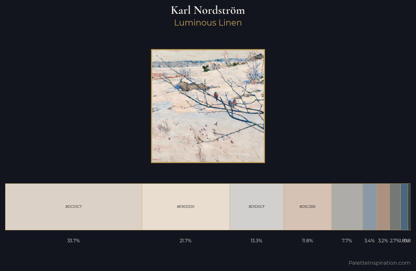
Karl Nordström is high-key - luminous, open, and weighted toward light. Warm hues command this palette; Karl Nordström favours the reds, oranges, and yellows of firelight and earth. All colours lean toward grey, building depth through value rather than colour punch. At 33.7%, #DCD1C7 functions less as a colour accent and more as a complete atmospheric environment. #4A6782 functions as the palette's exclamation mark: highest chroma, lowest percentage (1.8%). Spanning 52 units on the value axis, the palette achieves the balance between tonal flatness and fragmentation. Palette 1 sits within the larger chromatic argument that Karl Nordström's complete body of work advances.
Example use cases
- florist branding
- event design
- real estate
- jewelry retail
- hospitality branding
I Love This!
Use This Palette
Copy, export, or download for your project
Copy, export, or download for your project
Copy:
Download:
Share: