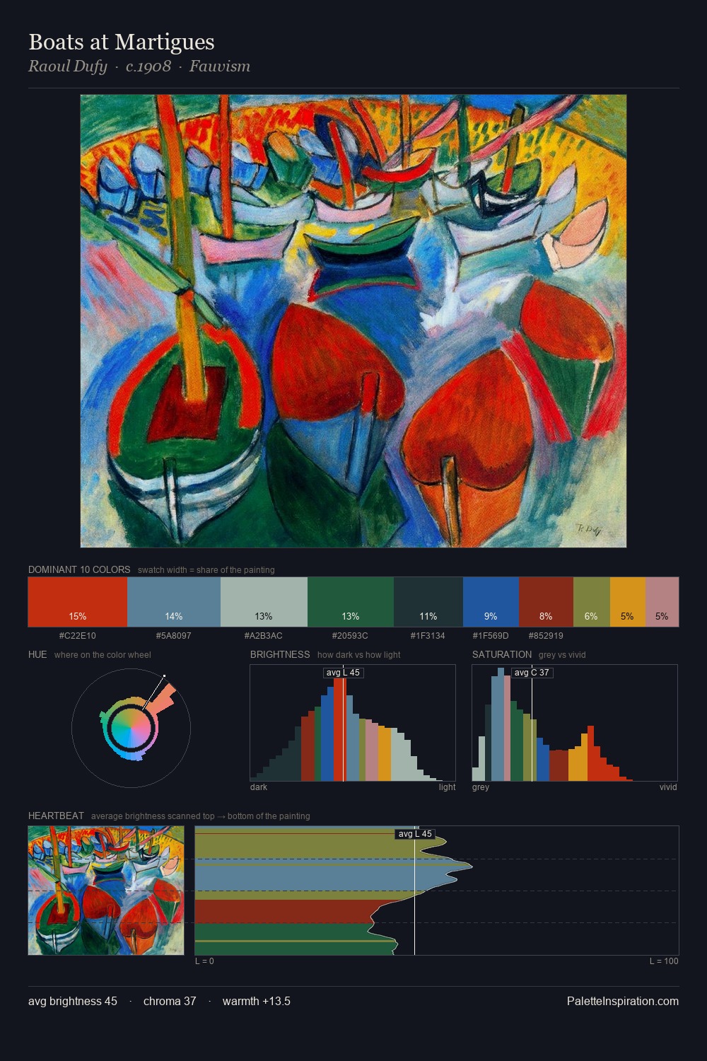
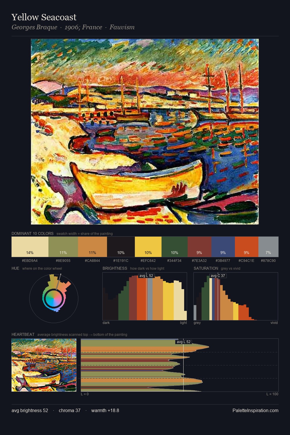
Sandor Bortnyik Palette 5

Palette Analysis
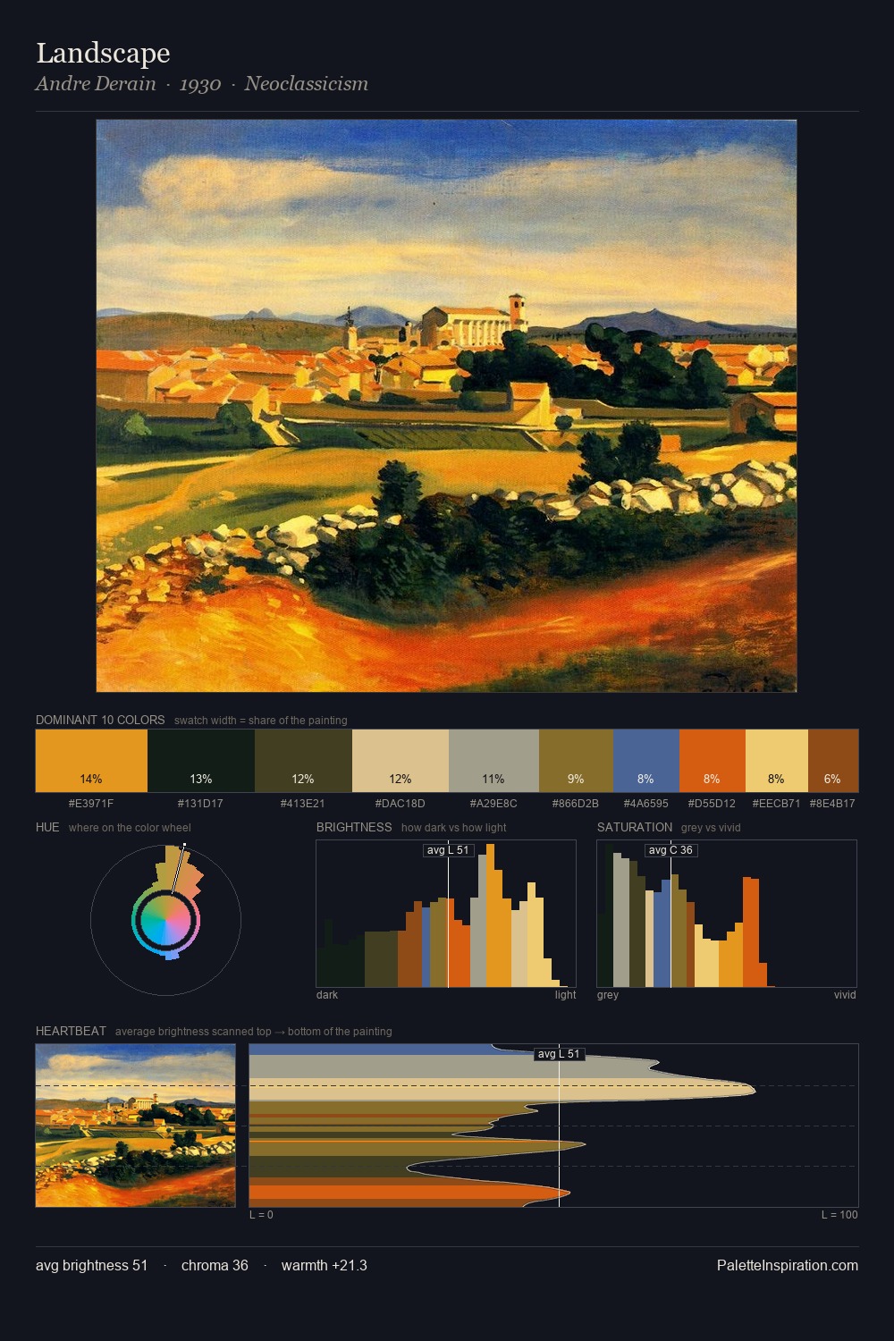
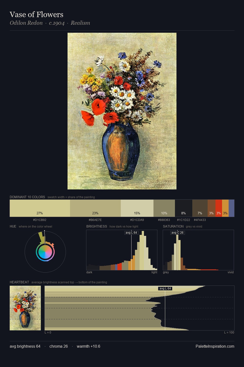
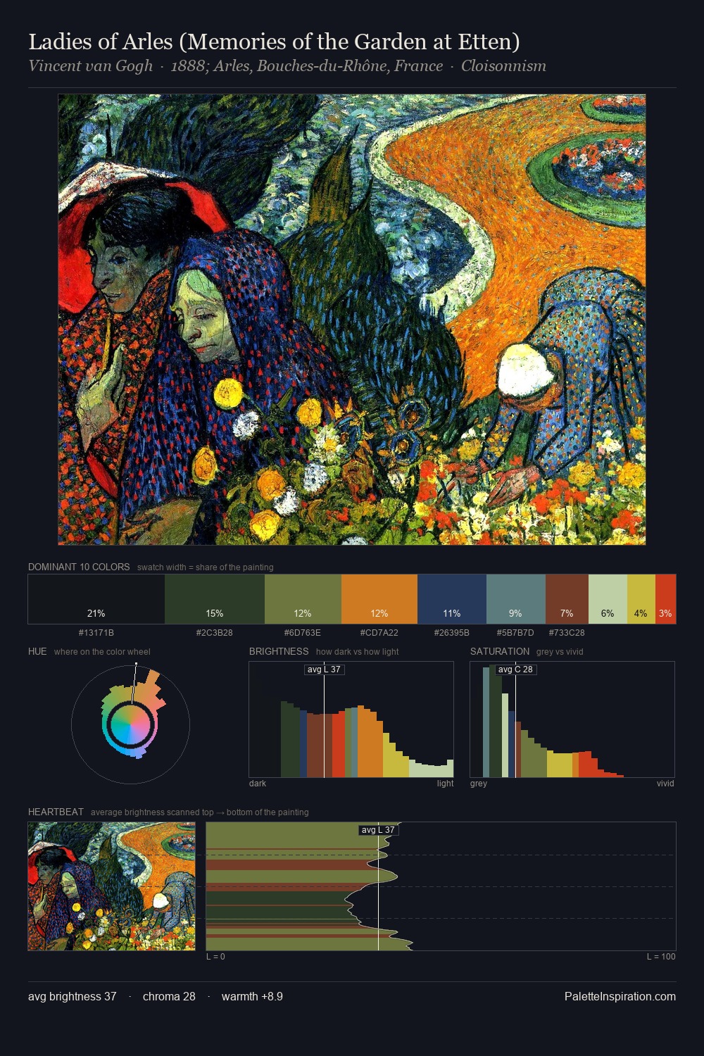
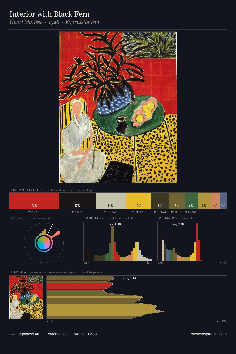
Values in Sandor Bortnyik tilt decisively toward white, giving the palette its luminous character. Sandor Bortnyik builds on cool foundations: the palette favours the blue-cyan-green arc. Chroma is moderate: colours carry enough saturation to be read as colour, but the palette stops well short of garish intensity. A single dominant - #F8F2D5 at 45.2% - sets the character of the whole composition. The saturated accent, #F3CB43, registers at 6.0% - sparse enough to feel like a deliberate surprise. A value spread of 81 units gives the palette both depth and air - shadows are genuinely dark, lights genuinely light. The palette has the character of outdoor light: cool, mid-bright, with colour rendered faithfully rather than expressively. In the context of Sandor Bortnyik's full range of palettes, group 5 represents one movement in an ongoing chromatic dialogue.
Example use cases
- publishing
- corporate identity
- consumer apps
- hospitality
- design agencies
I Love This!
Copy, export, or download for your project