Samuel Mutzner Palette 3

Palette Analysis
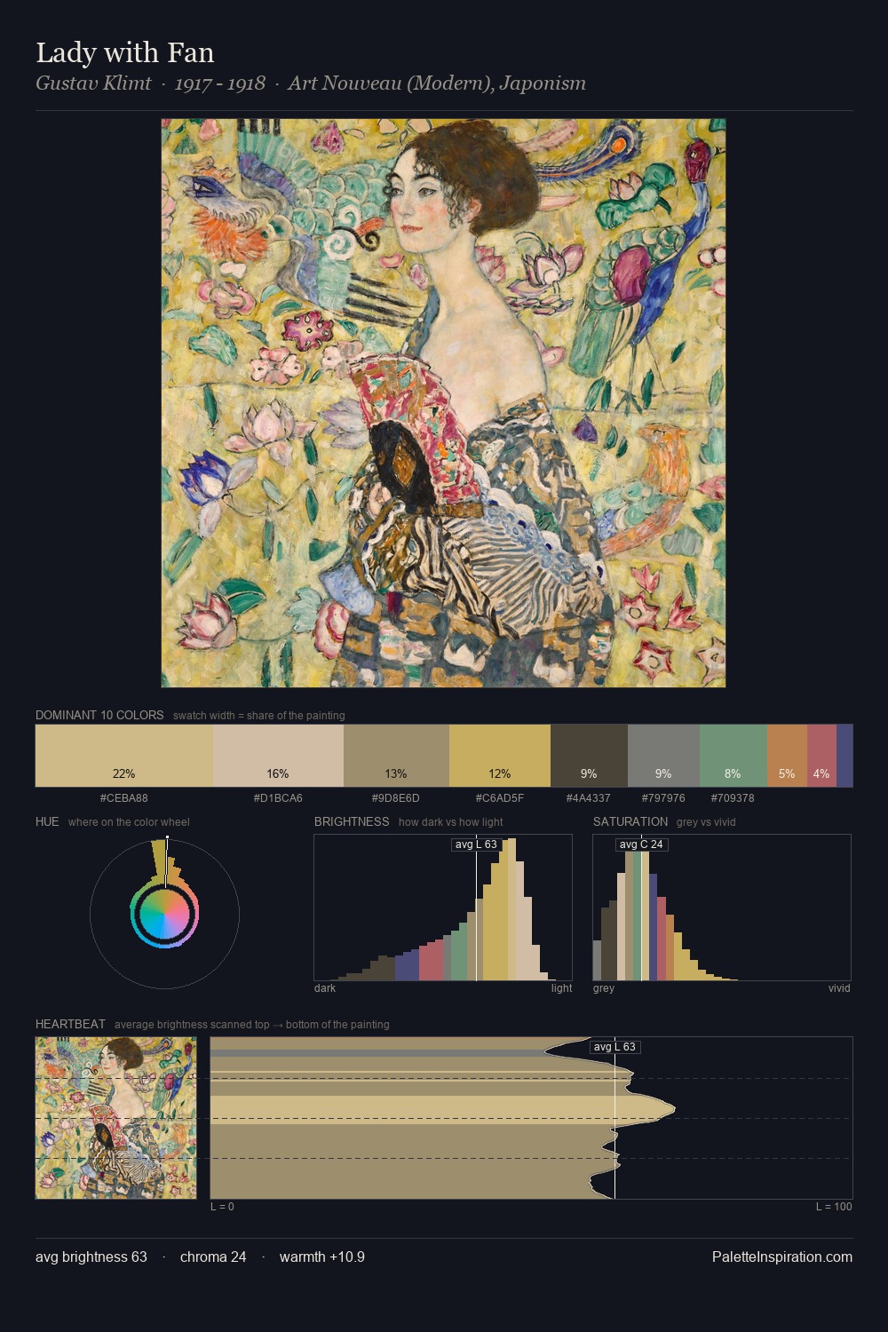
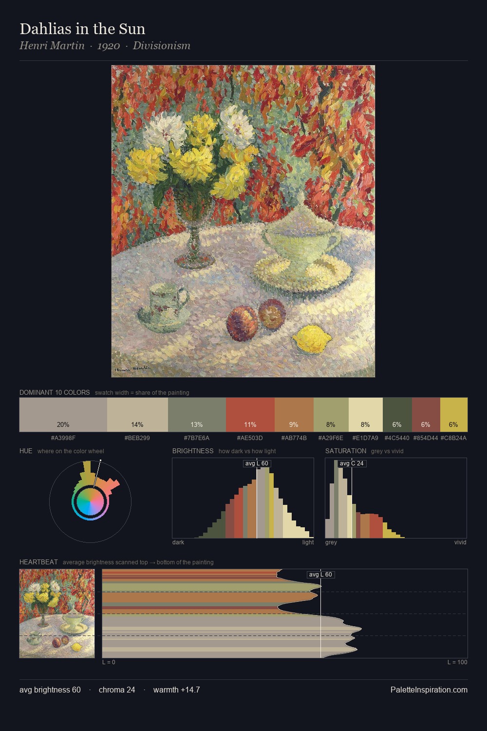
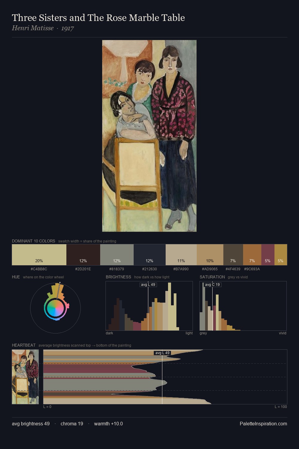
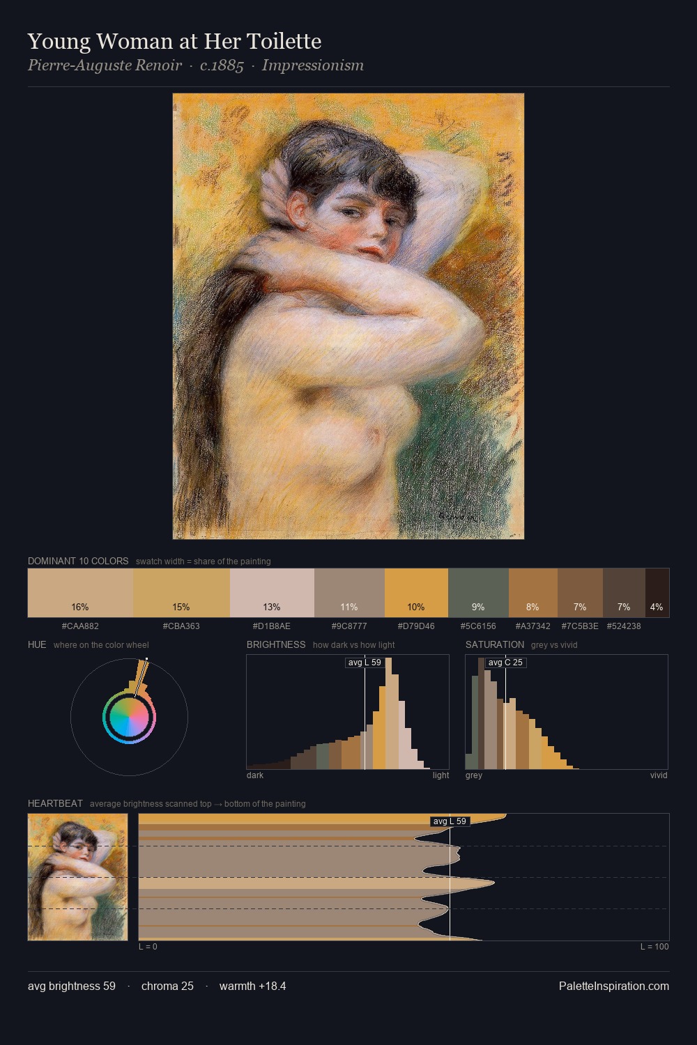
Samuel Mutzner is high in key: pale, luminous, and filled with optical air. A distinctly cool atmosphere runs through this palette: sky, water, and mist given colour form. Every colour is desaturated; the palette proceeds through near-neutrals and gently-coloured greys. Samuel Mutzner gives 27.3% of the composition to a single #CFC5B4 - a decisive chromatic anchor. Only 3.1% is devoted to #88524D, yet that small allocation delivers the palette's entire chromatic tension. At 44 units across the value scale, the palette keeps contrast readable without letting it dominate. The mid-to-high key, cool bias, and moderate chroma point to outdoor observation - sky and diffused daylight as the dominant light source. Samuel Mutzner's palette 3 carries its own internal logic while remaining in conversation with the artist's broader colour intelligence.
Example use cases
- ceramics & pottery
- boutique hospitality
- menswear
- heritage food brands
- craft & artisan brands
I Love This!
Copy, export, or download for your project