Samuel Mutzner Palette 2
Pale Ivory
Pale High-key and low-chroma - delicate, bleached, washed with light.
Ivory Warm creamy white - the color of natural ivory, warmer than pure white.

Palette Analysis
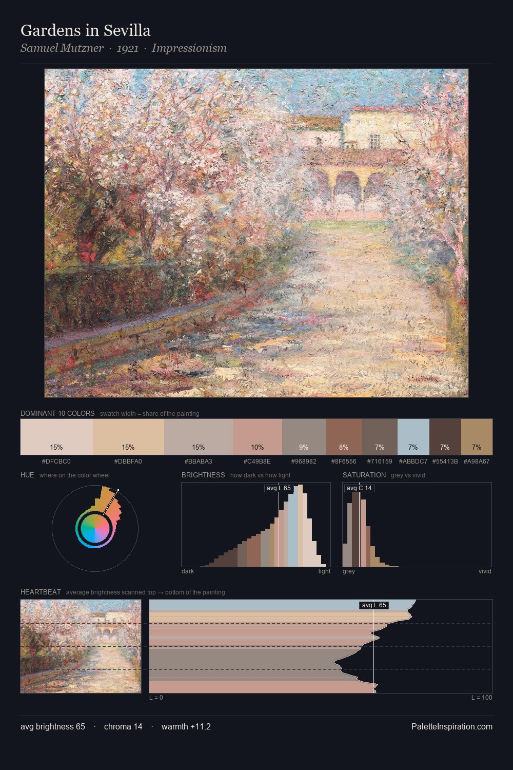
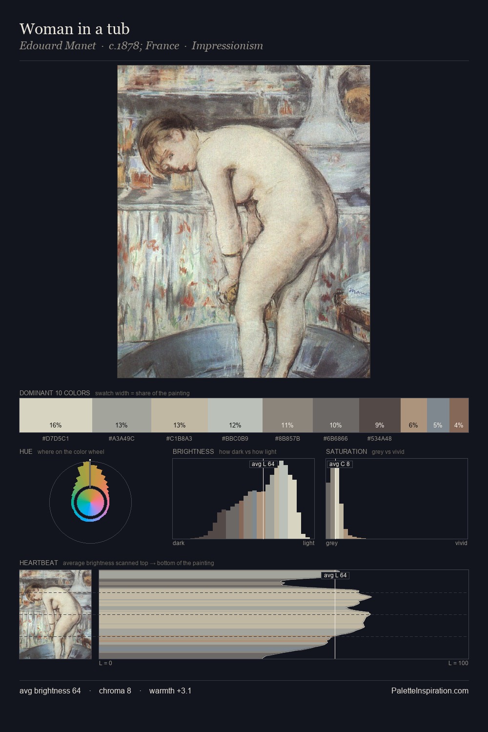
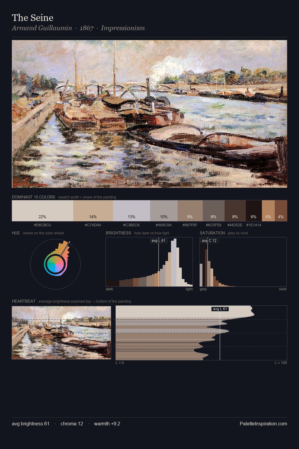
Samuel Mutzner is high in key: pale, luminous, and filled with optical air. Warmth dominates - the palette of Samuel Mutzner leans heavily on the yellow-orange-red arc of the colour wheel. Every colour is desaturated; the palette proceeds through near-neutrals and gently-coloured greys. Only 8.4% is devoted to #7B594F, yet that small allocation delivers the palette's entire chromatic tension. 53 units of value spread create a palette that is varied but unified - contrast in the service of harmony. Palette 2 sits within the larger chromatic argument that Samuel Mutzner's complete body of work advances.
Example use cases
- archival print
- university identity
- rare books
- cultural institutions
- nonprofit identity
I Love This!
Use This Palette
Copy, export, or download for your project
Copy, export, or download for your project
Copy:
Download:
Share: