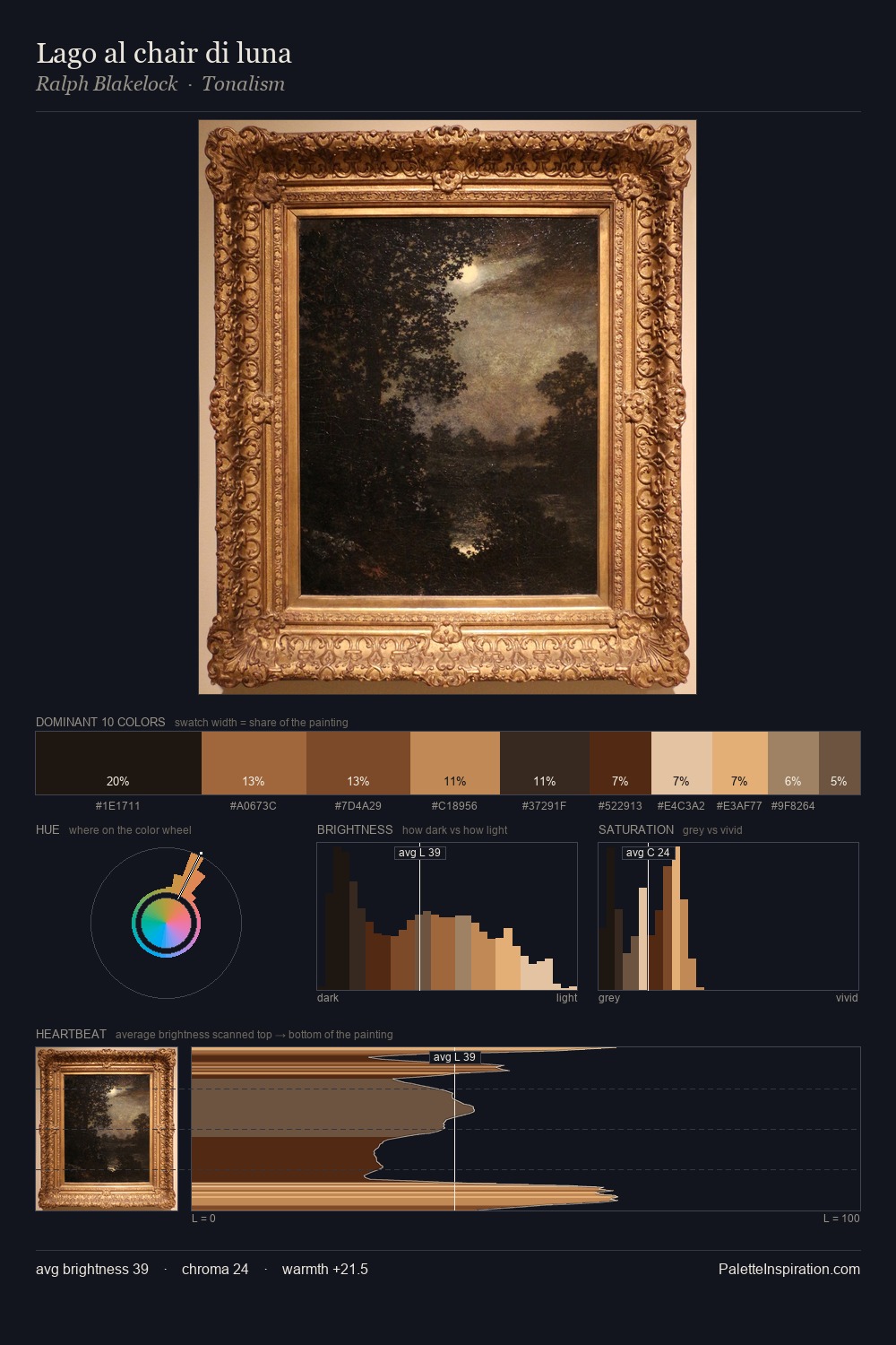
Samuel Morse Palette 2
Muted Caramel
Muted Deliberately desaturated - chroma pulled toward gray, the restraint of tonal painting.
Caramel Warm mid-brown - the color of cooked sugar, smooth and amber-toned.

Palette Analysis
Values in Samuel Morse rest in the mid-range - neither dramatically lit nor steeped in shadow. Temperature reads distinctly warm: the reds and earth tones from Samuel Morse carry the compositional weight. Mid-range chroma keeps the palette grounded - colourful but not strident. The highest-chroma note - #7A391C - appears at just 6.7%, deployed as a precision accent against the quieter ground. From deepest dark to palest light, the palette traverses 59 units of the value scale - a span that creates natural depth. This is palette 2 of Samuel Morse's sequence - a single chapter in a chromatic story told across many works.
Example use cases
- professional services
- specialty retail
- photography agencies
- tech products
- art galleries
I Love This!
Use This Palette
Copy, export, or download for your project
Copy, export, or download for your project
Copy:
Download:
Share: