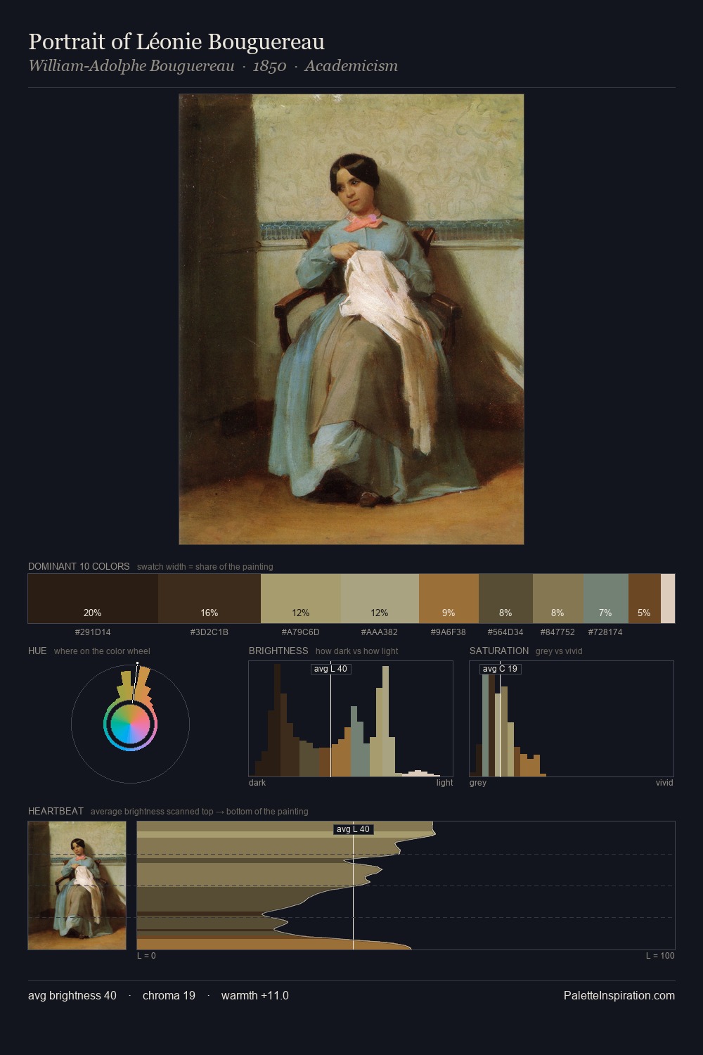
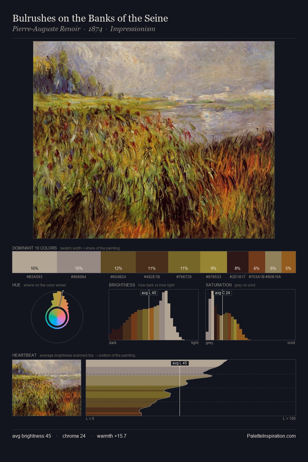
Rosa Bonheur Palette 7

Palette Analysis
The value structure of Rosa Bonheur is mid-key: quiet, controlled, and cohesive. Rosa Bonheur tilts toward cool - blues and silver-greys carry the structural weight. Chroma is held at a comfortable level - distinct colours, but no single hue is allowed to overwhelm. The most saturated colour, #A36B31, is reserved to 2.8% of the surface, where it acts as a focal punctuation. A value spread of 57 units gives the palette both depth and air - shadows are genuinely dark, lights genuinely light. The mid-to-high key, cool bias, and moderate chroma point to outdoor observation - sky and diffused daylight as the dominant light source. Rosa Bonheur's palette 7 carries its own internal logic while remaining in conversation with the artist's broader colour intelligence.
Example use cases
- ceramics & pottery
- boutique hospitality
- menswear
- heritage food brands
- craft & artisan brands
I Love This!
Copy, export, or download for your project