Rosa Bonheur Palette 6

Palette Analysis
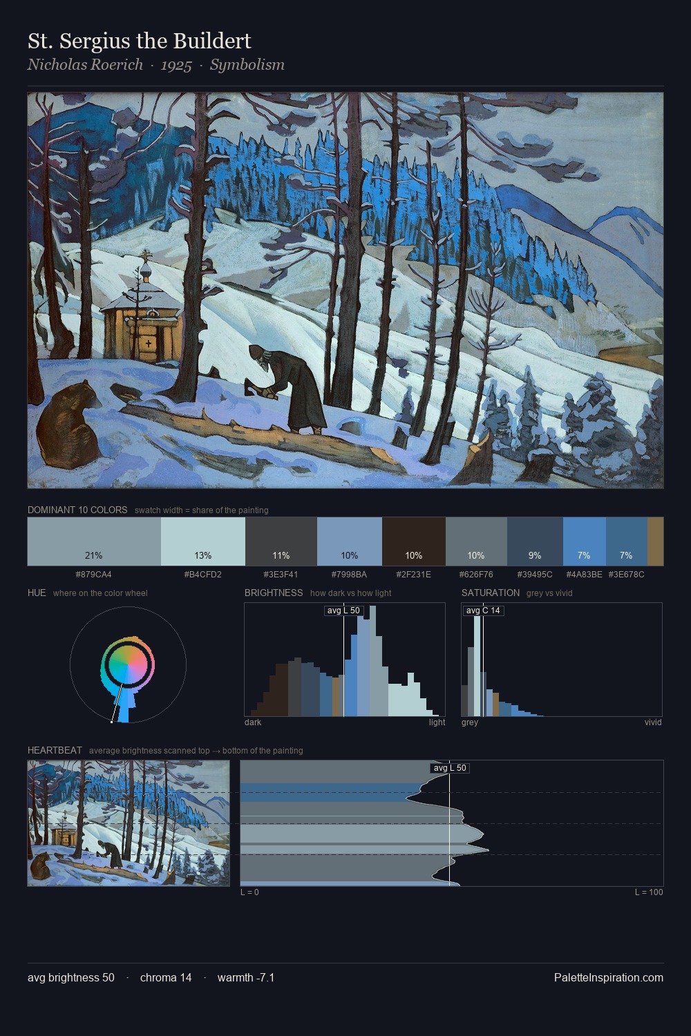
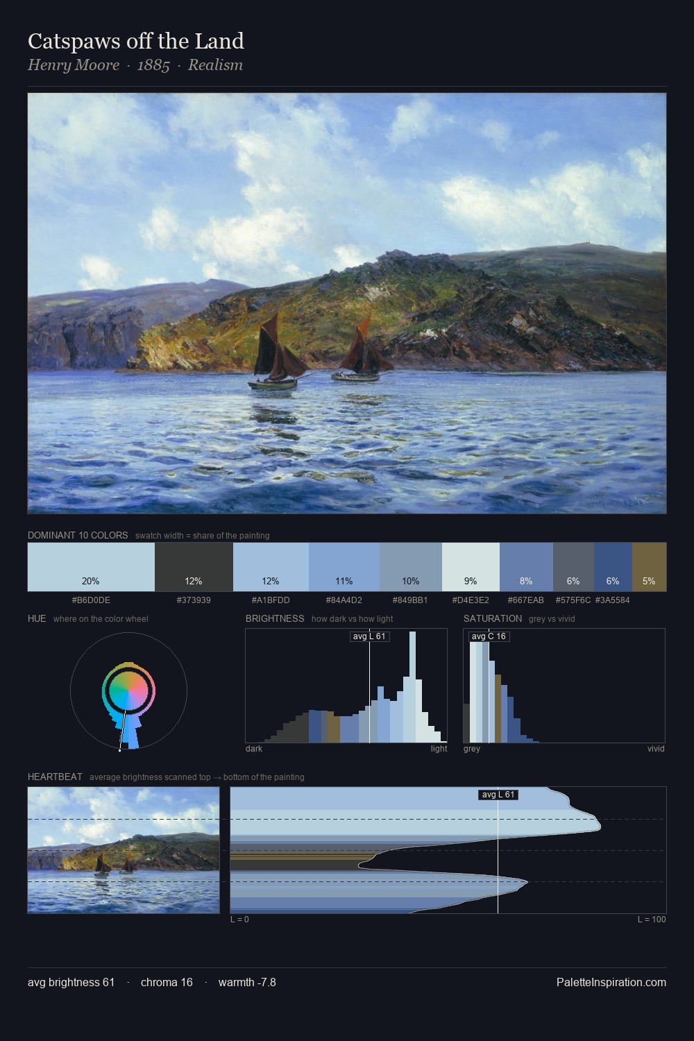
Rosa Bonheur occupies the comfortable middle of the value scale, avoiding both extremes to hold the eye in a sustained middle grey. Cool hues prevail: blues, greens, and greys anchor the palette's emotional temperature. Chroma is kept low across all colours, producing the soft, enveloping quality that characterises tonal painting. The saturated accent, #3C729C, registers at 12.4% - sparse enough to feel like a deliberate surprise. 63 units of value range underpin the palette's structural clarity: the eye always knows where light falls. High luminosity and cool temperature suggest the plein-air condition: unfiltered daylight and open sky. This is palette 6 of Rosa Bonheur's sequence - a single chapter in a chromatic story told across many works.
Example use cases
- legal services
- corporate identity
- industrial design
- professional services
- fintech
I Love This!
Copy, export, or download for your project