Rodolfo Amoedo Palette 2
Muted Parchment
Muted Deliberately desaturated - chroma pulled toward gray, the restraint of tonal painting.
Parchment Aged warm neutral - the color of old manuscript parchment, tan and slightly yellowed.

Palette Analysis
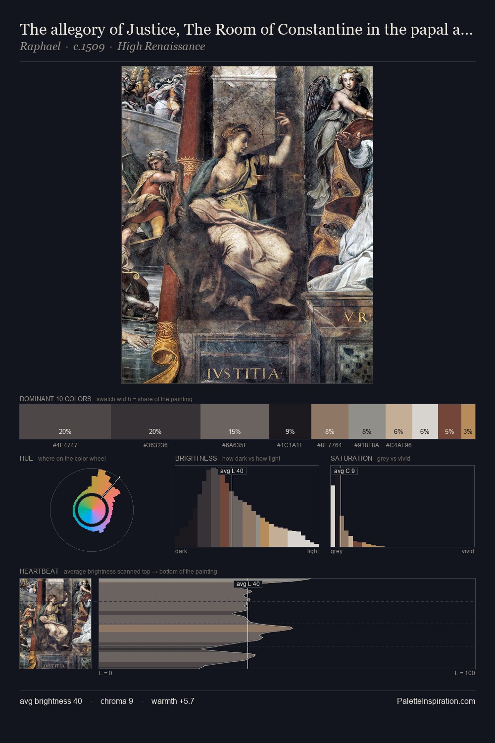
Rodolfo Amoedo distributes its values across the middle register, creating harmony without high contrast. Warmth dominates - the palette of Rodolfo Amoedo leans heavily on the yellow-orange-red arc of the colour wheel. All colours lean toward grey, building depth through value rather than colour punch. The most saturated colour, #9F7D6F, is reserved to 8.1% of the surface, where it acts as a focal punctuation. Value range is moderate at 51 units - enough contrast for legibility, not so much as to fragment the tonal unity. In the context of Rodolfo Amoedo's full range of palettes, group 2 represents one movement in an ongoing chromatic dialogue.
Example use cases
- exhibition design
- foundation branding
- estate management
- art education
- museums & galleries
I Love This!
Use This Palette
Copy, export, or download for your project
Copy, export, or download for your project
Copy:
Download:
Share: