Henri Joseph van Blarenberghe Palette 2

Palette Analysis
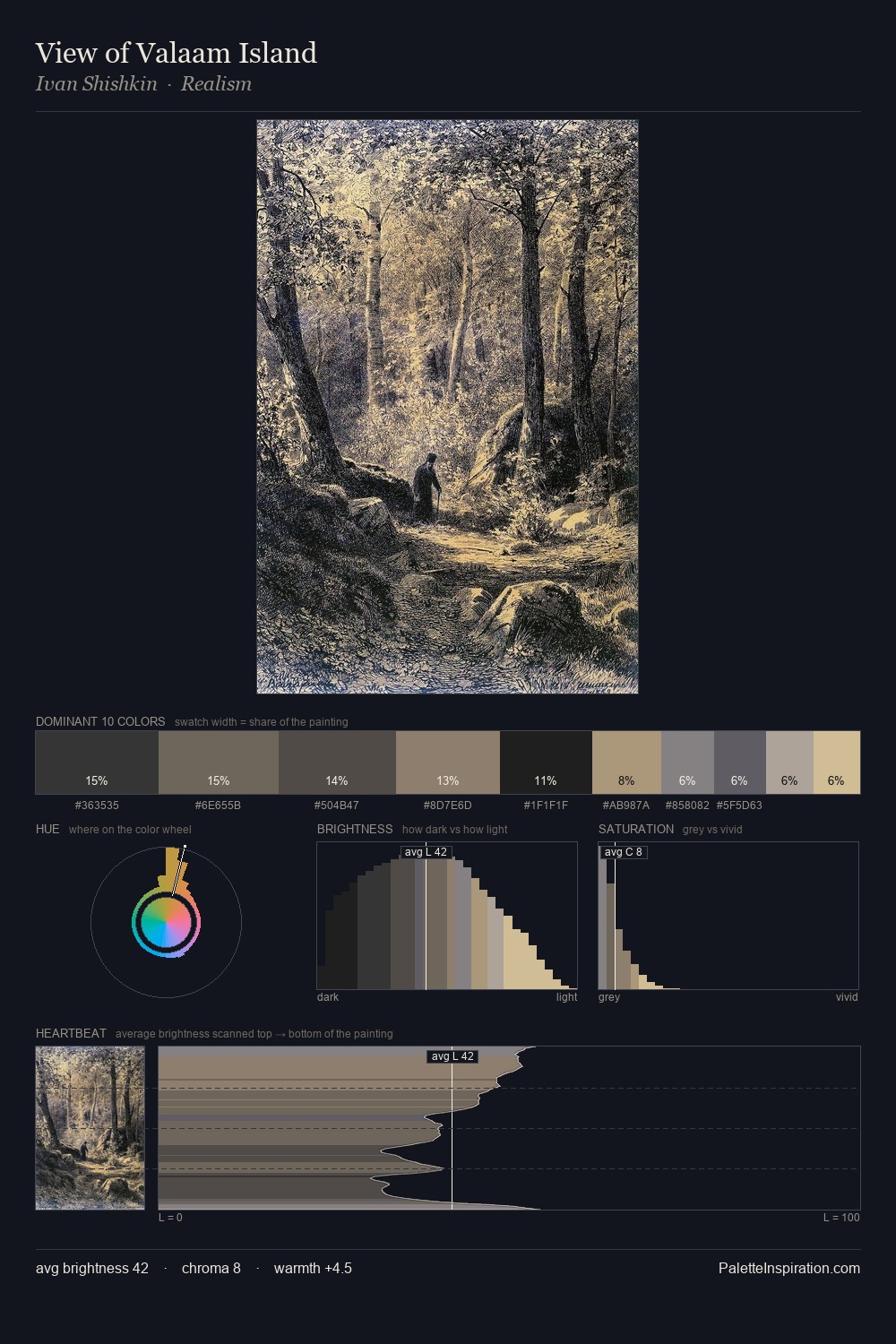
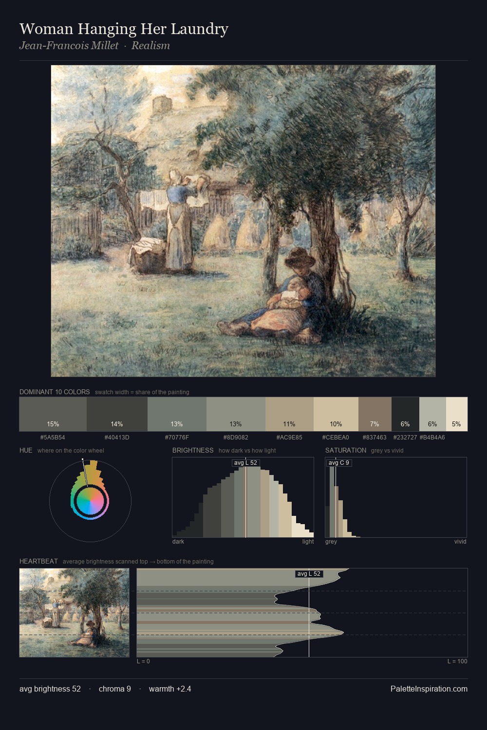
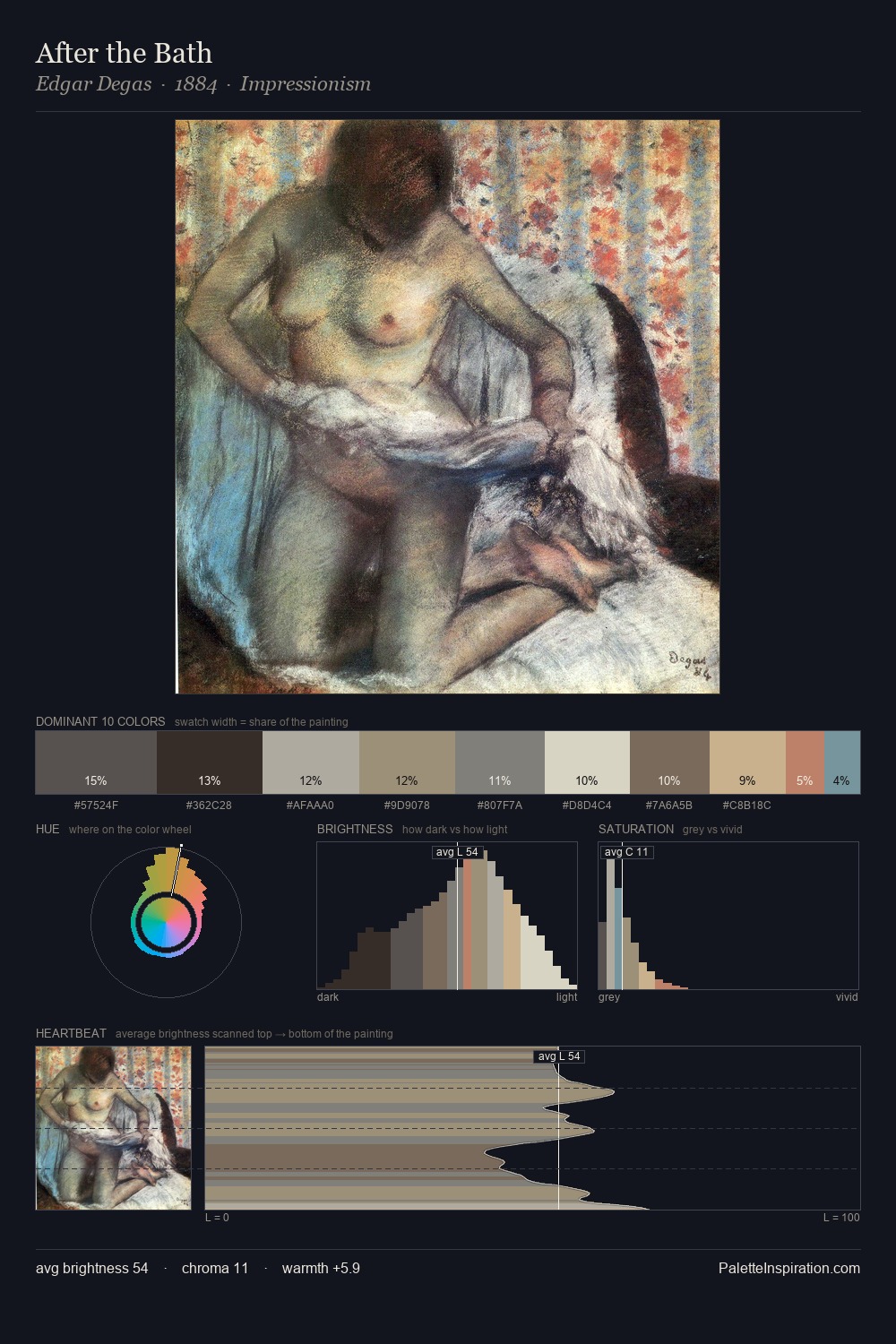
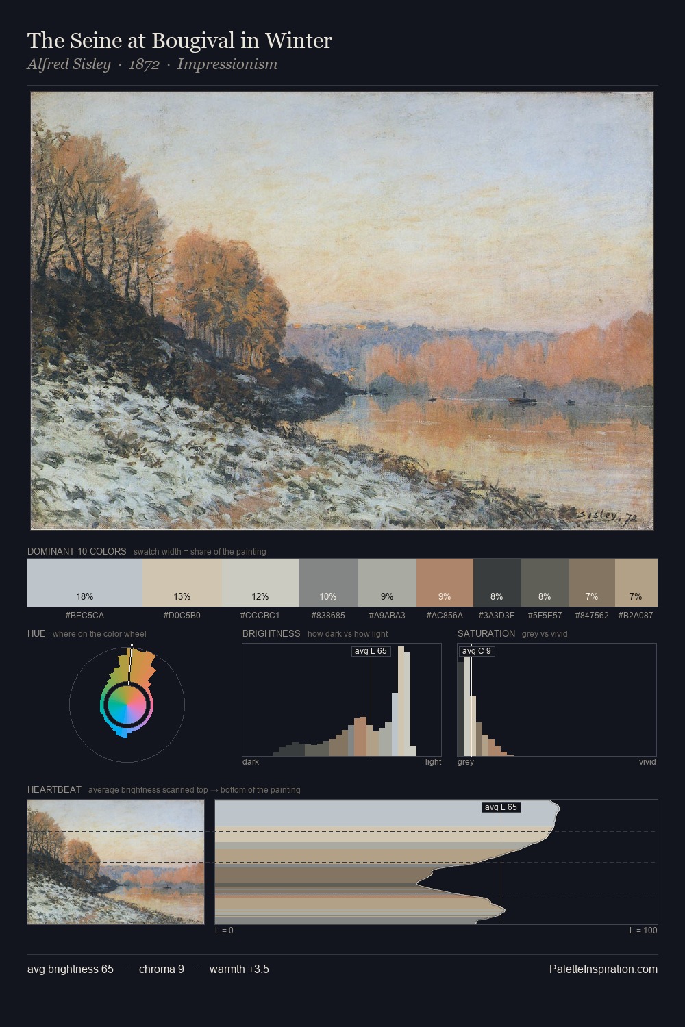
Mid-key values give Henri Joseph van Blarenberghe its characteristic quietness - nothing blazes, nothing disappears. Blues and teal-greys govern the palette, lending it an aquatic or atmospheric quality. Muted throughout, the palette achieves its effects through value and temperature rather than chromatic force. The most saturated colour, #BAA382, is reserved to 5.2% of the surface, where it acts as a focal punctuation. At 48 units across the value scale, the palette keeps contrast readable without letting it dominate. The mid-to-high key, cool bias, and moderate chroma point to outdoor observation - sky and diffused daylight as the dominant light source. Henri Joseph van Blarenberghe's palette 2 carries its own internal logic while remaining in conversation with the artist's broader colour intelligence.
Example use cases
- exhibition design
- foundation branding
- estate management
- art education
- museums & galleries
I Love This!
Copy, export, or download for your project