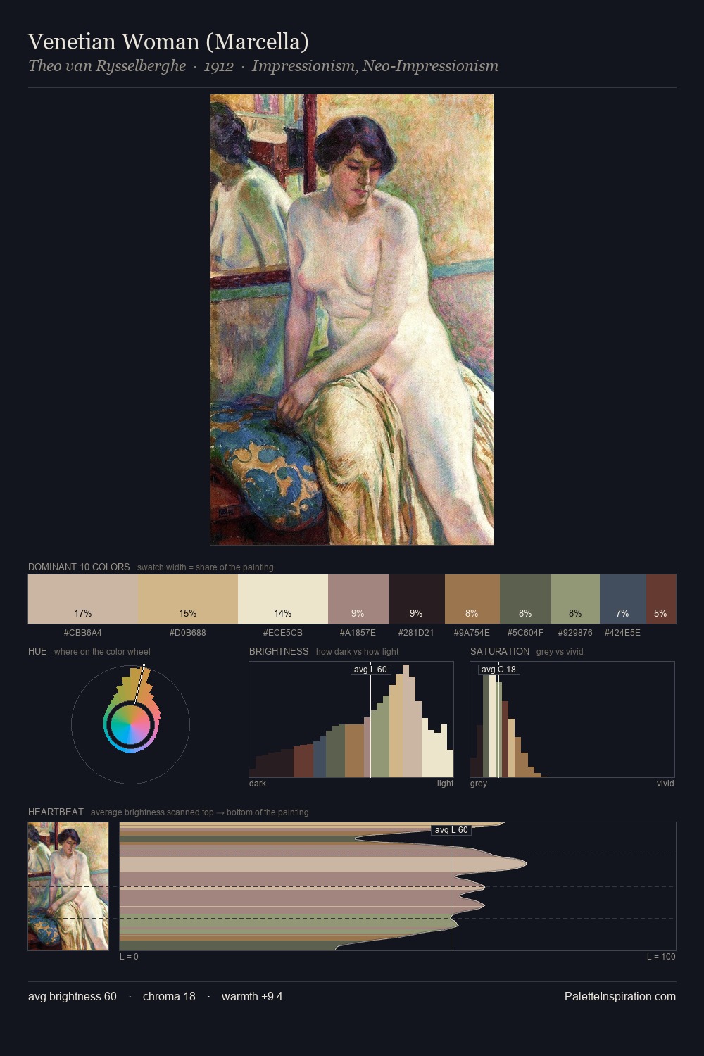
Robert Henri Palette 3

Palette Analysis
Robert Henri distributes its values across the middle register, creating harmony without high contrast. Cool tones set the register here - the blues and greens easily outweigh any warm accents. All colours lean toward grey, building depth through value rather than colour punch. #A5834E delivers the chromatic peak at only 6.9% - a small shot of colour with outsized visual impact. A value spread of 60 units gives the palette both depth and air - shadows are genuinely dark, lights genuinely light. The palette has the character of outdoor light: cool, mid-bright, with colour rendered faithfully rather than expressively. Robert Henri's palette 3 carries its own internal logic while remaining in conversation with the artist's broader colour intelligence.
Example use cases
- exhibition design
- foundation branding
- estate management
- art education
- museums & galleries
I Love This!
Copy, export, or download for your project