Robert Henri Palette 2

Palette Analysis
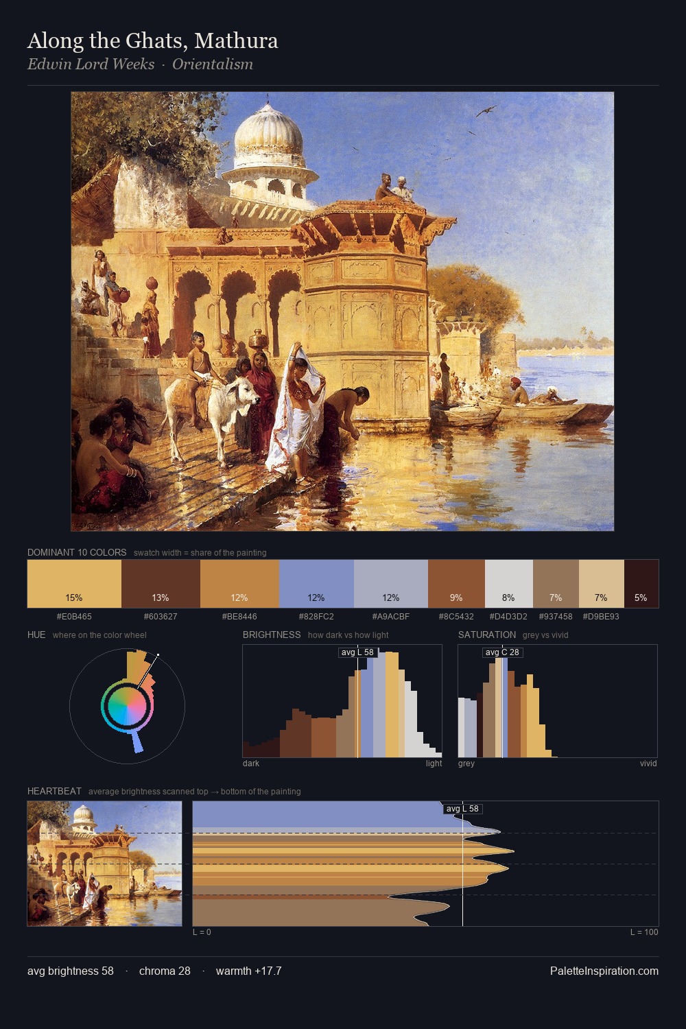
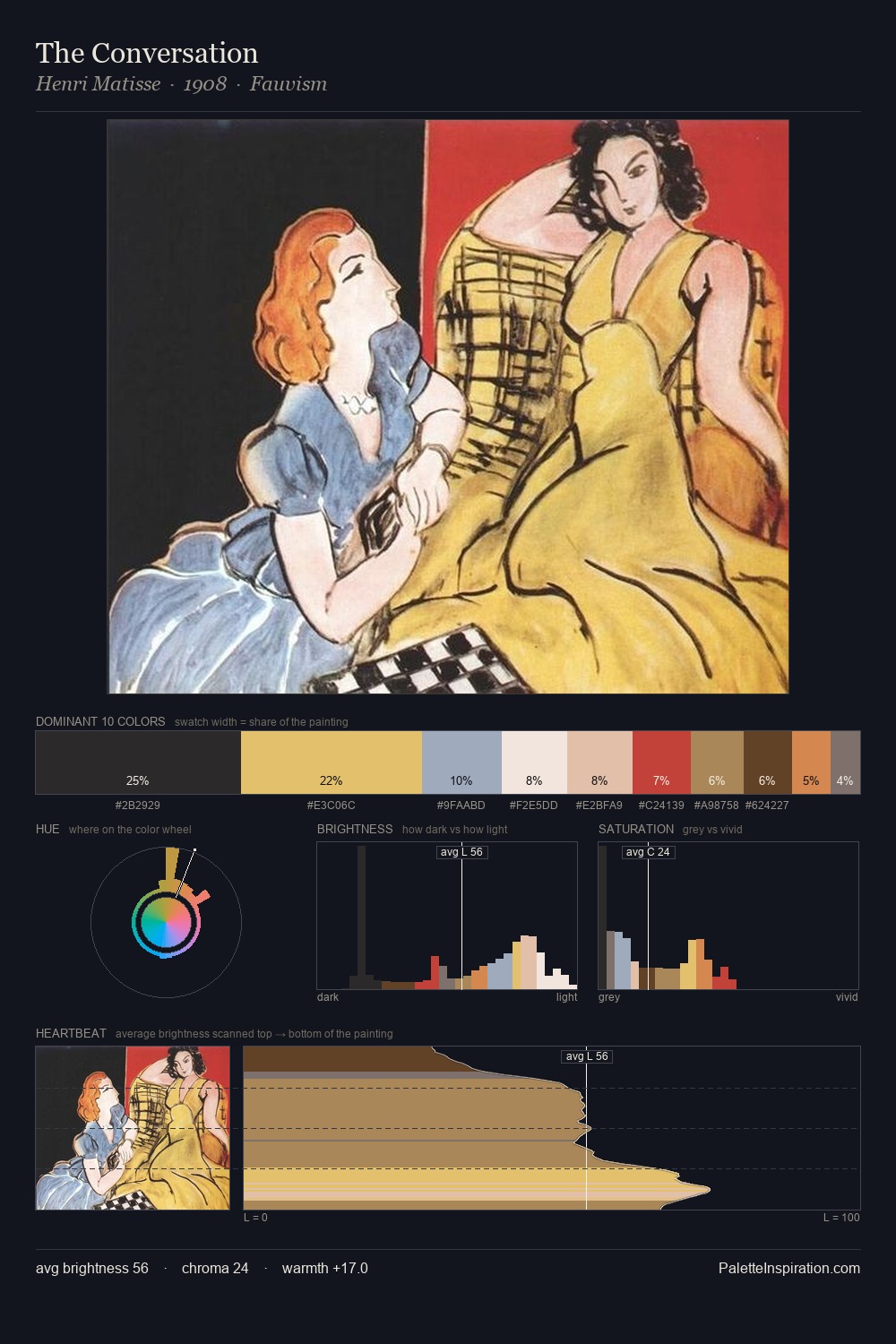
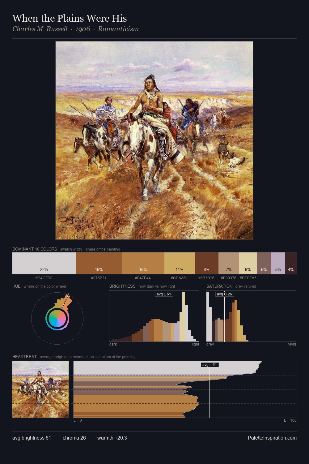
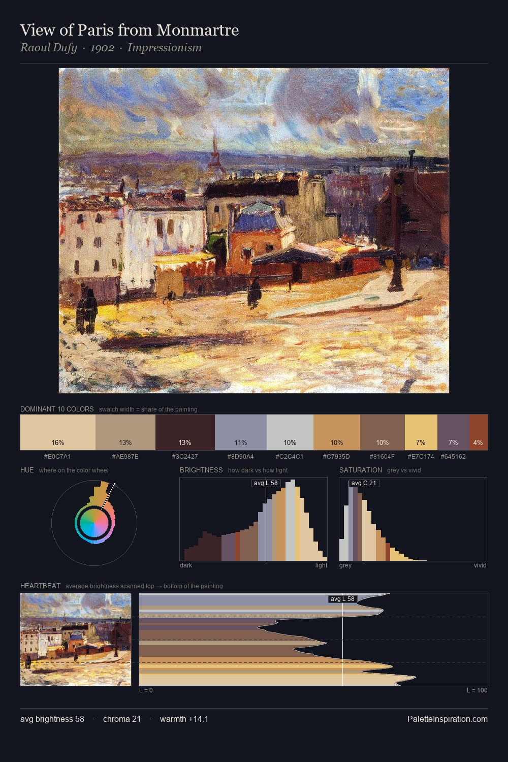
Robert Henri is high-key - luminous, open, and weighted toward light. Robert Henri keeps warm and cool in parity, a balance that lends the work a perceptual shimmer. Chroma is held at a comfortable level - distinct colours, but no single hue is allowed to overwhelm. #645135 delivers the chromatic peak at only 8.2% - a small shot of colour with outsized visual impact. The value range spans 65 units across the palette, providing the full gamut from deep shadow to near-white and ensuring clear tonal hierarchy. The palette reads as an Impressionist one - light-biased, chromatically direct, and built on temperature contrast rather than value opposition. Palette 2 sits within the larger chromatic argument that Robert Henri's complete body of work advances.
Example use cases
- ceramics & pottery
- boutique hospitality
- menswear
- heritage food brands
- craft & artisan brands
I Love This!
Copy, export, or download for your project