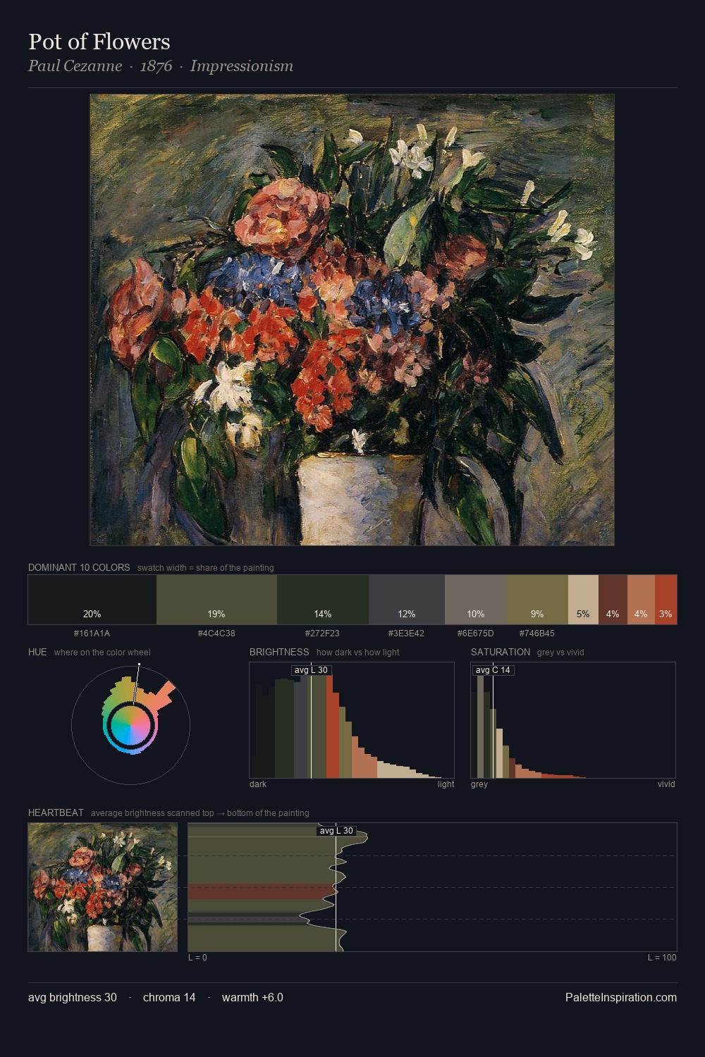
Rik Wouters Palette 5

Palette Analysis
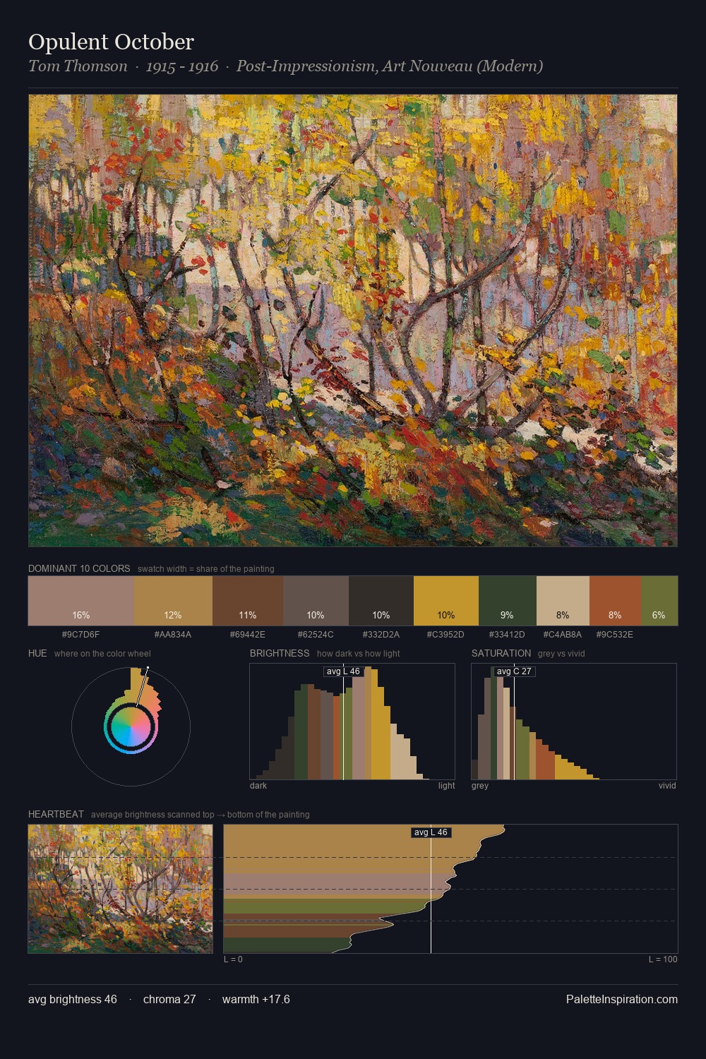
Rik Wouters distributes its values across the middle register, creating harmony without high contrast. Blues and teal-greys govern the palette, lending it an aquatic or atmospheric quality. The absence of saturated colour is itself an expressive choice: this is a palette of restraint and atmosphere. At 25.1%, #121417 functions less as a colour accent and more as a complete atmospheric environment. The most saturated colour, #66442E, is reserved to 5.5% of the surface, where it acts as a focal punctuation. From deepest dark to palest light, the palette traverses 62 units of the value scale - a span that creates natural depth. The mid-to-high key, cool bias, and moderate chroma point to outdoor observation - sky and diffused daylight as the dominant light source. This is palette 5 of Rik Wouters's sequence - a single chapter in a chromatic story told across many works.
Example use cases
- music labels
- luxury hospitality
- editorial photography
- leather goods
- premium streaming
I Love This!
Copy, export, or download for your project