Rik Wouters Palette 1

Palette Analysis
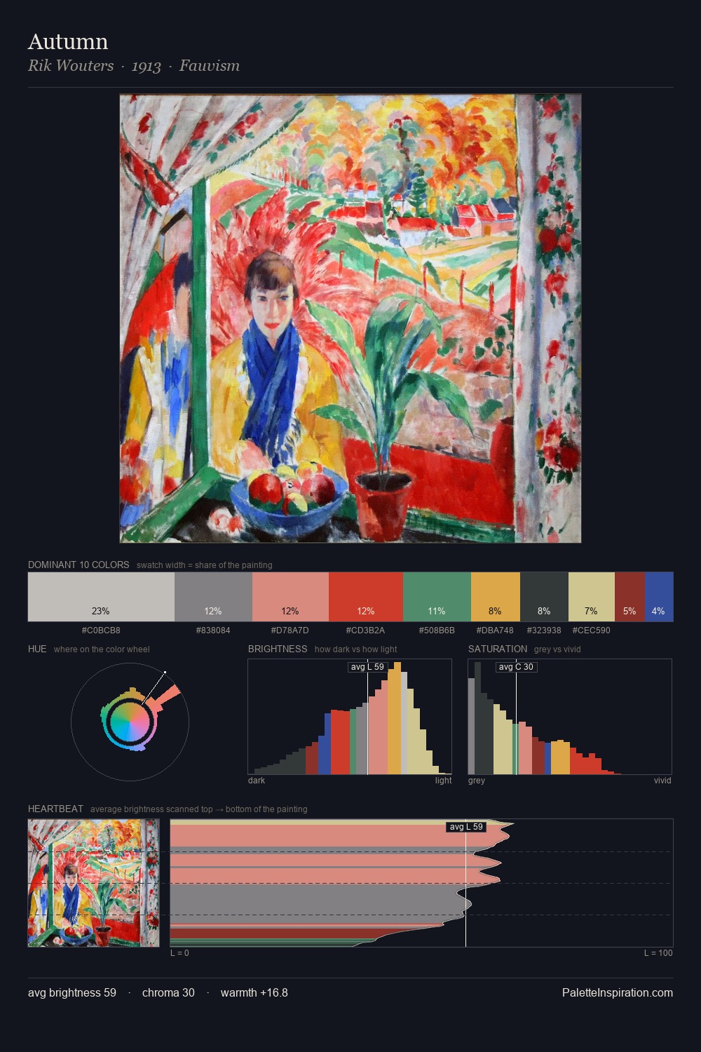
Rik Wouters works in the upper reaches of the value scale, creating an atmosphere of brightness and expansiveness. Cool hues prevail: blues, greens, and greys anchor the palette's emotional temperature. Mid-saturation across the board: the palette has colour character without chromatic excess. #324DA6 functions as the palette's exclamation mark: highest chroma, lowest percentage (4.3%). Value range is moderate at 36 units - enough contrast for legibility, not so much as to fragment the tonal unity. The mid-to-high key, cool bias, and moderate chroma point to outdoor observation - sky and diffused daylight as the dominant light source. In the context of Rik Wouters's full range of palettes, group 1 represents one movement in an ongoing chromatic dialogue.
Example use cases
- eco-tourism
- plant-based brands
- botanical skincare
- environmental nonprofits
- health food retail
I Love This!
Copy, export, or download for your project