Raphael Kirchner Palette 14

Palette Analysis
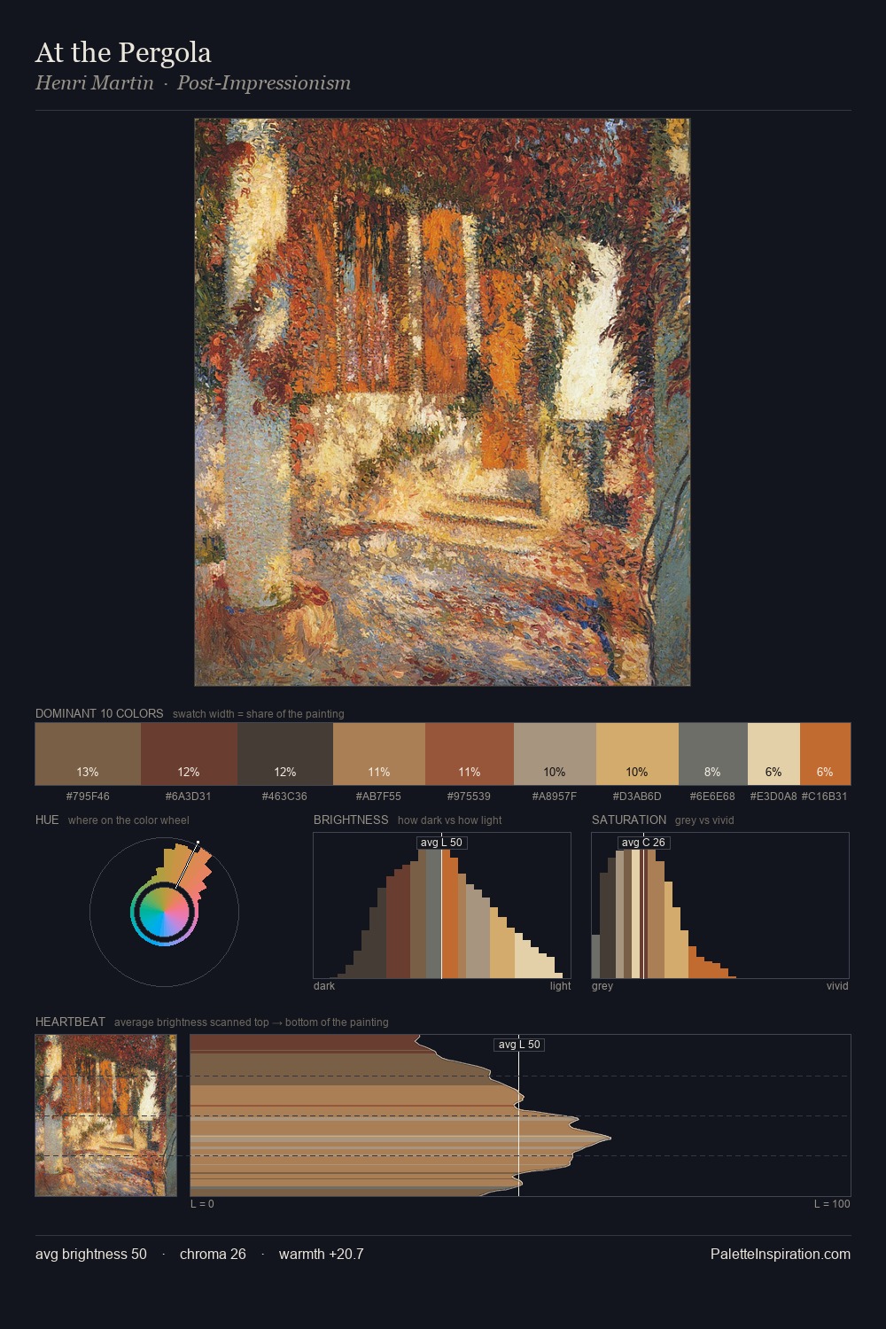
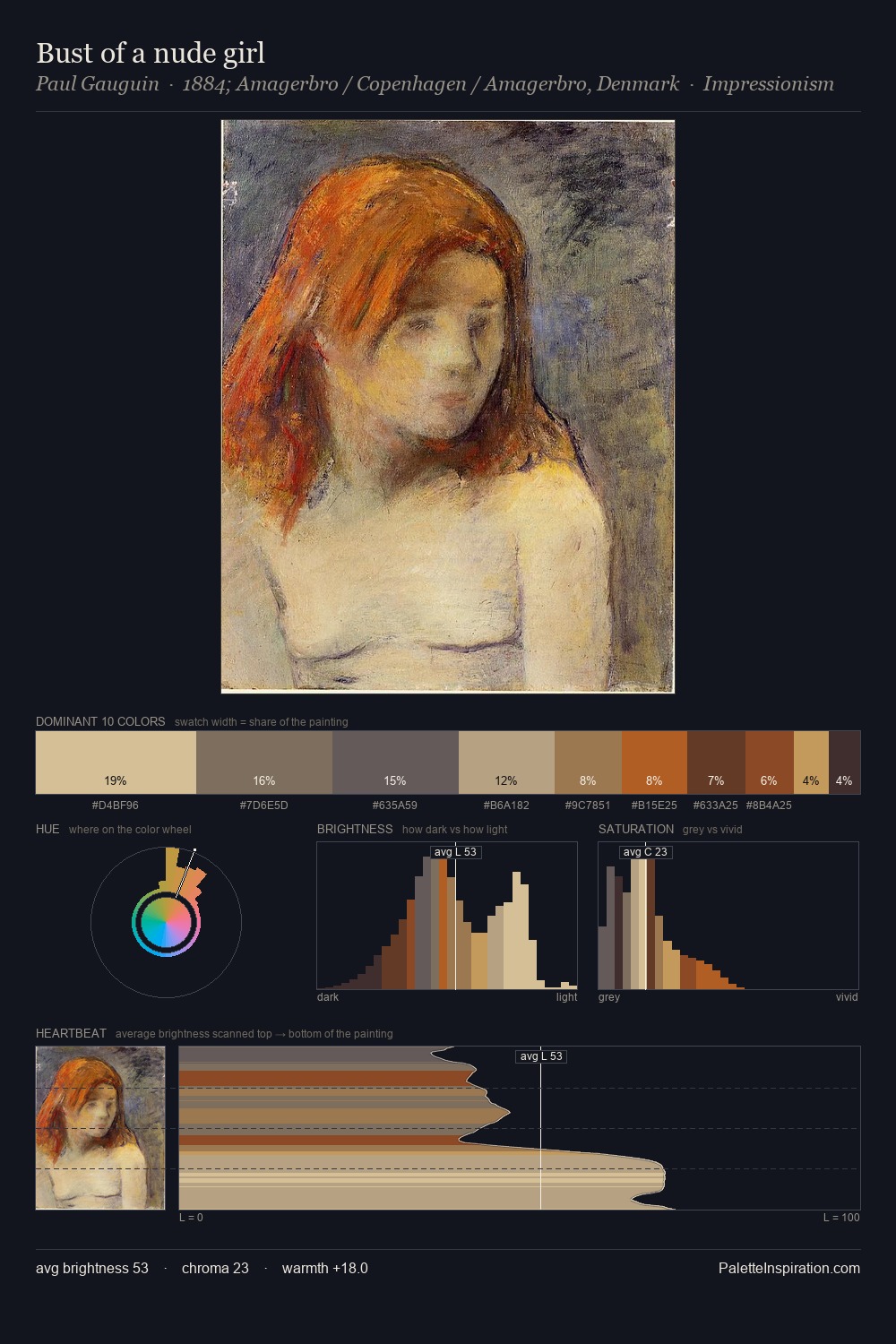
Raphael Kirchner is high in key: pale, luminous, and filled with optical air. Raphael Kirchner tilts toward cool - blues and silver-greys carry the structural weight. Saturation is deliberately withheld - the beauty here lies in the near-monochromatic gradations rather than colour difference. The dominant colour, #E7D2B3, takes 31.0% of the total area, establishing the overall mood before any other hue is introduced. Only 1.0% is devoted to #C85D3A, yet that small allocation delivers the palette's entire chromatic tension. At 55 units of value range, the palette has the tonal breadth to sustain complex spatial readings. High luminosity and cool temperature suggest the plein-air condition: unfiltered daylight and open sky. Raphael Kirchner's palette 14 carries its own internal logic while remaining in conversation with the artist's broader colour intelligence.
Example use cases
- publishing
- corporate identity
- consumer apps
- hospitality
- design agencies
I Love This!
Copy, export, or download for your project