Quentin Matsys Master Palette
Shadowed Caramel
Shadowed Low-key - values weighted toward shadow, the palette of dim interiors and overcast skies.
Caramel Warm mid-brown - the color of cooked sugar, smooth and amber-toned.

Palette Analysis
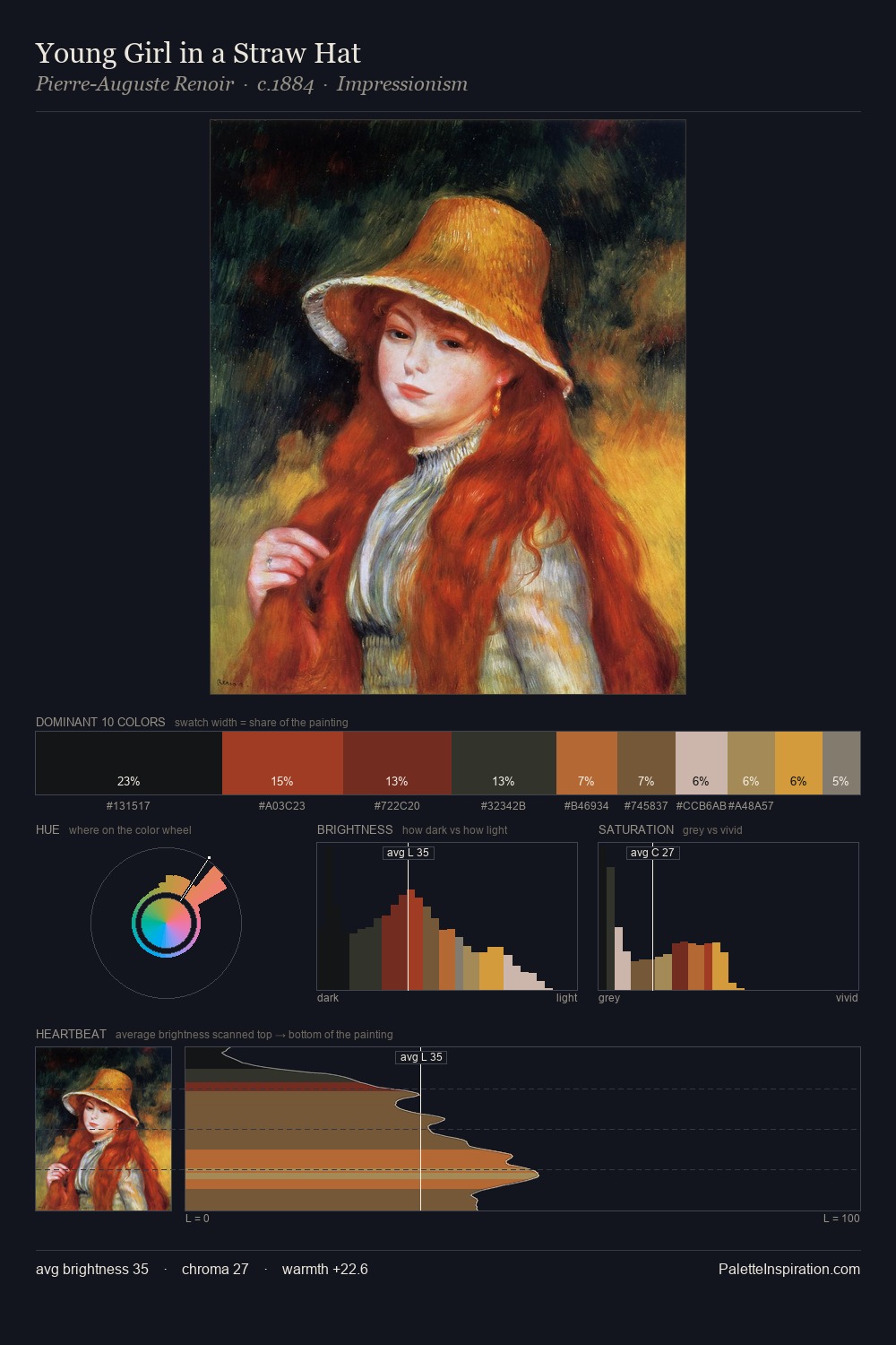
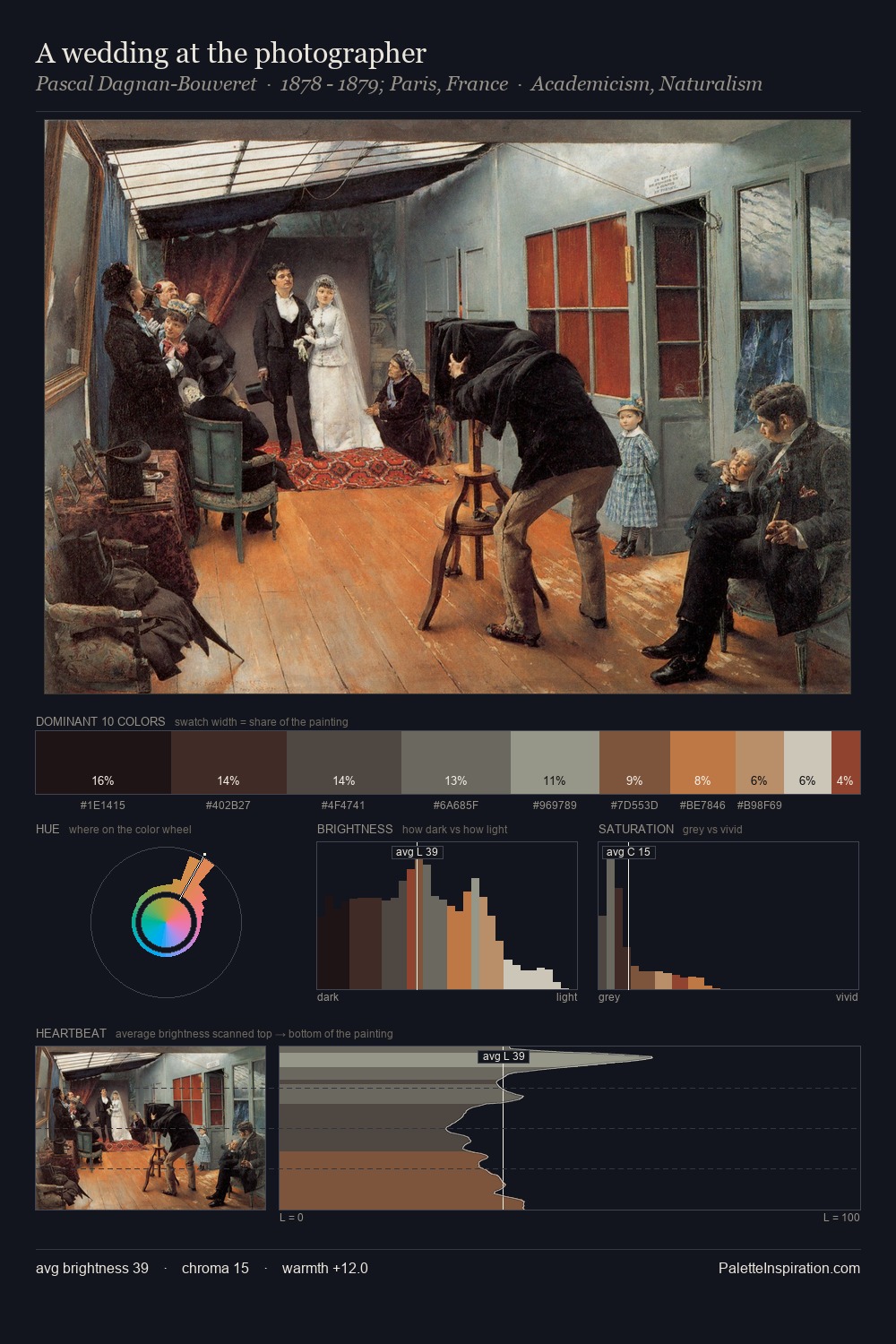
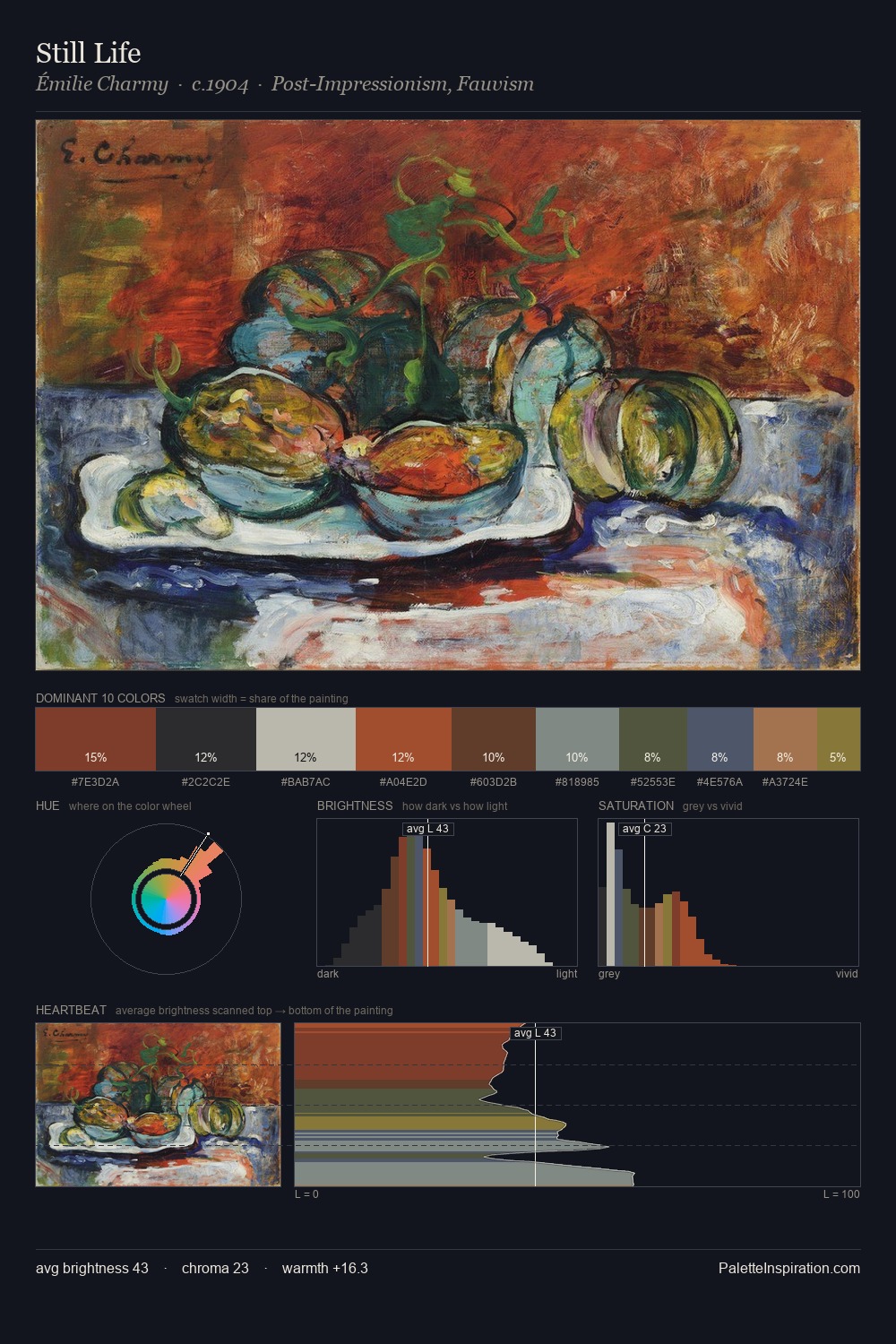
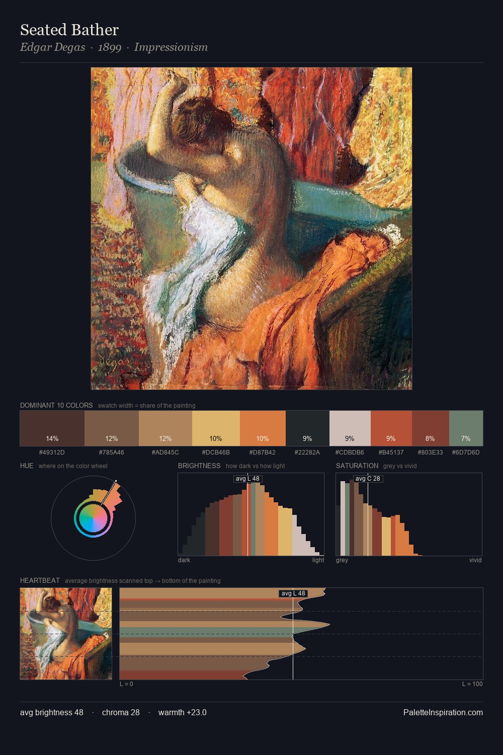
Quentin Matsys distributes its values across the middle register, creating harmony without high contrast. Temperature reads distinctly warm: the reds and earth tones from Quentin Matsys carry the compositional weight. All colours lean toward grey, building depth through value rather than colour punch. Only 3.9% is devoted to #AF632E, yet that small allocation delivers the palette's entire chromatic tension. A value spread of 63 units gives the palette both depth and air - shadows are genuinely dark, lights genuinely light. This is the light Quentin Matsys preferred, made measurable.
Example use cases
- theater design
- jewelry brands
- tobacco-adjacent retail
- event branding
- film & entertainment
I Love This!
Use This Palette
Copy, export, or download for your project
Copy, export, or download for your project
Copy:
Download:
Share: