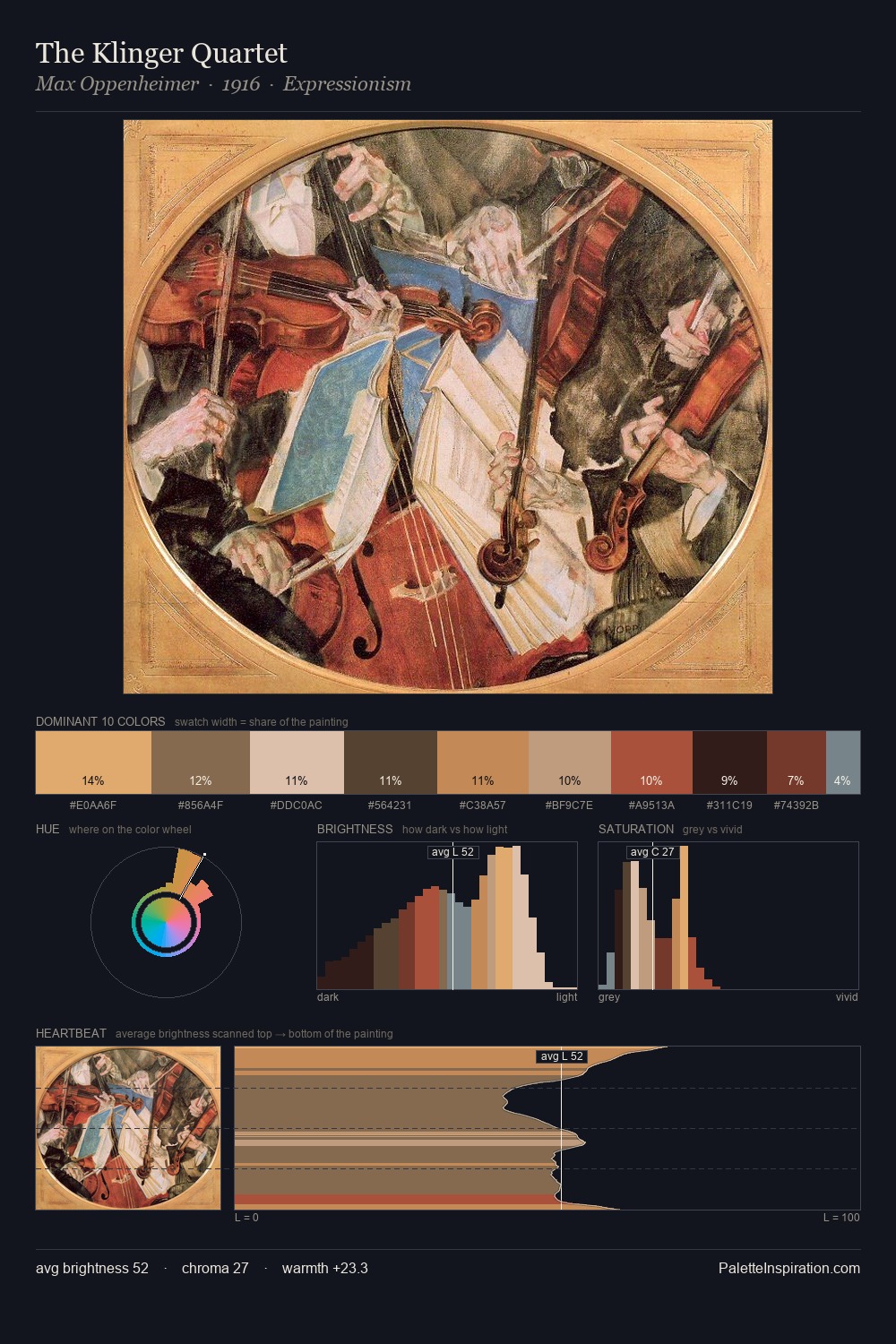
Pisanello Master Palette
Muted Caramel
Muted Deliberately desaturated - chroma pulled toward gray, the restraint of tonal painting.
Caramel Warm mid-brown - the color of cooked sugar, smooth and amber-toned.

Palette Analysis
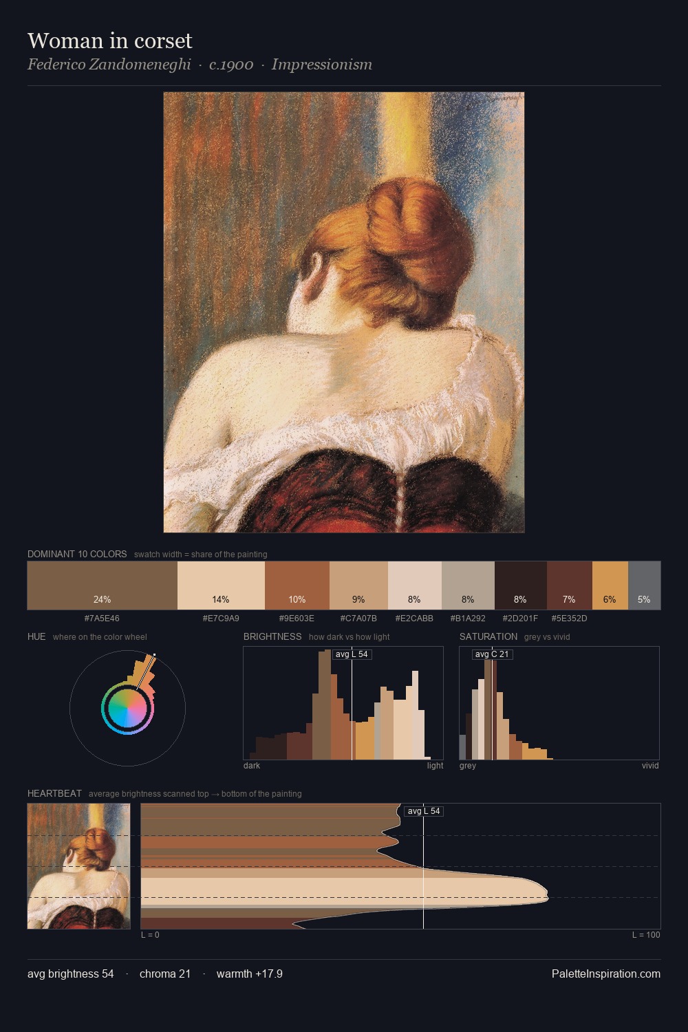
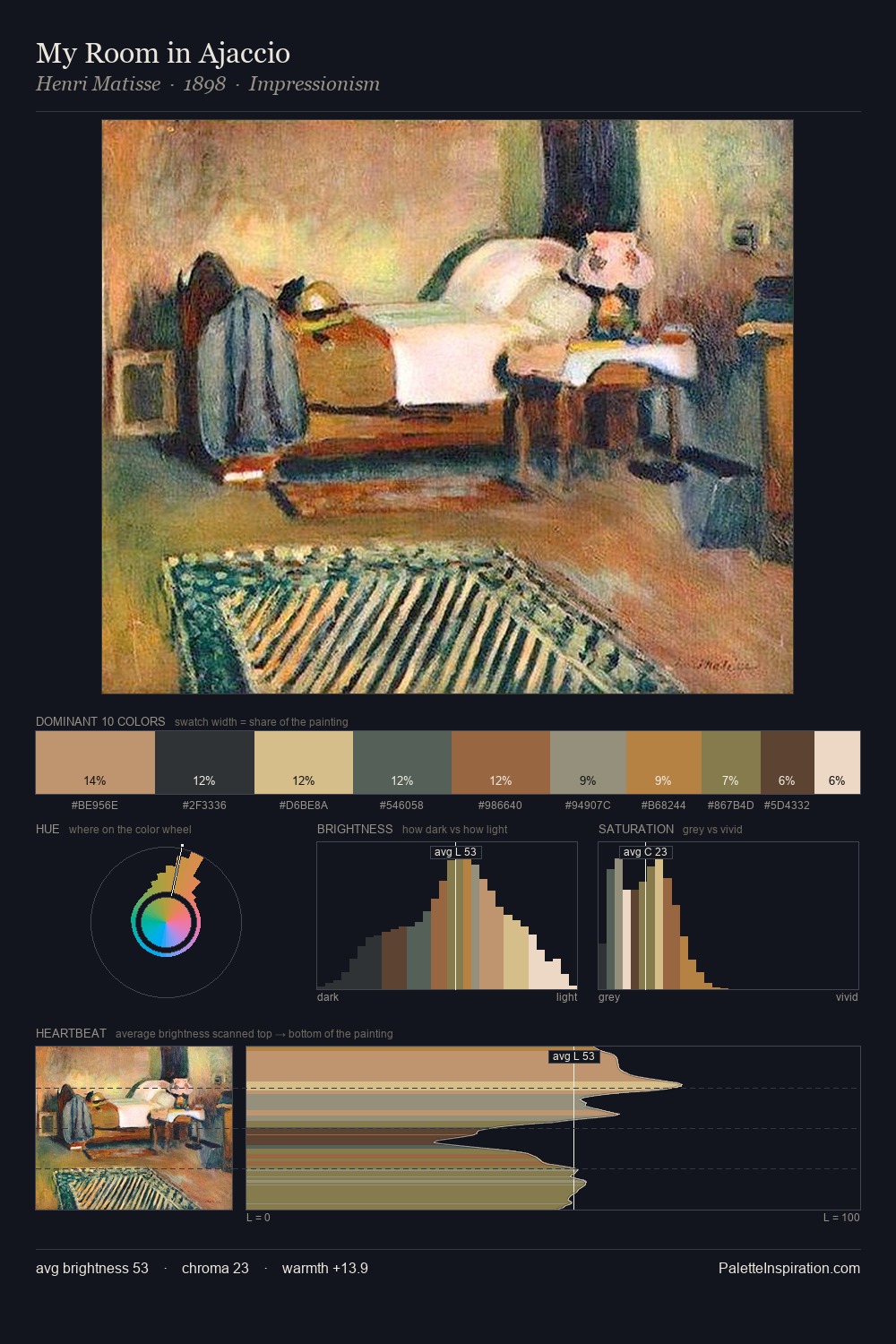
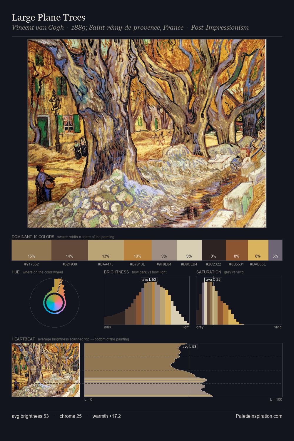
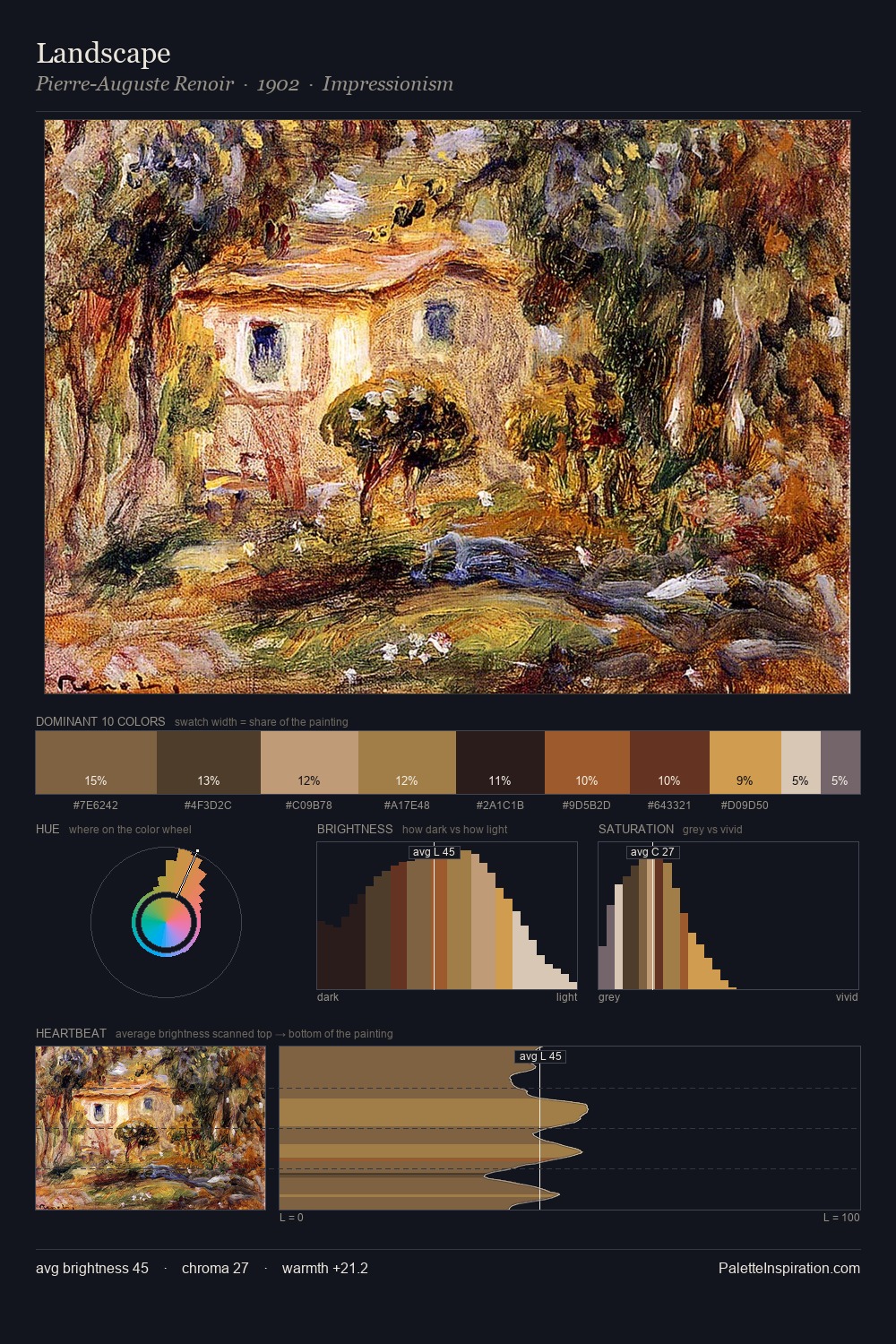
Pisanello distributes its values across the middle register, creating harmony without high contrast. Yellow, ochre, sienna: warm hues that Pisanello deploys as the palette's primary energy. The absence of saturated colour is itself an expressive choice: this is a palette of restraint and atmosphere. Only 10.0% is devoted to #DDC6A3, yet that small allocation delivers the palette's entire chromatic tension. At 68 units of value range, the palette has the tonal breadth to sustain complex spatial readings. The palette is a signature: Pisanello's particular sense of value, warmth, and colour weight made legible.
Example use cases
- ceramics & pottery
- boutique hospitality
- menswear
- heritage food brands
- craft & artisan brands
I Love This!
Use This Palette
Copy, export, or download for your project
Copy, export, or download for your project
Copy:
Download:
Share: